

- ProblemProblema
- Shipment data spread across 15+ Excel files, cost figures corrupted by decimal formatting errors, no unique route identifiers, and multi-country customer operations with no tracking.Dati di spedizione sparsi su oltre 15 file Excel, importi di costo corrotti da errori di formattazione decimale, nessun identificativo univoco di rotta e clienti operativi in più paesi senza alcun tracciamento.
- Data modelModello dati
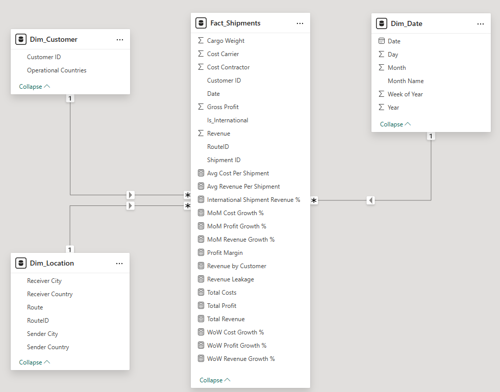
- Star schema with a shipment fact table; customer dimension mapping multi-country operations, location dimension using surrogate keys for routes, and a date dimension for trending.Star schema con tabella dei fatti sulle spedizioni; dimensione cliente che mappa le operazioni multi-paese, dimensione località con chiavi surrogate per le rotte e dimensione data per l'analisi dei trend.
- AnalysisAnalisi
- Profit margin by customer, route and period; cost-per-shipment benchmarking; revenue-leakage detection; week-over-week and month-over-month trending.Margine per cliente, rotta e periodo; benchmark del costo per spedizione; individuazione delle perdite di ricavo; andamento settimana su settimana e mese su mese.
- OutcomeEsito
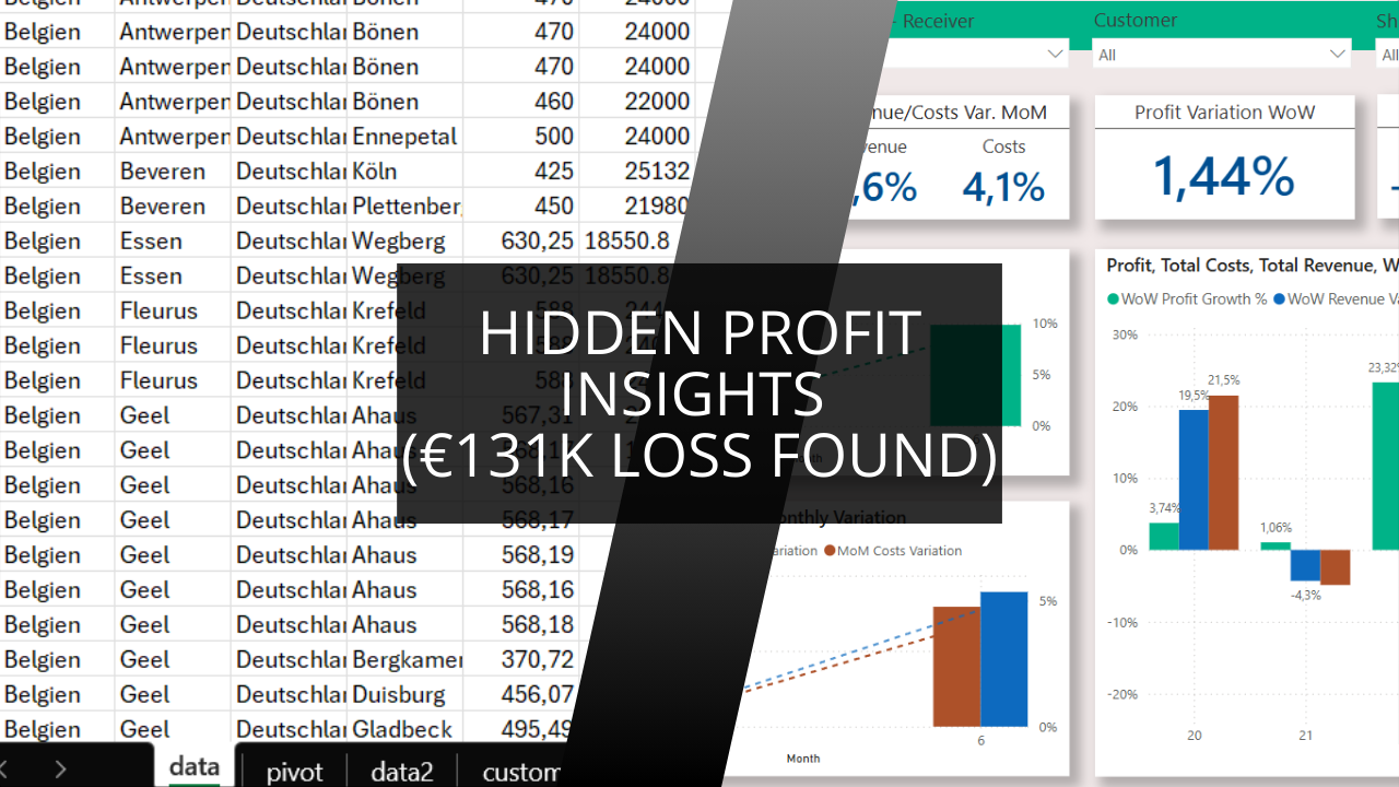
- Surfaced a €131K loss in French operations that was invisible against +€541K from Germany — plus a single customer costing €70K a year, and another generating 33% of total profit.Emersa una perdita di 131K€ sulle operazioni francesi, invisibile a fronte dei +541K€ della Germania — più un singolo cliente che costava 70K€ all'anno e un altro che generava il 33% del profitto totale.
How I uncovered profit leaks, optimized routes, and transformed chaos into clarity using Power BI and strategic analysis
The Challenge: When Success Hides Serious Problems
A growing European logistics company contacted me with a concerning situation. Despite healthy revenue growth, their operations team suspected something was wrong with their financial figures for May and June 2024.
The symptoms:
- Revenue numbers that didn't match operational performance
- Inconsistent cost reporting across departments
- Route profitability that seemed "off" to experienced managers
- Manual reporting taking days to compile
The real problem: Their data was scattered across multiple systems, making it impossible to see the complete financial picture.
The Investigation: What the Data Revealed
Step 1: Data Archaeology
Before building any dashboards, I needed to understand what we were really working with.
What I found:
- Shipment data spread across 15+ Excel files
- Cost carrier figures with decimal formatting errors creating numbers in the millions
- No unique route identifiers making analysis nearly impossible
- Customer operations spanning multiple countries without proper tracking
The fix: I rebuilt the data foundation using Python for cleaning and Power BI for modeling, creating a star schema that could actually tell the story hidden in their numbers.
Step 2: Building the Financial Picture
Once the data was clean, the real insights started emerging:
Overall Health Check:
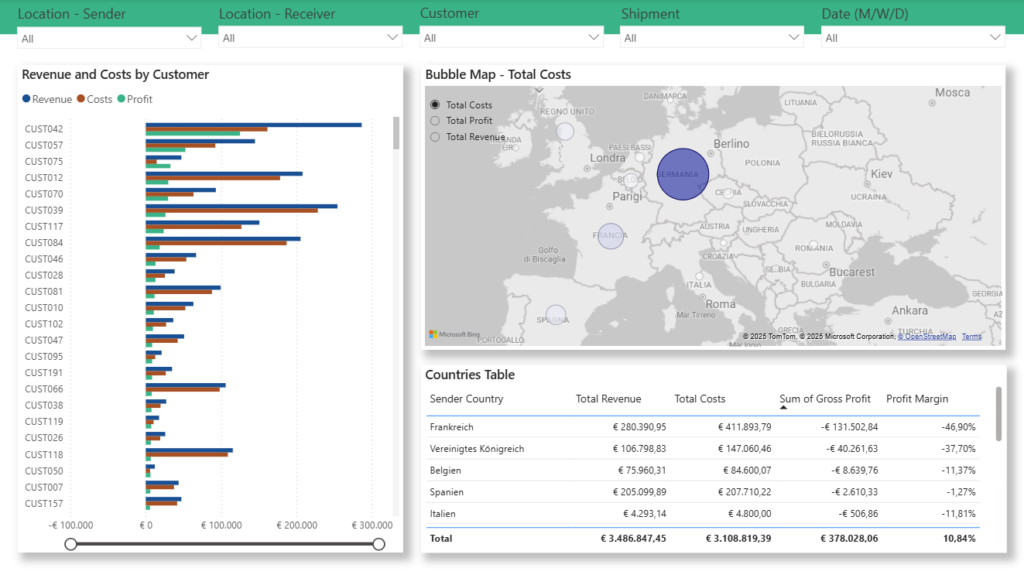
- Profit margin: 10.84% (healthier than expected)
- International focus: 84% of revenue from cross-border shipments
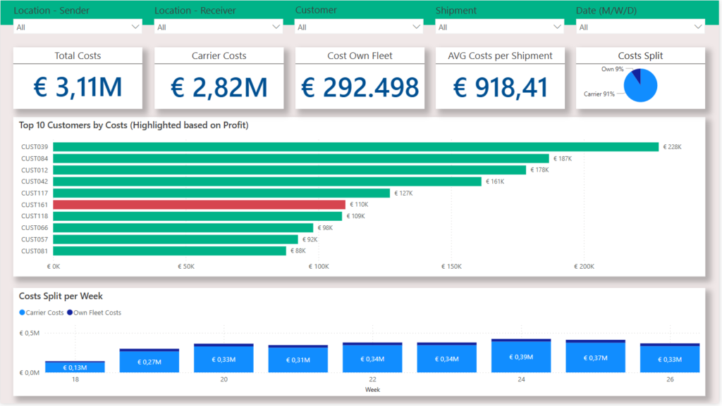
- Cost structure: 91% external carriers vs. 9% internal fleet
But then came the surprises...
Step 3: The €131K Discovery
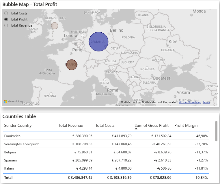
The breakthrough came when I analyzed performance by operational country:
- Germany operations: +€541K profit (stellar performance)
- France operations: -€131K loss (completely hidden before)
This single insight immediately explained why overall margins felt "wrong" despite decent headline numbers.
The Route Analysis: Where Money Disappears
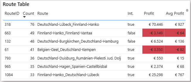
Route #318: The Revenue Champion
- 76 shipments (highest volume)
- 18.6% of total company revenue
- Strong profitability requiring optimization focus
The Problem Routes
Several routes showing consistent losses, with specific sender-receiver combinations bleeding money monthly without anyone realizing.
Why this mattered: Before this analysis, route pricing was based on distance and weight. Now they could see actual profitability per route and adjust accordingly.
Customer Profitability: The Real Eye-Opener
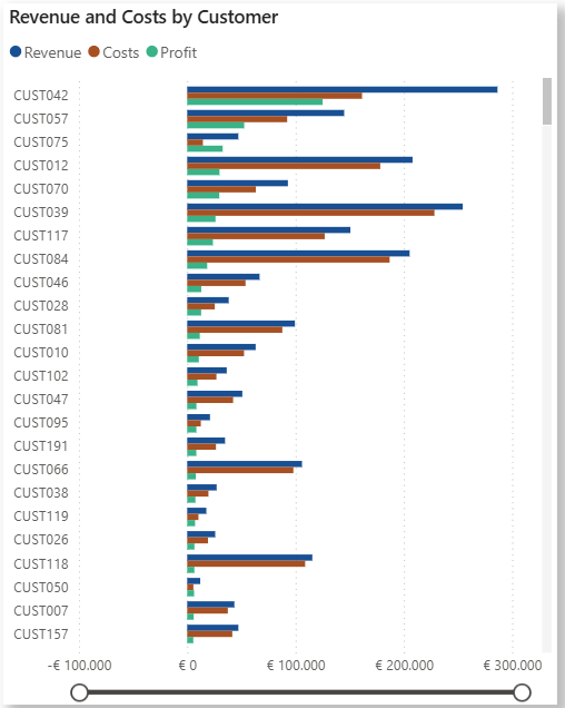
Customer #042: The Profit Engine
- €125K in profits (33% of total company profit)
- Consistent performer across multiple routes
- Clear candidate for relationship deepening
Customer #224: The Hidden Drain
- €70K annual loss (larger than many companies' entire profit)
- High service requirements without proportional revenue
- Contract restructuring or relationship evaluation needed
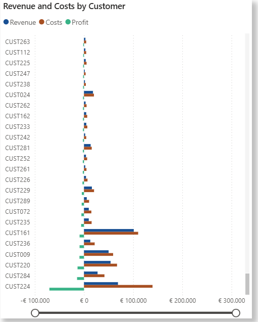
The strategic shift: Instead of treating all customers equally, they now had data to focus resources on profit-generating relationships.
Weekly Volatility: The Planning Problem
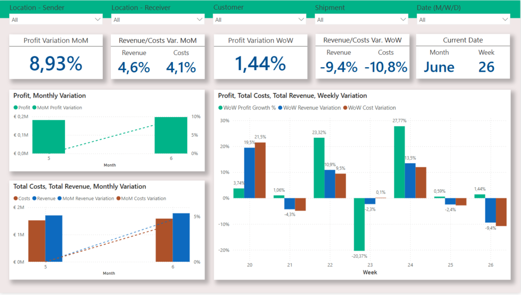
The month-over-month view looked stable (+8.93% growth from May to June), but weekly analysis revealed dramatic swings:
- Week 21-22: +23% profit spike
- Week 22-23: -20% sudden drop
- Week 23-24: +28% recovery
- Week 24-25: +0.6% plateau
- Week 25-26: +1.4% modest growth
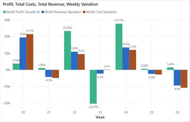
What this meant: Financial planning was nearly impossible without understanding these fluctuation drivers.
The Transformation Results
Immediate Wins:
- €131K loss identified and addressed within 30 days
- Route optimization based on actual profitability data
- Customer contract reviews prioritized by profit impact
- Weekly reporting reduced from 2 days to 30 minutes
Strategic Changes:
- Pricing strategy shifted from cost-plus to value-based
- Resource allocation focused on German market expansion
- Carrier negotiations leveraged with 91% cost visibility
- Decision speed improved from days to hours
Long-term Impact:
With real-time visibility into route and customer profitability, they could make strategic decisions based on data rather than intuition.
The Technical Foundation
For those interested in the methodology:
Data Architecture:
- Star schema with fact table for shipments
- Customer dimension with multi-country operations mapping
- Location dimension using surrogate keys for routes
- Date dimension enabling trend analysis
Key Measures:
- Profit margins by customer, route, and time period
- Cost per shipment benchmarking
- Revenue leakage identification
- Week-over-week and month-over-month trending
Tools Used:
- Python for data cleaning and validation
- Power BI for modeling and visualization
- DAX for advanced calculations
- Automated refresh for real-time insights
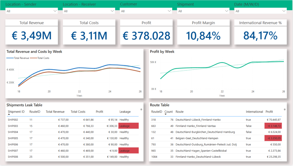
Why This Approach Works
This wasn't just about building dashboards—it was about uncovering the story hidden in their data.
The difference:
- Traditional BI: Shows what happened
- Strategic analysis: Reveals why it happened and what to do next
The process:
- Data detective work: Find what's really happening
- Strategic modeling: Build architecture for insights
- Business translation: Turn numbers into actions
- Ongoing optimization: Continuous improvement based on results
Come ho scoperto perdite di margine, ottimizzato le rotte e trasformato il caos in chiarezza con Power BI e l'analisi strategica
La sfida: quando il successo nasconde problemi seri
Un'azienda di logistica europea in crescita mi ha contattato con una situazione preoccupante. Nonostante i ricavi crescessero bene, il team operativo sospettava che qualcosa non tornasse nei dati economici di maggio e giugno 2024.
I sintomi:
- Numeri di ricavo che non corrispondevano alla performance operativa
- Rendicontazione dei costi incoerente tra i reparti
- Redditività delle rotte che ai manager esperti sembrava «strana»
- Reportistica manuale che richiedeva giorni di lavoro
Il problema vero: I dati erano sparsi su più sistemi, il che rendeva impossibile vedere il quadro economico completo.
L'indagine: cosa hanno rivelato i dati
Passo 1: archeologia dei dati
Prima di costruire qualsiasi dashboard, dovevo capire con cosa stessimo davvero lavorando.
Cosa ho trovato:
- Dati di spedizione sparsi su oltre 15 file Excel
- Importi dei vettori con errori di formattazione decimale che generavano cifre nell'ordine dei milioni
- Nessun identificativo univoco di rotta, il che rendeva l'analisi quasi impossibile
- Clienti operativi in più paesi senza un tracciamento adeguato
La soluzione: Ho ricostruito le fondamenta dei dati usando Python per la pulizia e Power BI per la modellazione, creando uno star schema capace di raccontare davvero la storia nascosta nei loro numeri.
Passo 2: costruire il quadro economico
Una volta puliti i dati, sono cominciati a emergere gli insight veri:
Stato di salute generale:
- Margine: 10,84% (più sano del previsto)
- Focus internazionale: 84% dei ricavi da spedizioni transfrontaliere
- Struttura dei costi: 91% vettori esterni contro il 9% di flotta interna
Ma poi sono arrivate le sorprese...
Passo 3: la scoperta da 131K€
La svolta è arrivata analizzando la performance per paese operativo:
- Operazioni in Germania: +541K€ di margine (performance eccellente)
- Operazioni in Francia: -131K€ di perdita (prima completamente invisibile)
Questo singolo insight ha spiegato subito perché i margini complessivi sembrassero «sbagliati» nonostante numeri di facciata discreti.
L'analisi delle rotte: dove spariscono i soldi
Rotta #318: la regina dei ricavi
- 76 spedizioni (volume più alto)
- 18,6% del ricavo totale aziendale
- Buona redditività, da presidiare con attenzione all'ottimizzazione
Le rotte problematiche
Diverse rotte in perdita costante, con specifiche combinazioni mittente-destinatario che perdevano soldi ogni mese senza che nessuno se ne accorgesse.
Perché contava: Prima di questa analisi il prezzo delle rotte si basava su distanza e peso. Ora potevano vedere la redditività reale per rotta e regolarsi di conseguenza.
Redditività per cliente: la vera rivelazione
Cliente #042: il motore del margine
- 125K€ di margine (33% del margine totale aziendale)
- Performance costante su più rotte
- Candidato chiaro per rafforzare la relazione
Cliente #224: la perdita nascosta
- 70K€ di perdita annua (più dell'intero margine di molte aziende)
- Livello di servizio elevato senza ricavi proporzionati
- Serve ristrutturare il contratto o rivalutare la relazione
Il cambio di strategia: Invece di trattare tutti i clienti allo stesso modo, ora avevano i dati per concentrare le risorse sulle relazioni che generano margine.
Volatilità settimanale: il problema della pianificazione
La vista mese su mese sembrava stabile (+8,93% da maggio a giugno), ma l'analisi settimanale ha rivelato oscillazioni marcate:
- Settimane 21-22: +23% di picco sul margine
- Settimane 22-23: -20% di calo improvviso
- Settimane 23-24: +28% di recupero
- Settimane 24-25: +0,6% di stallo
- Settimane 25-26: +1,4% di crescita modesta
Cosa significava: La pianificazione economica era quasi impossibile senza capire cosa guidasse queste oscillazioni.
I risultati della trasformazione
Risultati immediati:
- Perdita da 131K€ individuata e affrontata entro 30 giorni
- Ottimizzazione delle rotte basata sui dati di redditività reale
- Revisione dei contratti clienti ordinata per impatto sul margine
- Reportistica settimanale ridotta da 2 giorni a 30 minuti
Cambiamenti strategici:
- Strategia di prezzo passata da cost-plus a basata sul valore
- Allocazione delle risorse concentrata sull'espansione nel mercato tedesco
- Trattative con i vettori rafforzate dal 91% di visibilità sui costi
- Velocità decisionale passata da giorni a ore
Impatto di lungo periodo:
Con visibilità in tempo reale sulla redditività di rotte e clienti, potevano prendere decisioni strategiche sui dati invece che a intuito.
Le basi tecniche
Per chi è interessato alla metodologia:
Architettura dei dati:
- Star schema con tabella dei fatti sulle spedizioni
- Dimensione cliente con mappatura delle operazioni multi-paese
- Dimensione località con chiavi surrogate per le rotte
- Dimensione data che abilita l'analisi dei trend
Misure principali:
- Margini per cliente, rotta e periodo
- Benchmark del costo per spedizione
- Individuazione delle perdite di ricavo
- Andamento settimana su settimana e mese su mese
Strumenti usati:
- Python per la pulizia e la validazione dei dati
- Power BI per la modellazione e la visualizzazione
- DAX per i calcoli avanzati
- Aggiornamento automatico per insight in tempo reale
Perché questo approccio funziona
Non si trattava solo di costruire dashboard: si trattava di far emergere la storia nascosta nei loro dati.
La differenza:
- BI tradizionale: mostra cosa è successo
- Analisi strategica: rivela perché è successo e cosa fare dopo
Il processo:
- Lavoro investigativo sui dati: capire cosa sta succedendo davvero
- Modellazione strategica: costruire un'architettura che produca insight
- Traduzione in termini di business: trasformare i numeri in azioni
- Ottimizzazione continua: Miglioramento continuo sulla base dei risultati
How it was builtCome è stato costruito
Cleaning happened before modelling, in PythonLa pulizia è avvenuta prima della modellazione, in Python
The source was 15+ Excel files with carrier costs mangled by decimal formatting — errors large enough to push figures into the millions. Those were corrected and validated in Python before anything reached the model, so the Power BI layer never had to carry defensive logic to compensate for bad inputs.La fonte erano oltre 15 file Excel con i costi dei vettori rovinati dalla formattazione decimale — errori abbastanza grandi da spingere gli importi nell'ordine dei milioni. Sono stati corretti e validati in Python prima che arrivassero al modello, così il livello Power BI non ha mai dovuto contenere logica difensiva per compensare input sbagliati.
Surrogate keys because the routes had no identifiersChiavi surrogate perché le rotte non avevano identificativi
Routes existed only as sender/receiver combinations with no unique identifier, which makes per-route aggregation impossible. The location dimension introduces surrogate keys, and that is precisely what turns 'route #318' into something that can be ranked, compared and costed — the step that later exposed the loss-making routes.Le rotte esistevano solo come combinazioni mittente/destinatario senza identificativo univoco, il che rende impossibile aggregare per rotta. La dimensione località introduce chiavi surrogate, ed è esattamente ciò che trasforma la «rotta #318» in qualcosa che si può ordinare, confrontare e valorizzare — il passaggio che ha poi fatto emergere le rotte in perdita.
A customer dimension that spans countriesUna dimensione cliente che attraversa i paesi
The same customers operated across multiple countries with no consistent tracking, so country-level and customer-level profitability could not both be true at once. Mapping multi-country operations in the customer dimension is what allowed the €131K French loss to be seen separately from the +€541K German result, rather than netting off into a single healthy-looking margin.Gli stessi clienti operavano in più paesi senza un tracciamento coerente, quindi la redditività per paese e quella per cliente non potevano essere entrambe vere allo stesso tempo. Mappare le operazioni multi-paese nella dimensione cliente è ciò che ha permesso di vedere la perdita francese di 131K€ separata dal risultato tedesco di +541K€, invece di compensarsi in un unico margine apparentemente sano.
Why weekly, not just monthlyPerché settimanale, non solo mensile
Month-over-month showed steady growth of 8.93%. The same data at weekly grain showed a +23% spike followed by a −20% drop. Both are correct; only one of them is useful for planning. The date dimension supports both, and the difference between them was itself a finding.Il confronto mese su mese mostrava una crescita costante dell'8,93%. Gli stessi dati a granularità settimanale mostravano un picco del +23% seguito da un calo del −20%. Entrambi sono corretti; solo uno dei due è utile per pianificare. La dimensione data supporta entrambi, e la differenza fra i due era già di per sé un risultato.
Want to talk about work like this?
BI Developer & Data Analyst, based in Italy and working remotely. Open to roles and freelance projects.
Vuoi parlare di un lavoro come questo?
BI Developer e Data Analyst, con base in Italia e operativo da remoto. Disponibile per assunzione e progetti freelance.