

- ProblemProblema
- Operational data scattered across spreadsheets, desktop invoices, messaging apps, paper toll receipts, and separate GPS and fuel systems — with no single view of what a route actually cost.Dati operativi sparsi tra fogli di calcolo, fatture sul desktop, app di messaggistica, ricevute cartacee dei pedaggi e sistemi GPS e carburante separati — senza una vista unica di quanto costasse davvero una rotta.
- IntegrationIntegrazione
- Deliveries, fuel, leasing, driver pay and tolls connected into one model, using systems the company already had rather than replacing them.Consegne, carburante, leasing, compensi degli autisti e pedaggi collegati in un unico modello, usando i sistemi già presenti in azienda invece di sostituirli.
- Key measuresMisure chiave
- Gross margin per kilometre as the headline efficiency metric, with cost-per-km, actual-vs-target margin, and breakdowns by vehicle, vehicle type, country, driver and day.Margine lordo per chilometro come metrica principale di efficienza, con costo al km, margine effettivo rispetto al target e dettaglio per veicolo, tipo di veicolo, paese, autista e giorno.
- DeliveredRisultato
- One operational report answering which routes are profitable, which vehicles are efficient, and which clients generate revenue but destroy margin.Un unico report operativo che risponde a quali rotte sono redditizie, quali veicoli sono efficienti e quali clienti generano ricavi ma distruggono il margine.
Turning Everyday Chaos into Clarity
Most transport companies have data everywhere.
Spreadsheets, invoices on the office desktop.
Notes in WhatsApp.
Toll receipts sitting on the passenger seat.
GPS and fuel data stuck in separate apps.
(That’s where data integration matters, connecting what you already track into one clear picture).
Everyone sort of knows what’s happening, until something goes wrong.
Fuel costs rise, a route stops making money, or someone asks:
“Why did profit drop this month?”
And suddenly, no one has a clear answer.
That’s when you realize: it’s not that you don’t have data.
You just don’t have it in one place.
An operational report fixes that.
It connects what you already track (deliveries, fuel, leasing, driver pay, tolls) and turns it into something you can actually read and act on.
No new systems. No more guessing. Just your numbers, organized properly.
That’s what I specialize in: building connected reports that let you track every truck, route, and cost in real time.
Two articles if you want to see examples of how I merge data from different systems step by step:
1) Build a Sales System That Works While You Sleep (Free Google Sheets + Zapier Flows Included)
2) B2B SaaS Sales Ops: Automated Lead-to-Customer Tracking for 5 Reps and €950K ARR
Contents
What It Really Does
It’s not a fancy dashboard full of colors.
It’s a simple way to understand what’s working and what isn’t.
- Which routes actually bring profit, and which just keep trucks busy?
- How much does one kilometer really cost?
- Who are the most efficient drivers?
- Which clients bring in revenue but kill your margin?
All those questions now have clear answers.
Inside the Report
Here’s what you could actually see once everything is connected (fully customizable for your transport company).
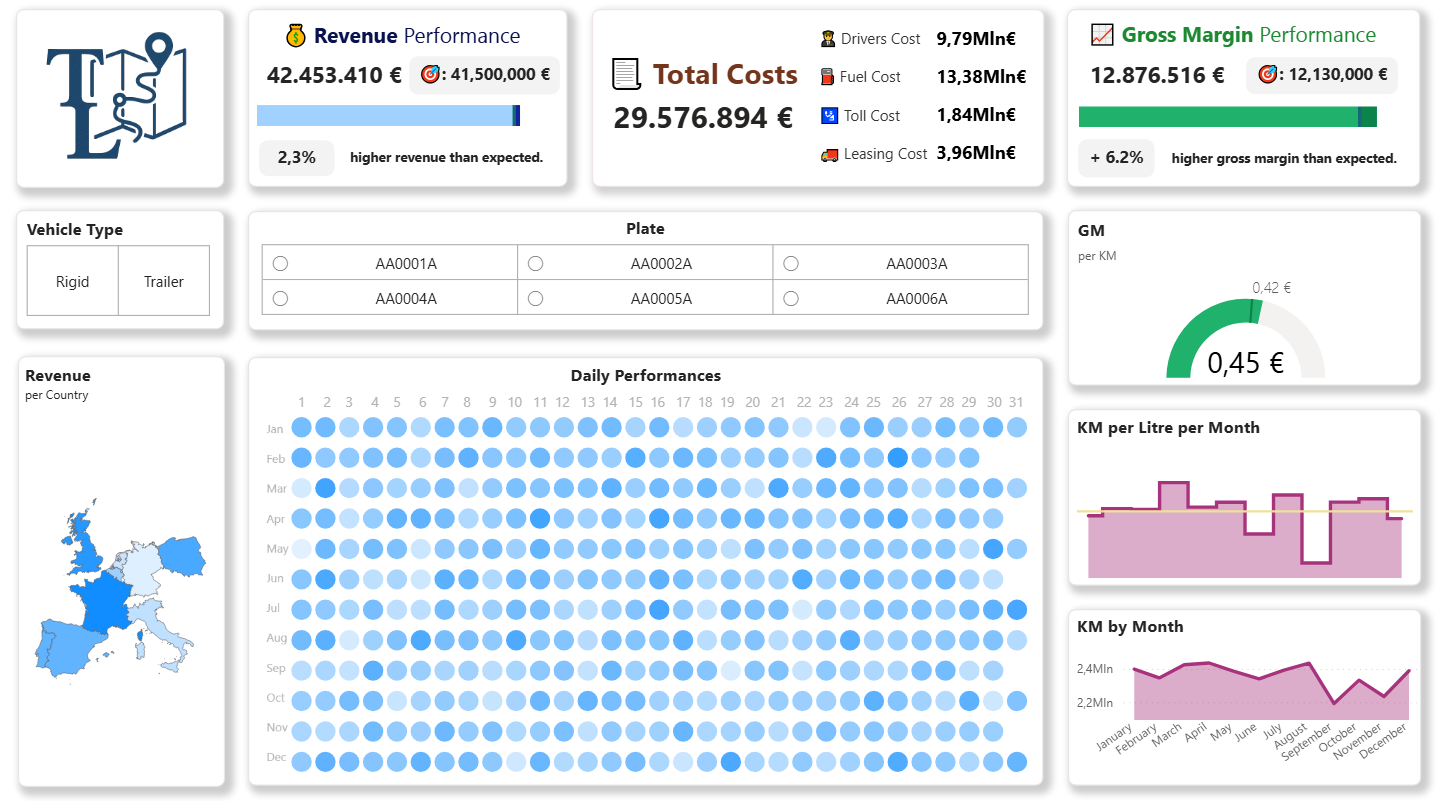
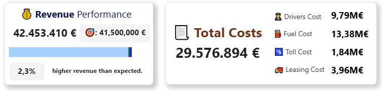
Revenue and Costs, Side by Side
See exactly how much money comes in, and where it goes.
Fuel, tolls, leasing, drivers are all broken down clearly.
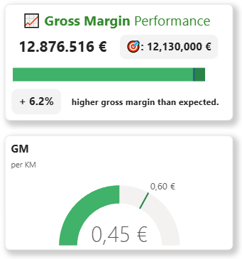
Gross Margin Performance
You see how much profit each vehicle, country or driver really brings after fuel, tolls, and driver costs.
You can compare your actual margin vs. target, see where you’re overperforming, and where you’re falling behind.
The metric Gross Margin per KM is what separates a profitable operation from one that just moves trucks around.
It’s the real measure of efficiency: how much you earn from every single kilometer.
Type of Vehicles and Single Vehicles
You can filter and rank vehicles by distance, revenue, and margin.
You’ll see which one consistently drives efficiently and which one burns too much fuel.
Same for the drivers, which ones make money and which ones just drives.

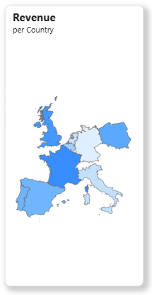
Countries
A simple map shows where you’re earning and where you’re not.
No more relying on memory or routine.
When you see it in black and white, the decisions get easier.
Kilometers and Efficiency
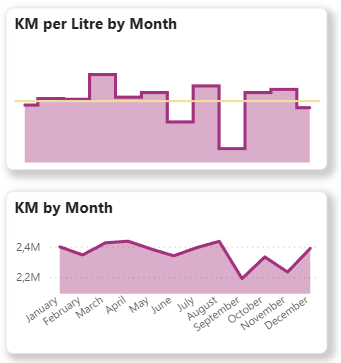
Kilometers per Litre by Month, Kilometers driven by Month (and much more possible: Total kilometers driven, cost per kilometer, margin per kilometer, etc.).
Everything that tells you how the business is really performing.
It’s the part where “we already track this in Excel” usually falls apart, because in Excel, those numbers never line up perfectly.
These are all dynamic metrics I build directly in Power BI.
Daily Performance
One of the biggest pains for transport managers is timing.
Monthly reports come too late and the problems have already happened.
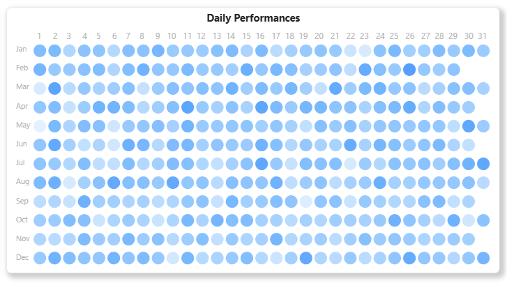
That’s why the report also includes daily performance tracking.
You see every day’s revenue, kilometers, and margin trend.
You can tell if something’s off immediately before it snowballs into a monthly loss.
...And More
This report is only a fraction of the potential of Business Intelligence for Logistics.
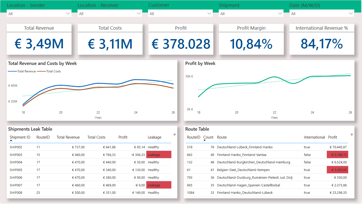
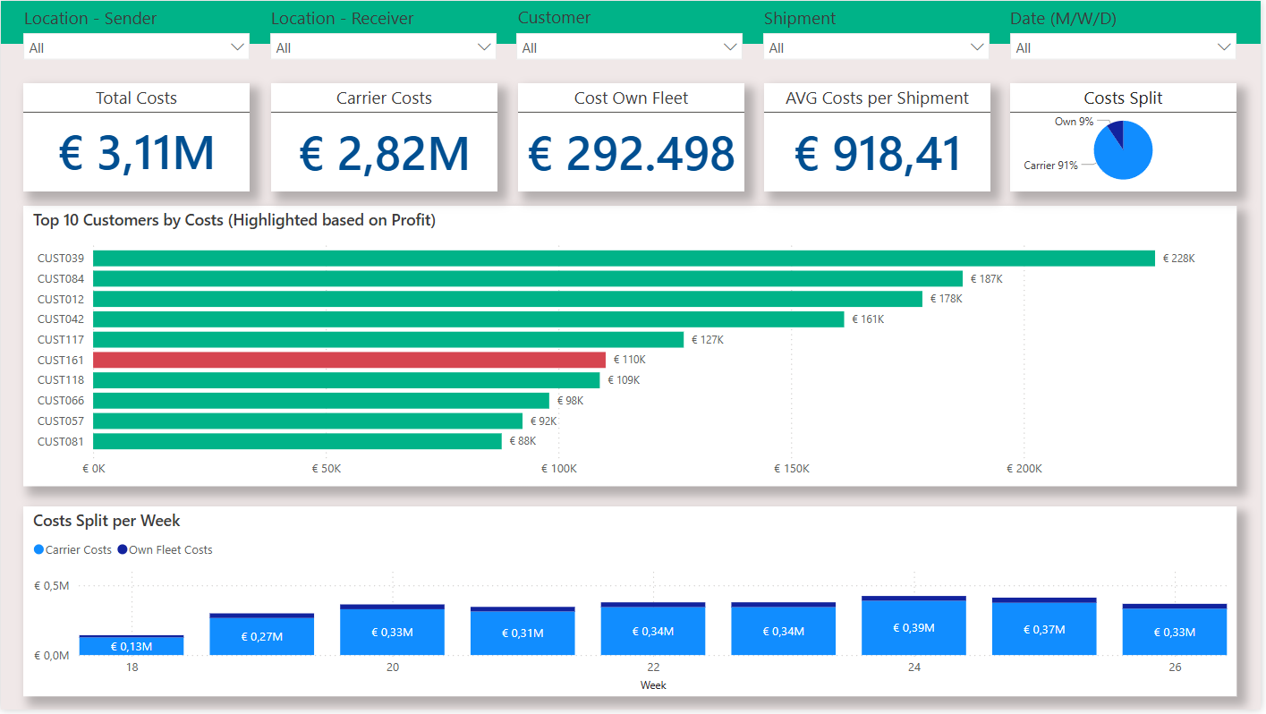
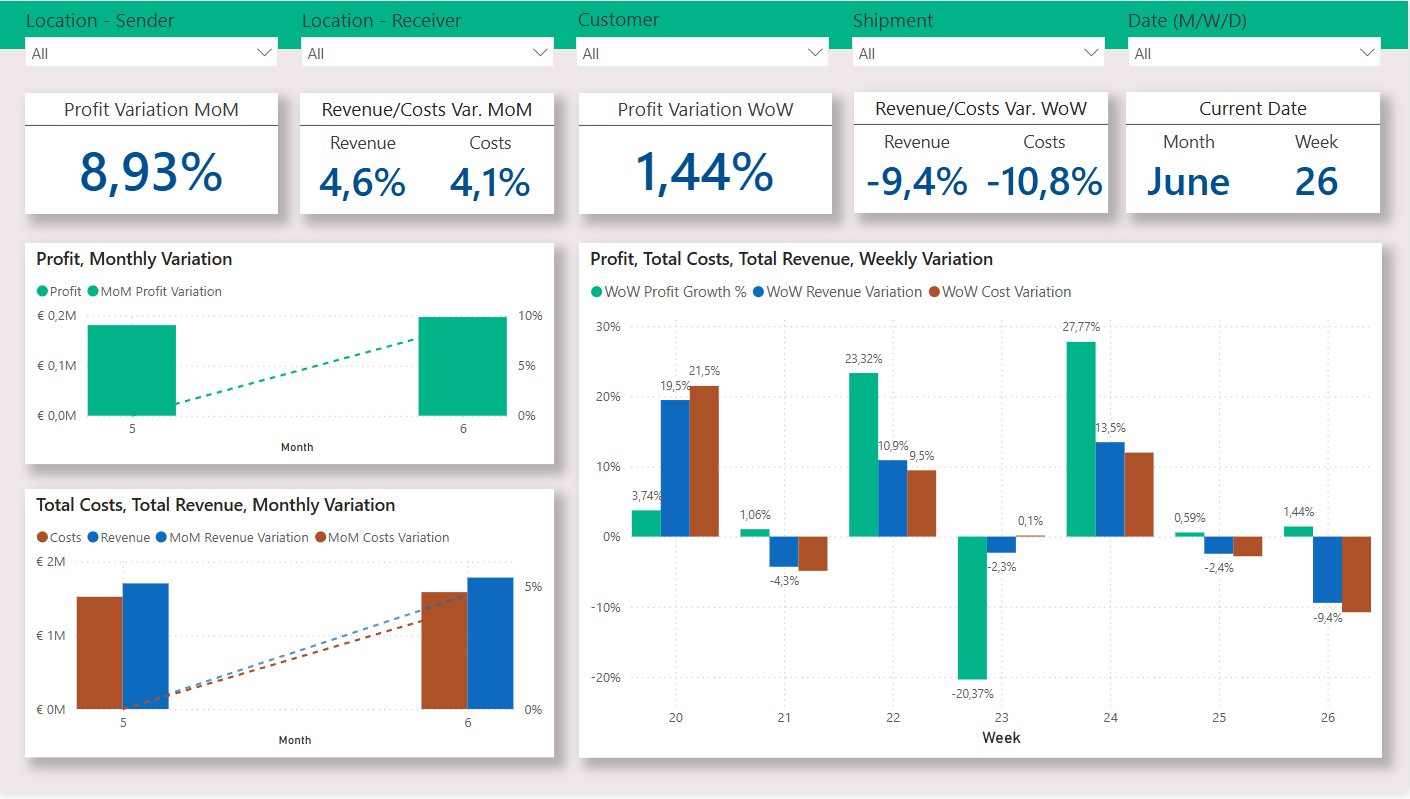
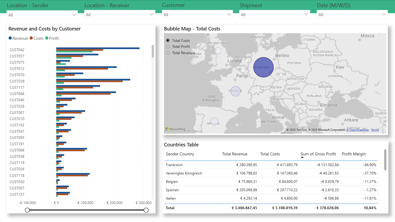
If you want to see how I analysed routes, shipments, monthly/weekly trends and customers and discovered a €131K Loss for a German company, click here: The Hidden €131K Loss: A European Logistics Company’s Data Analysis Story
Why It Actually Helps
Because most transport owners don’t need another app.
They just want control.
They want to know, right now, if things are going well or not.
This report gives you that, it doesn’t change how you work, it shows you where you stand.
Confusion turns into clarity, and “I think” becomes “I know.”
You can finally make decisions based on real numbers and live KPIs, not assumptions.
You’ll also save hours of chasing data.
Across countries, vehicles, and drivers, you’ll see exactly where cash leaks out.
And when it’s time to act, you’ll make quick, confident calls, whether it’s dropping a client, adjusting prices, or rewarding a driver who does things right.
Most people tell me:
“We already have all this in Excel.”
Sure, but how long does it take to update it?
How many versions exist?
And how often do you actually open it?
Or they say:
“We don’t have time for something new.”
That’s exactly why this works, it updates itself.
Once it’s set up, you just open it and see the latest numbers.
Conclusion
You don’t need to be a big logistics group to get value out of data.
Even with ten trucks, it’s enough to know exactly what makes money and what doesn’t.
This operational report gives you control.
And in this business, that’s what separates companies that survive from those that guess.
Trasformare il caos quotidiano in chiarezza
Quasi tutte le aziende di trasporto hanno dati ovunque.
Fogli di calcolo, fatture sul desktop dell'ufficio.
Appunti su WhatsApp.
Ricevute dei pedaggi sul sedile del passeggero.
Dati GPS e carburante bloccati in app separate.
(È qui che conta l'integrazione dei dati: collegare ciò che già registri in un quadro unico e chiaro).
Tutti più o meno sa cosa sta succedendo, finché qualcosa non va storto.
Il costo del carburante sale, una rotta smette di essere redditizia, oppure qualcuno chiede:
«Perché il margine è calato questo mese?»
E all'improvviso nessuno ha una risposta chiara.
È lì che te ne accorgi: non è che non hai i dati.
Semplicemente non li hai in un posto solo.
An report operativo risolve proprio questo.
Collega quello che già registri (consegne, carburante, leasing, compensi autisti, pedaggi) e lo trasforma in qualcosa che puoi davvero leggere e usare per decidere.
Nessun sistema nuovo. Basta andare a intuito. Solo i tuoi numeri, organizzati bene.
È questo di cui mi occupo: costruire report collegati che ti permettono di seguire ogni mezzo, rotta e costo in tempo reale.
Due articoli se vuoi vedere passo passo come unisco dati da sistemi diversi:
1) Costruisci un sistema di vendita che lavora mentre dormi (con fogli Google e flussi Zapier gratuiti)
2) Sales Ops B2B SaaS: tracciamento automatico da lead a cliente per 5 venditori e 950K€ di ARR
Indice
Cosa fa davvero
Non è una dashboard elaborata piena di colori.
È un modo semplice per capire cosa funziona e cosa no.
- Quali rotte portano davvero margine e quali tengono solo i mezzi occupati?
- Quanto costa davvero un chilometro?
- Quali sono gli autisti più efficienti?
- Quali clienti portano ricavi ma distruggono il margine?
Tutte queste domande ora hanno una risposta chiara.
Dentro il report
Ecco cosa potresti vedere una volta collegato tutto (completamente personalizzabile per la tua azienda di trasporti).
Ricavi e costi, affiancati
Vedi esattamente quanto entra e dove va a finire.
Carburante, pedaggi, leasing e autisti sono tutti scomposti in modo chiaro.
Performance del margine lordo
Vedi quanto margine porta davvero ogni veicolo, paese o autista dopo carburante, pedaggi e costo dell'autista.
Puoi confrontare il margine effettivo con il target, vedere dove stai andando oltre le attese e dove sei in ritardo.
La metrica del margine lordo per chilometro è ciò che distingue un'operazione redditizia da una che si limita a spostare camion.
È la vera misura dell'efficienza: quanto guadagni da ogni singolo chilometro.
Tipo di veicolo e singoli mezzi
Puoi filtrare e ordinare i veicoli per distanza, ricavo e margine.
Vedrai quale viaggia sempre in modo efficiente e quale consuma troppo carburante.
Lo stesso per gli autisti: quali generano margine e quali si limitano a guidare.
Paesi
Una mappa semplice mostra dove stai guadagnando e dove no.
Basta affidarsi alla memoria o all'abitudine.
Quando lo vedi nero su bianco, le decisioni diventano più facili.
Chilometri ed efficienza
Chilometri per litro per mese, chilometri percorsi per mese (e molto altro: chilometri totali percorsi, costo al chilometro, margine per chilometro, ecc.).
Tutto ciò che ti dice come sta andando davvero l'azienda.
È il punto in cui «questo lo teniamo già in Excel» di solito crolla, perché in Excel quei numeri non tornano mai perfettamente.
Sono tutte metriche dinamiche che costruisco direttamente in Power BI.
Performance giornaliera
Uno dei problemi più grossi per chi gestisce i trasporti è il tempismo.
I report mensili arrivano troppo tardi, quando i problemi sono già successi.
Per questo il report include anche il monitoraggio giornaliero delle performance.
Vedi ricavi, chilometri e andamento del margine giorno per giorno.
Capisci subito se qualcosa non va, prima che diventi una perdita mensile.
...E altro ancora
Questo report è solo una frazione del potenziale della Business Intelligence per la logistica.
Se vuoi vedere come ho analizzato rotte, spedizioni, trend mensili e settimanali e clienti scoprendo una perdita da 131K€ per un'azienda tedesca, clicca qui: La perdita nascosta da 131K€: l'analisi dei dati di un'azienda logistica europea
Perché funziona davvero
Perché la maggior parte dei titolari di aziende di trasporto non ha bisogno di un'altra app.
Vogliono solo controllo.
Vogliono sapere, adesso, se le cose stanno andando bene o no.
Questo report dà esattamente quello: non cambia il modo in cui lavori, ti mostra a che punto sei.
La confusione diventa chiarezza, e «credo» diventa «so».
Puoi finalmente decidere sulla base di numeri reali e KPI aggiornati, non di supposizioni.
Risparmierai anche ore passate a rincorrere i dati.
Tra paesi, veicoli e autisti, vedrai esattamente dove si perdono i soldi.
E quando sarà il momento di agire, deciderai in fretta e con sicurezza: lasciare un cliente, ritoccare i prezzi o premiare un autista che lavora bene.
La maggior parte delle persone mi dice:
«Questo ce l'abbiamo già tutto in Excel.»
Certo, ma quanto tempo ci vuole per aggiornarlo?
Quante versioni ne esistono?
E quanto spesso lo apri davvero?
Oppure dicono:
«Non abbiamo tempo per una cosa nuova.»
È esattamente per questo che funziona: si aggiorna da solo.
Una volta impostato, lo apri e vedi i numeri aggiornati.
Conclusione
Non serve essere un grande gruppo logistico per ricavare valore dai dati.
Anche con dieci mezzi, basta sapere esattamente cosa genera margine e cosa no.
Questo report operativo ti dà il controllo.
E in questo settore è ciò che distingue le aziende che sopravvivono da quelle che tirano a indovinare.
How it was builtCome è stato costruito
Integration over replacementIntegrare invece di sostituire
The data already existed — deliveries, fuel, leasing, driver pay, tolls, GPS — but was spread across spreadsheets, desktop invoices, messaging apps and paper receipts. The report connects those existing sources rather than introducing a new operational system, which is what makes it adoptable by a business that has no appetite for migrating.I dati esistevano già — consegne, carburante, leasing, compensi autisti, pedaggi, GPS — ma erano sparsi tra fogli di calcolo, fatture sul desktop, app di messaggistica e ricevute cartacee. Il report collega queste fonti esistenti invece di introdurre un nuovo sistema operativo, ed è questo che lo rende adottabile da un'azienda che non ha nessuna voglia di migrare.
Gross margin per kilometre as the unit of truthIl margine lordo per chilometro come unità di verità
Revenue per route flatters long routes and cost per route flatters short ones. Normalising to margin per kilometre makes vehicles, drivers, countries and clients directly comparable regardless of distance — and it is the measure that separates a profitable operation from one that is simply busy.Il ricavo per rotta favorisce le rotte lunghe, il costo per rotta favorisce quelle corte. Normalizzare a margine per chilometro rende veicoli, autisti, paesi e clienti direttamente confrontabili a prescindere dalla distanza — ed è la misura che distingue un'operazione redditizia da una semplicemente indaffarata.
Actual against target, at every grainEffettivo contro target, a ogni granularità
The same margin measure is evaluated against target by vehicle, vehicle type, country, driver and day. Keeping one measure and varying the grain, rather than writing a separate metric per view, is what keeps the numbers reconcilable when two people compare two different pages.La stessa misura di margine viene valutata rispetto al target per veicolo, tipo di veicolo, paese, autista e giorno. Mantenere una sola misura variando la granularità, invece di scrivere una metrica diversa per ogni vista, è ciò che permette ai numeri di riconciliarsi quando due persone confrontano due pagine diverse.
Want to talk about work like this?
BI Developer & Data Analyst, based in Italy and working remotely. Open to roles and freelance projects.
Vuoi parlare di un lavoro come questo?
BI Developer e Data Analyst, con base in Italia e operativo da remoto. Disponibile per assunzione e progetti freelance.