

- ProblemProblema
- An entire sales pipeline tracked by hand across three disconnected Google Sheets — leads, deals, payments — with no relational integrity, repeated status columns and no funnel metrics.Un'intera pipeline commerciale gestita a mano su tre fogli Google scollegati — lead, trattative, pagamenti — senza integrità relazionale, con colonne di stato ripetute e nessuna metrica di funnel.
- Data modelModello dati
- Star schema rebuilt from the three raw sheets, plus a Date dimension generated in Power Query, a Targets table for monthly goals, and a sales-reps table driving all rep-level measures.Star schema ricostruito dai tre fogli grezzi, più una dimensione Data generata in Power Query, una tabella Target per gli obiettivi mensili e una tabella commerciali che alimenta tutte le misure per venditore.
- ConstraintVincolo
- The team had to keep entering data in Google Sheets exactly as before — the rebuild had to happen underneath them, not around them.Il team doveva continuare a inserire i dati in Google Sheets esattamente come prima: la ricostruzione doveva avvenire sotto di loro, non attorno a loro.
- DeliveredRisultato
- Executive overview, month-over-month, funnel view and per-rep performance, refreshing automatically against the live sheets.Vista executive, confronto mese su mese, vista funnel e performance per venditore, con aggiornamento automatico dai fogli in uso.
This is how I transformed a chaotic spreadsheet into a clean, automated BI system that tracks revenue, conversion rates, and reps performance in real time.
The client was tracking their entire sales pipeline manually in Google Sheets with three different sheets: leads, deals, payments. Nothing was connected and no one had a real-time view of how the funnel was performing.
Yet the company was growing. And they needed a way to track performance without changing how the team worked.
My role was to build a complete reporting system that:
- Kept the current input flow (Google Sheets)
- Cleaned and structured the data model underneath
- Provided clear, automated visibility into revenue, conversion, and rep efficiency
The original spreadsheet had a structure like this:
- Leads_Raw: lead ID, assigned rep, contact source, manual status column, multiple follow-up dates
- Deals_Raw: lead ID reference, deal amount, closing date, deal stage (open/won/lost)
- Payments_Raw: lead ID reference, payment date, amount, status (paid/failed)
This setup created multiple issues:
- Manual and inconsistent status updates
- Repeated columns for actions instead of one status field
- Disconnected tables with no relational integrity
- No timeline tracking, no funnel metrics, no performance goals
The company had data — but no visibility.
If you want to practice some of the techniques used in this article with a demo dataset I suggest you ti start from here: Finding The Best Dataset For Data Analytics Practice And Portfolio.
Note: The data shown has been modified for privacy.
Contents
Reorganizing the Input Data
I cleaned and restructured the original sheets into three clean fact tables:
Leads Table
From the Leads_Raw tab
- Lead_ID (primary key)
- Assigned_Rep, Source, Created_Date
- Flags like Is_Won, Is_Paying, Has_Deal (calculated in Power BI)
Deals Table
From Deals_Raw
- Lead_ID, Deal_Amount, Close_Date, Status
- Flag logic for conversion tracking and deal qualification
Payments Table
From Payments_Raw
- Lead_ID, Payment_Amount, Payment_Date, Status
- Aggregated for revenue KPIs, success/fail rate, and LTV
I also created:
- A complete Date Dimension using Power Query
- A Targets table, defining monthly goals for:
- Revenue, Leads, Paying Customers, LTV
- CR Lead→Deal, CR Lead→Paying
- A sales reps table used for all the measures neede to calculate reps KPIs
Dimensional Model in Power BI
Once cleaned, I connected everything using a star schema:
- Fact tables: Fact_Leads, Fact_Deals, Fact_Payments
- Dimensions: Dim_Date, Dim_SalesReps, Targets
Key relationships:
- Lead_ID is used as the primary bridge across fact tables
- All facts are linked to Dim_Date via activity date fields (Created_At, Close_Date, Payment_Date)
- Targets is a disconnected table accessed via lookup logic
💡 This model lets users slice KPIs by rep, source, and time with full flexibility.
To understand more about data modeling in Power BI check this two articles where I explain in details the theory and the practice of creating a responsive and scalable data model: Data Modeling Guide and How to Create a Power BI Data Model: Step-by-Step Guide with IBM HR Dataset.

The Dashboards
With the model in place, I built a report with 5 strategic views.
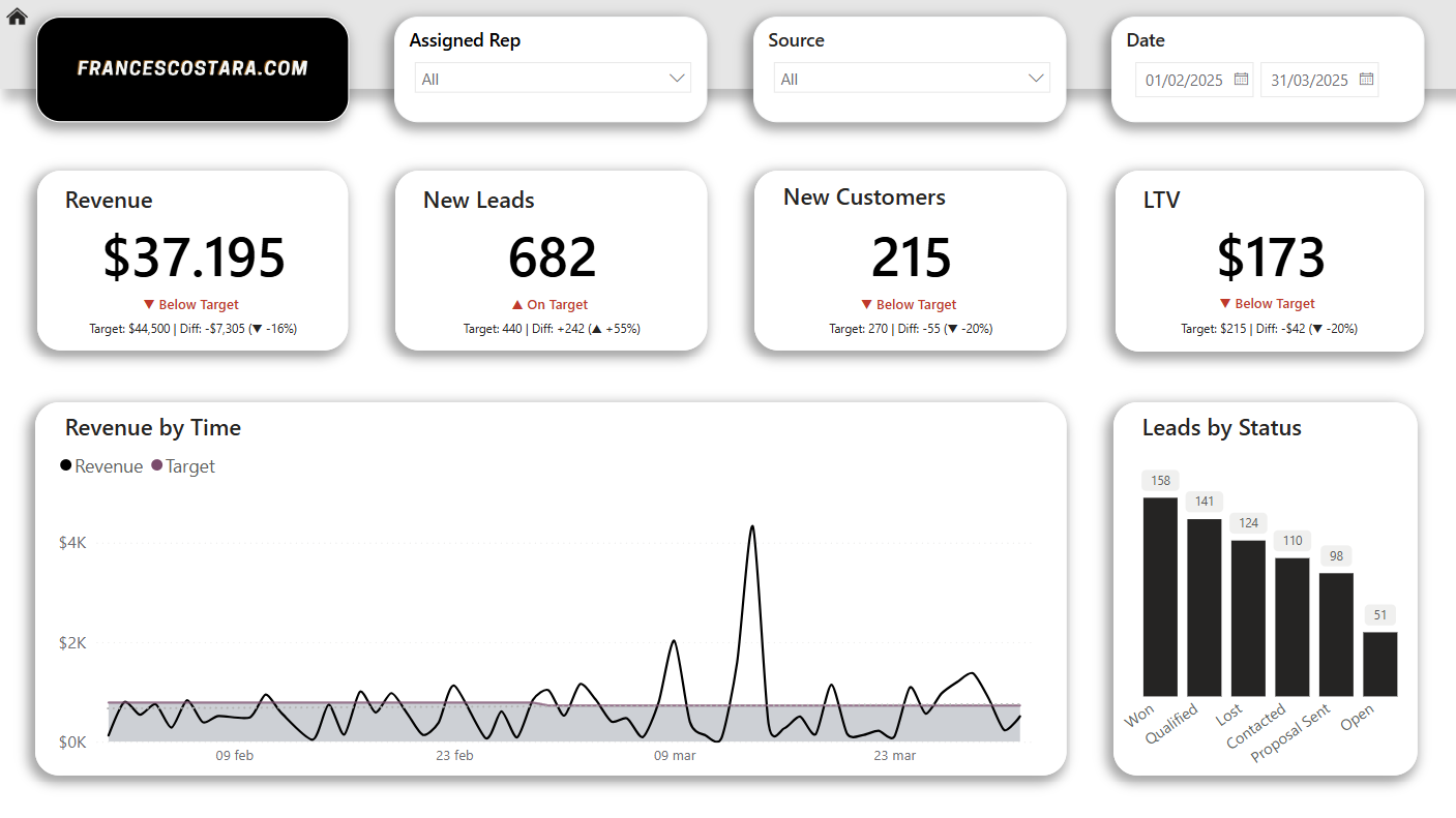
Executive Overview
This is the main decision-maker view. It includes:
- Total Revenue, Leads, Customers, LTV
- Status labels (with color coding)
- Performance commentary (e.g., “$7.3K below target, ▼ -16%”)
- Revenue trend over time
- Leads by Status breakdown
This page uses a lot of DAX language, if you want to have an understanding of how to create simple KPIs measure check my article: Mastering DAX for Advanced HR Analytics in Power BI.
The DAX used for creating the text under the KPIs is explained in the next sections of this article.
Month - Over - Month
This page compares the current month to the previous one across key KPIs:
- Revenue, Leads, Deals, CR
- Comparison trend charts
- Variations and arrows (↑ or ↓) for each metric
- Breakdown by sales rep
This page is built mainly with DAX measures.
Using as example Revenue, firstly I calculate the revenue per month:
Revenue per Month =
CALCULATE(
SUM(Fact_Payments[Amount]),
DATESMTD(Dim_Date[Date]))
After I calculated the revenue of the previous month:
Prev Month Revenue =
CALCULATE(
[Revenue per Month],
PARALLELPERIOD(Dim_Date[Date], -1, MONTH))
At this point I was able to create the variation between the current month selected and the previous month:
Revenue MoM % =
DIVIDE([Revenue per Month] - [Prev Month Revenue], [Prev Month Revenue])
I decided to create the card in a way that can give a clear understanding of the situation rapidly, showing the variation over month with a growing or decreasing sign and with a dynamic text that explain the variation in details.
For the label with the percentage of variation:
Revenue MoM Label =
VAR Diff = [Revenue MoM %]
RETURN
IF(
ISBLANK(Diff),
"–",
IF(
Diff > 0,
"▲ " & FORMAT(Diff, "0%"),
IF(
Diff < 0,
"▼ " & FORMAT(ABS(Diff), "0%"),
"–" )))
For the text under:
Revenue MoM Detail =
VAR Current1 = [Revenue per Month]
VAR Previous = [Prev Month Revenue]
VAR Diff = Current1 - Previous
VAR Sign = IF(Diff > 0, "+", IF(Diff < 0, "-", ""))
VAR MonthNow = FORMAT(MAX(Dim_Date[Date]), "mmm")
VAR MonthPrev = FORMAT(EDATE(MAX(Dim_Date[Date]), -1), "mmm")
RETURN
MonthPrev & ": $" & FORMAT(Previous, "#,0") & " | " &
MonthNow & ": $" & FORMAT(Current1, "#,0") &
" | Var: " & Sign & "$" & FORMAT(ABS(Diff), "#,0")

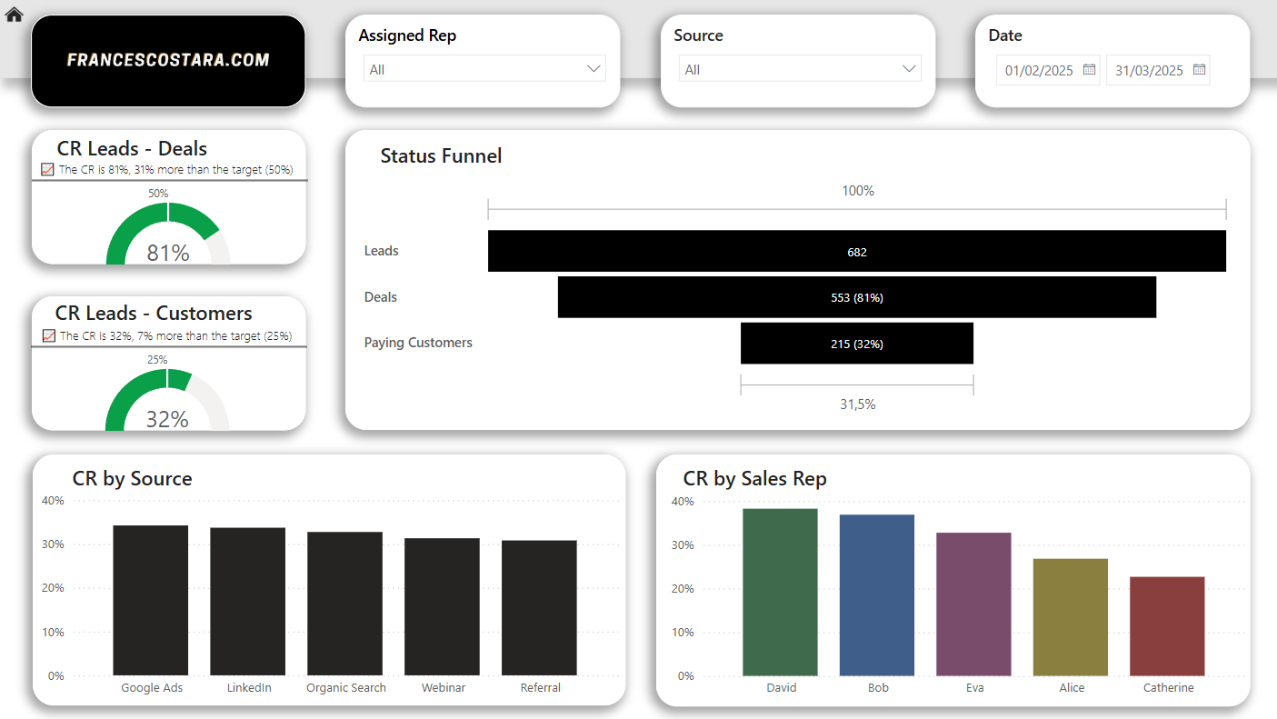
Funnel View
Here I visualized the full journey from Lead → Deal → Paying Customer with:
- A clean horizontal funnel
- Conversion rate gauges with live targets
- Label summaries showing “+7% above target”
- Conversion breakdown by source and rep
- All visuals are clickable and act as filters
Also this page is built using different DAX formulas, I calculated the conversion rate for source, reps and for different stages of the funnel, using the function DIVIDE, for example:
Conversion Rate by Source (%) = DIVIDE([Paying Customers per Source], [Leads per Source])
For the cards with the gauge graphs I used the same logic as for the MoM cards, developing a text that showcases the situation in details.
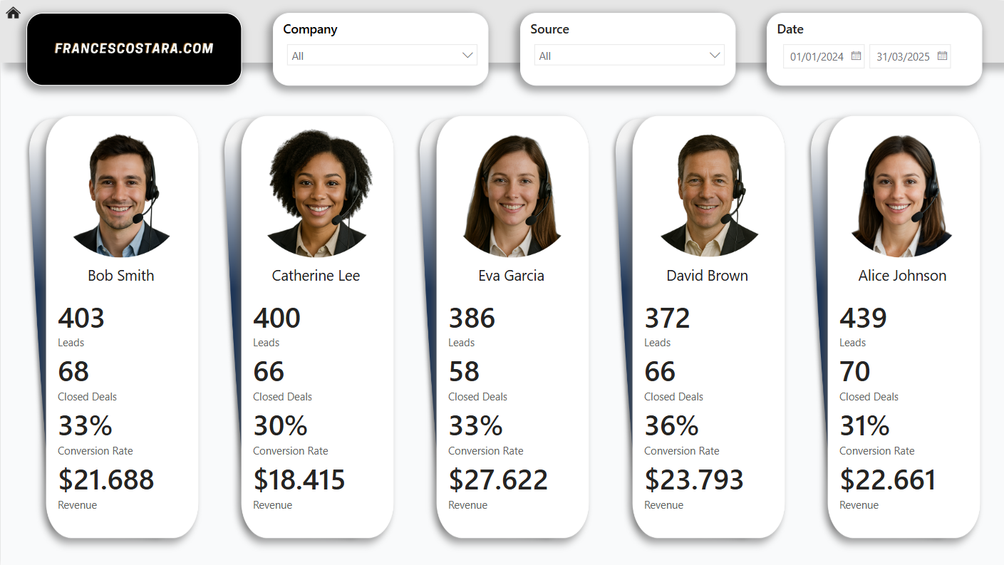
Sales Reps Details
A modern, card-style page with images and clean KPIs per rep:
- Leads handled
- Deals closed
- Conversion rate
- Revenue generated
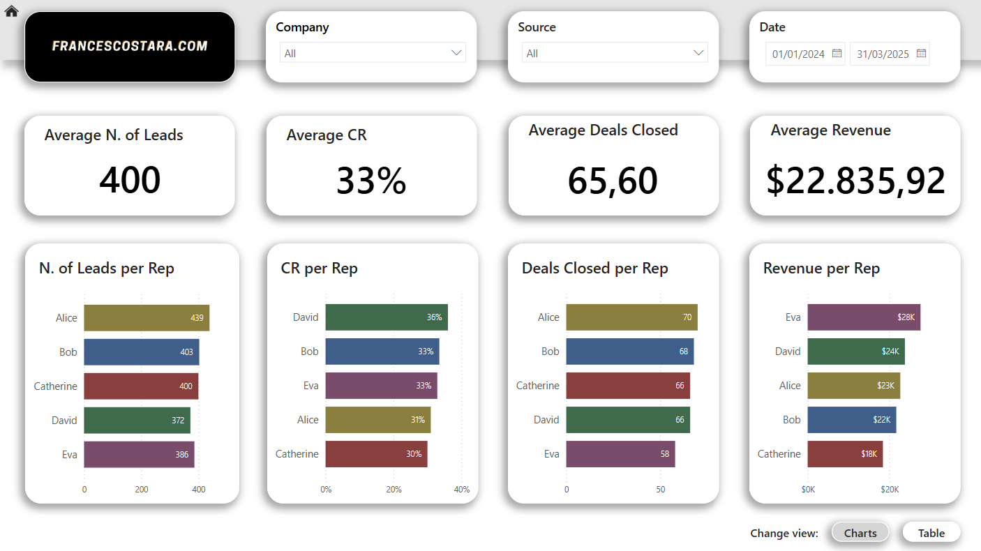
Sales Reps Insights
Compare reps on performance averages:
- Dynamic bar charts by lead, deal, CR, revenue
- Possibility to change the view with a table
Final Result
This once chaotic Google Sheet is now:
- A fully automated sales dashboard
- With KPIs, benchmarks, and clear commentary
- Connected to a model that supports any custom time range
- Providing daily insight without changing the original input process
How it was builtCome è stato costruito
One bridge key across three factsUna chiave ponte su tre tabelle dei fatti
Fact_Leads, Fact_Deals and Fact_Payments all carry Lead_ID, which is what makes the funnel measurable end to end: a lead that never converts and a lead that paid twice are both traceable through the same key. Conversion flags (Is_Won, Is_Paying, Has_Deal) are calculated in the model rather than stored in the sheets, so they cannot drift out of sync with the raw data.Fact_Leads, Fact_Deals e Fact_Payments portano tutte Lead_ID, ed è questo che rende il funnel misurabile da un capo all'altro: un lead che non converte mai e uno che ha pagato due volte sono entrambi tracciabili con la stessa chiave. I flag di conversione (Is_Won, Is_Paying, Has_Deal) sono calcolati nel modello invece che salvati nei fogli, così non possono disallinearsi dai dati grezzi.
One date table, three date rolesUna tabella data, tre ruoli
Each fact connects to Dim_Date through its own activity date — Created_Date for leads, Close_Date for deals, Payment_Date for payments. A single date selection therefore moves the whole funnel at once, instead of each stage needing its own filter.Ogni tabella dei fatti si collega a Dim_Date tramite la propria data di attività — Created_Date per i lead, Close_Date per le trattative, Payment_Date per i pagamenti. Una sola selezione di data muove quindi l'intero funnel, invece di richiedere un filtro per ciascuna fase.
Targets held outside the relationshipsTarget tenuti fuori dalle relazioni
Monthly goals (revenue, leads, paying customers, LTV, and the two conversion rates) live in a disconnected Targets table read through lookup logic rather than a physical relationship. Targets are set at month grain while the facts sit at per-lead, per-deal and per-payment grain, so keeping them unrelated avoids the target value being fanned out across every underlying row.Gli obiettivi mensili (ricavi, lead, clienti paganti, LTV e i due tassi di conversione) vivono in una tabella Target scollegata, letta con logica di lookup invece che con una relazione fisica. I target sono a granularità mensile mentre i fatti sono per lead, per trattativa e per pagamento: tenerli scollegati evita che il valore del target si moltiplichi su ogni riga sottostante.
The source system stayed where it wasIl sistema di partenza è rimasto dov'era
The team kept entering leads, deals and payments in the same Google Sheets throughout. The restructuring happened in Power Query underneath them — repeated action columns collapsed into single status fields, types enforced, keys established — so adoption required no change of habit, which is usually what kills this kind of migration.Il team ha continuato a inserire lead, trattative e pagamenti negli stessi Google Sheets. La ristrutturazione è avvenuta in Power Query, sotto di loro — colonne di azione ripetute compresse in singoli campi di stato, tipi forzati, chiavi definite — così l'adozione non ha richiesto alcun cambio di abitudini, che è di solito ciò che fa fallire questo tipo di migrazione.
Want to talk about work like this?
BI Developer & Data Analyst, based in Italy and working remotely. Open to roles and freelance projects.
Vuoi parlare di un lavoro come questo?
BI Developer e Data Analyst, con base in Italia e operativo da remoto. Disponibile per assunzione e progetti freelance.