Turning Everyday Chaos into Clarity
Most transport companies have data everywhere.
Spreadsheets, invoices on the office desktop.
Notes in WhatsApp.
Toll receipts sitting on the passenger seat.
GPS and fuel data stuck in separate apps.
(That’s where data integration matters, connecting what you already track into one clear picture).
Everyone sort of knows what’s happening, until something goes wrong.
Fuel costs rise, a route stops making money, or someone asks:
“Why did profit drop this month?”
And suddenly, no one has a clear answer.
That’s when you realize: it’s not that you don’t have data.
You just don’t have it in one place.
An operational report fixes that.
It connects what you already track (deliveries, fuel, leasing, driver pay, tolls) and turns it into something you can actually read and act on.
No new systems. No more guessing. Just your numbers, organized properly.
That’s what I specialize in: building connected reports that let you track every truck, route, and cost in real time.
Two articles if you want to see examples of how I merge data from different systems step by step:
1) Build a Sales System That Works While You Sleep (Free Google Sheets + Zapier Flows Included)
2) B2B SaaS Sales Ops: Automated Lead-to-Customer Tracking for 5 Reps and €950K ARR
Contents
What It Really Does
It’s not a fancy dashboard full of colors.
It’s a simple way to understand what’s working and what isn’t.
- Which routes actually bring profit, and which just keep trucks busy?
- How much does one kilometer really cost?
- Who are the most efficient drivers?
- Which clients bring in revenue but kill your margin?
All those questions now have clear answers.
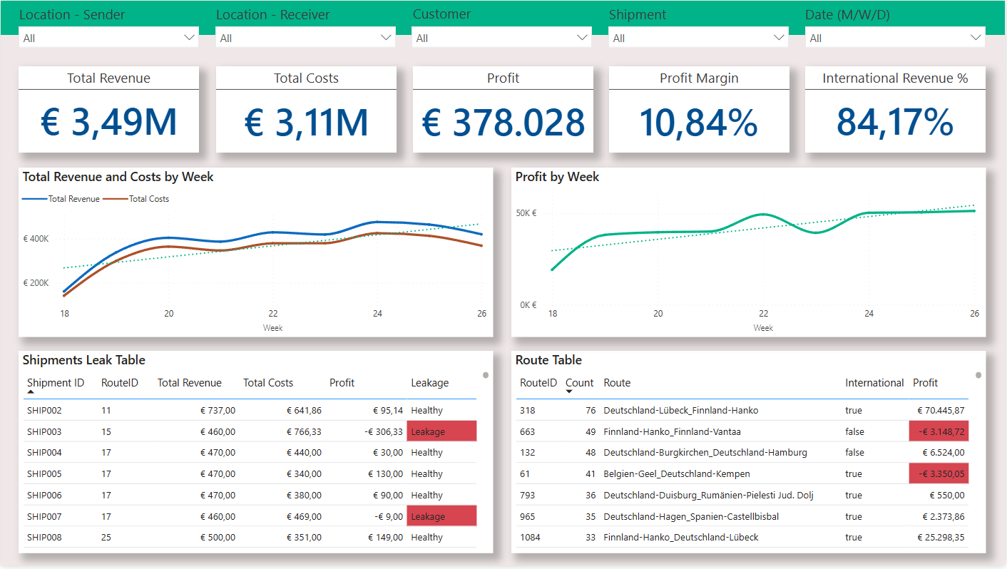
Inside the Report
Here’s what you could actually see once everything is connected (fully customizable for your transport company).
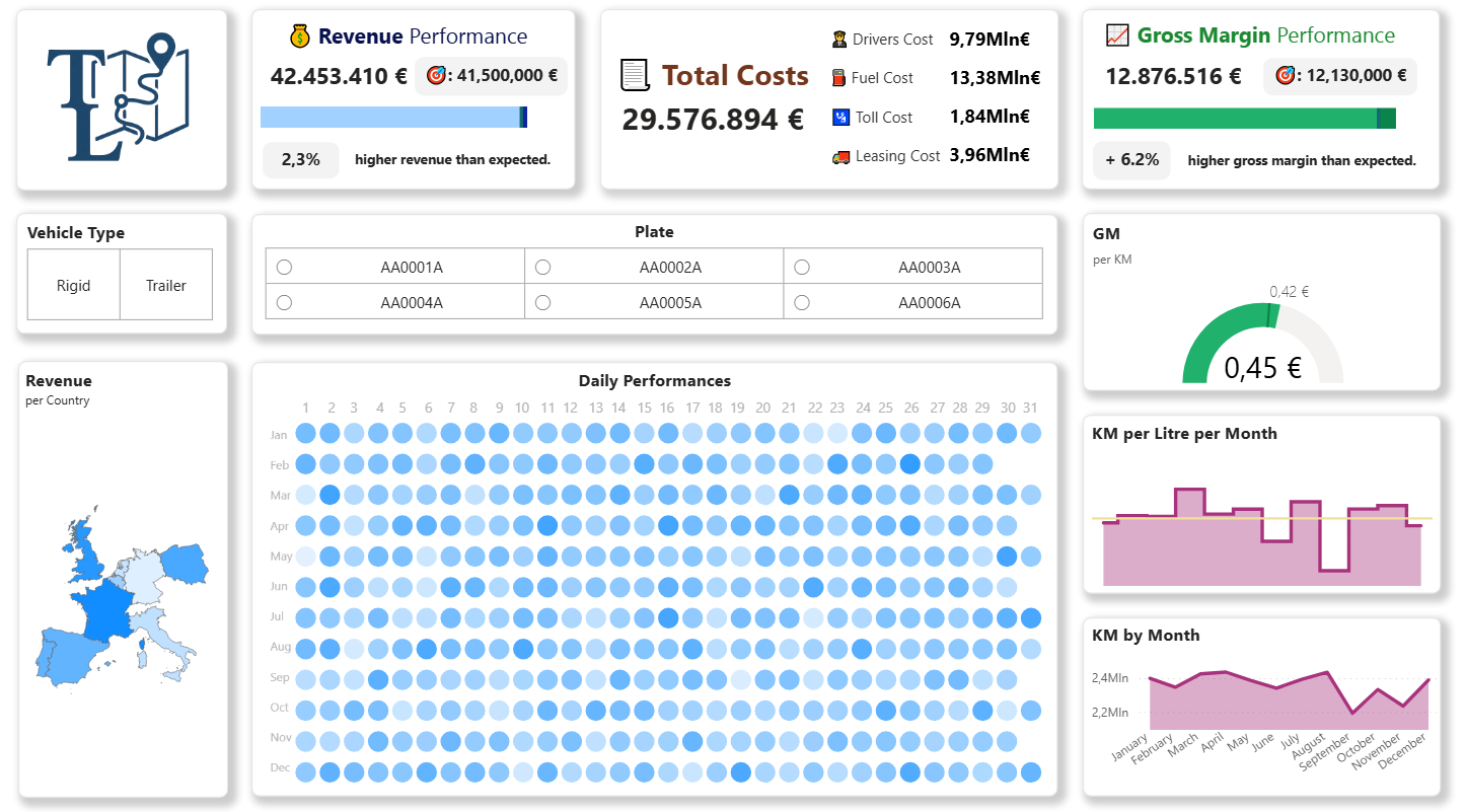
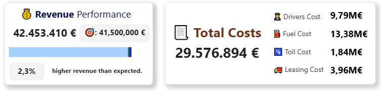
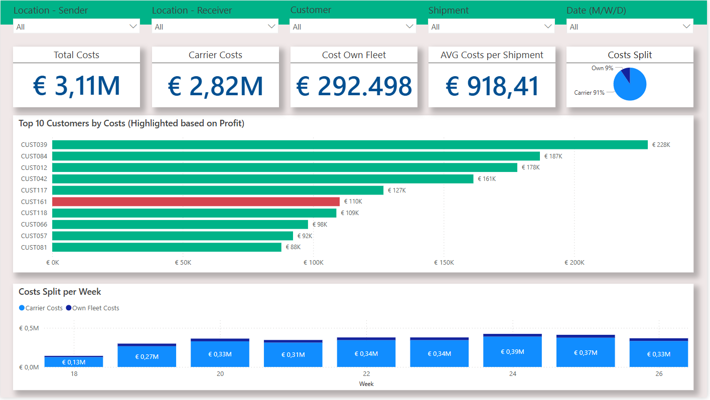
Revenue and Costs, Side by Side
See exactly how much money comes in, and where it goes.
Fuel, tolls, leasing, drivers are all broken down clearly.
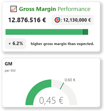
Gross Margin Performance
You see how much profit each vehicle, country or driver really brings after fuel, tolls, and driver costs.
You can compare your actual margin vs. target, see where you’re overperforming, and where you’re falling behind.
The metric Gross Margin per KM is what separates a profitable operation from one that just moves trucks around.
It’s the real measure of efficiency: how much you earn from every single kilometer.
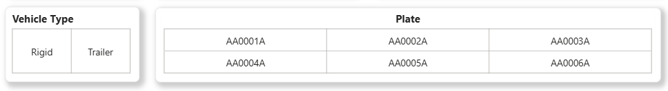
Type of Vehicles and Single Vehicles
You can filter and rank vehicles by distance, revenue, and margin.
You’ll see which one consistently drives efficiently and which one burns too much fuel.
Same for the drivers, which ones make money and which ones just drives.
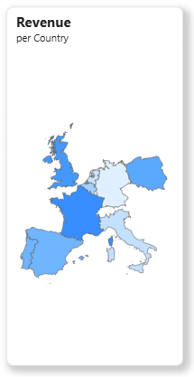
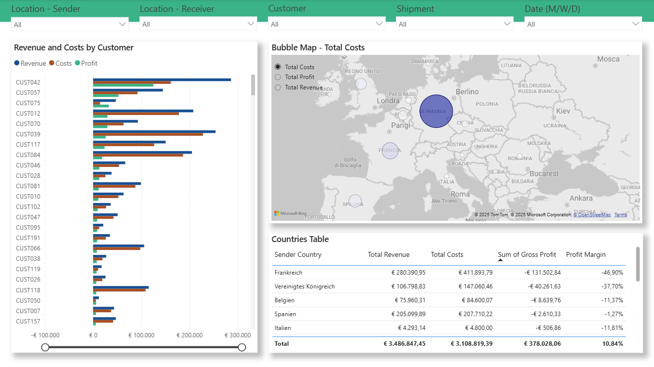
Countries
A simple map shows where you’re earning and where you’re not.
No more relying on memory or routine.
When you see it in black and white, the decisions get easier.
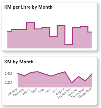
Kilometers and Efficiency
Kilometers per Litre by Month, Kilometers driven by Month (and much more possible: Total kilometers driven, cost per kilometer, margin per kilometer, etc.).
Everything that tells you how the business is really performing.
It’s the part where “we already track this in Excel” usually falls apart, because in Excel, those numbers never line up perfectly.
These are all dynamic metrics I build directly in Power BI.
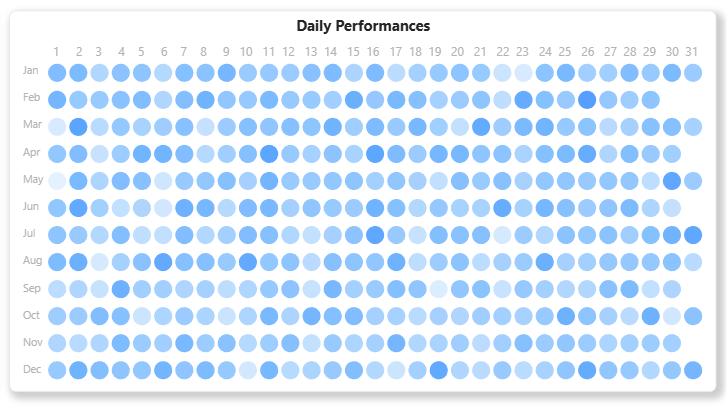
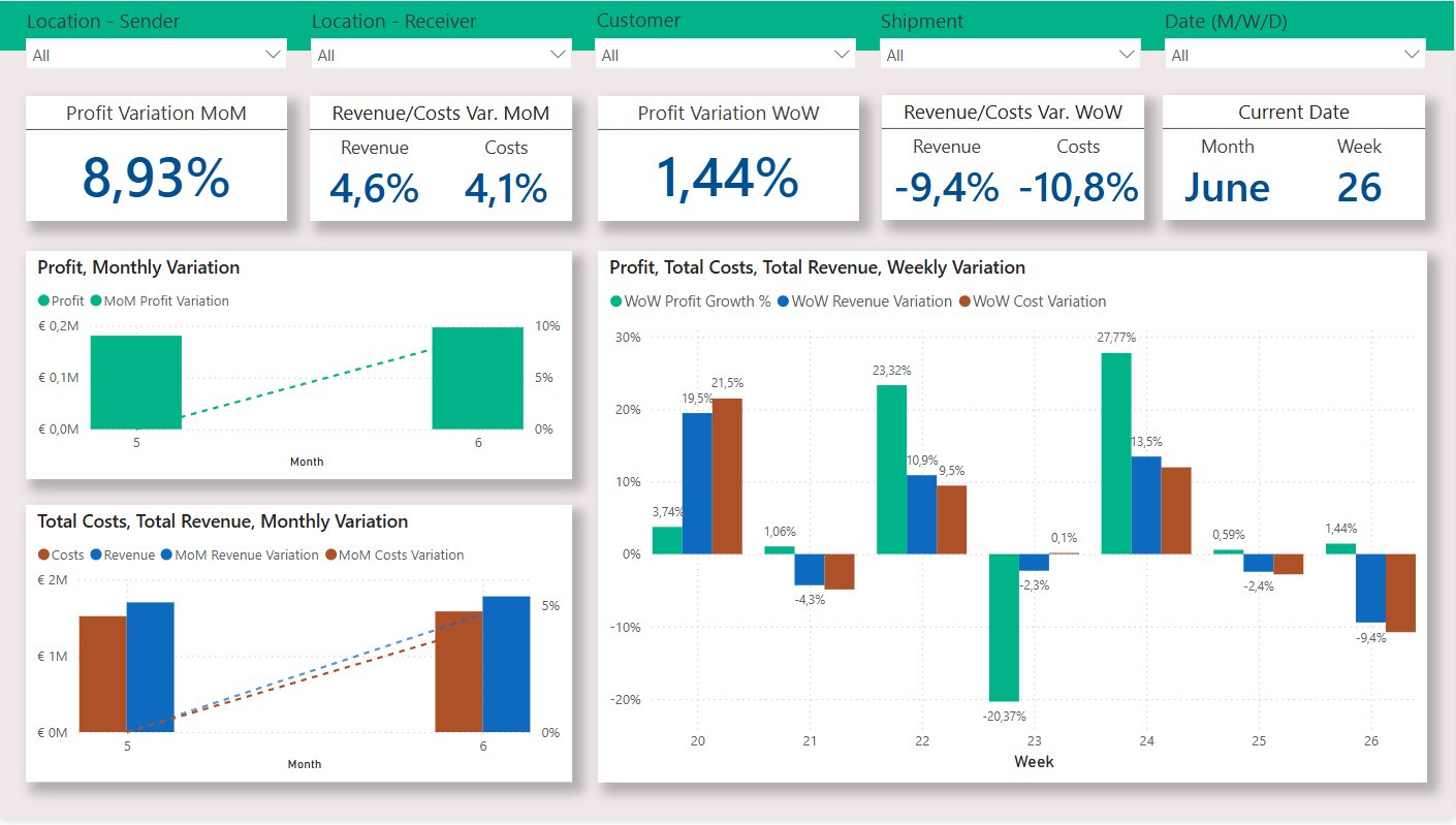
Daily Performance
One of the biggest pains for transport managers is timing.
Monthly reports come too late and the problems have already happened.
That’s why the report also includes daily performance tracking.
You see every day’s revenue, kilometers, and margin trend.
You can tell if something’s off immediately before it snowballs into a monthly loss.
…And More
This report is only a fraction of the potential of Business Intelligence for Logistics.
If you want to see how I analysed routes, shipments, monthly/weekly trends and customers and discovered a €131K Loss for a German company, click here: The Hidden €131K Loss: A European Logistics Company’s Data Analysis Story
Why It Actually Helps
Because most transport owners don’t need another app.
They just want control.
They want to know, right now, if things are going well or not.
This report gives you that, it doesn’t change how you work, it shows you where you stand.
Confusion turns into clarity, and “I think” becomes “I know.”
You can finally make decisions based on real numbers and live KPIs, not assumptions.
You’ll also save hours of chasing data.
Across countries, vehicles, and drivers, you’ll see exactly where cash leaks out.
And when it’s time to act, you’ll make quick, confident calls, whether it’s dropping a client, adjusting prices, or rewarding a driver who does things right.
Most people tell me:
“We already have all this in Excel.”
Sure, but how long does it take to update it?
How many versions exist?
And how often do you actually open it?
Or they say:
“We don’t have time for something new.”
That’s exactly why this works, it updates itself.
Once it’s set up, you just open it and see the latest numbers.
Conclusion
You don’t need to be a big logistics group to get value out of data.
Even with ten trucks, it’s enough to know exactly what makes money and what doesn’t.
This operational report gives you control.
And in this business, that’s what separates companies that survive from those that guess.
Want to see it with your own data?
I can show you how one small operator found €131,000 in hidden costs, simply by seeing all routes, drivers, and margins in one clean dashboard.
No theory. Just real numbers, finally clear.