
This is the first part of a 3 parts project, you can find the full project here.
Building a robust data model is the foundation of effective analytics. In this step-by-step guide, we’ll use the IBM HR Analytics dataset (found on kaggle.com) to create a star schema that simplifies data analysis and reporting. This is the first article in a three-part series designed to understand more about Power BI functionalities, from data preparation to advanced calculations and interactive dashboards.
In another article I explained how to find the best datasets for practicing and build a good BI portfolio: Finding The Best Dataset For Data Analytics Practice And Portfolio.
In this article, we’ll focus on:
- Cleaning and preparing the data for analysis.
- Structuring the model into a star schema for optimized performance.
The next steps in this series will cover:
- Part 2: Writing and utilizing DAX formulas to calculate key metrics like attrition rates and satisfaction trends.
- Part 3: Creating an interactive and visually compelling dashboard in Power BI.
Contents
Understanding the Dataset and Why Use Power BI for Data Modeling
For this project, we’re using the IBM HR Analytics Attrition Dataset, which includes employee data such as demographics, job roles, satisfaction levels, and attrition status. This dataset is clean, with no missing values or duplicates, making it ideal for learning how to build a Power BI data model.
Why Power BI?
We’re using Power BI for this entire project because:
- Seamless Workflow: Power BI allows us to handle all steps, from data preparation to visualization, without the need of switching tools.
- Performance Optimization: Its in-memory engine ensures fast query performance, even for complex models.
- User-Friendly Interface: Power BI simplifies tasks like creating relationships, adding calculated columns, and building interactive dashboards.
- Scalability: The model-first approach in Power BI makes it easy to add new dimensions or metrics as the analysis evolves.
This project is a perfect introduction to Power BI data modeling capabilities.
Preparing the Data for a Power BI Data Model
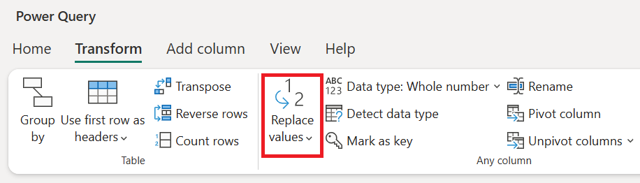
Renaming Values for Readability
The dataset uses numerical codes to represent categories, such as:
- Education: Values range from 1 (Below College) to 5 (Doctor).
- Satisfaction Levels: Ratings range from 1 (Low) to 4 (Very High).
These categories were provided in the dataset’s documentation. To improve readability, I replaced the numerical codes with descriptive text using the Replace Values function in Power Query.
For example, 1 in the Education column was replaced with “Below College.”
Alternative Approach: Instead of directly replacing values, we could also create lookup tables to map numbers to text. This approach offers:
- Flexibility: Changes can be made in the lookup table without editing the dataset.
- Reusability: Lookup tables can be used across multiple datasets or projects.
I chose direct renaming for simplicity in this project.
Removing Duplicates
The dataset was already clean, with no duplicate rows, making it ready for modeling without additional cleansing.
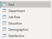
Creating Dimension Tables in Power BI
To build the model, I normalized the data by splitting it into dimension tables. This approach improves performance, simplifies the fact table, and makes the model easier to scale.
Job Role and Department Tables
I created separate dimension tables for JobRole and Department. These tables are frequently used for filtering and grouping data in analyses.
How I Created These Tables:
- Duplicated the dataset in Power Query.
- Kept only the JobRole or Department column.
- Added numeric keys using Add Column > Index Column (from 1).
- Renamed the resulting tables to Job Role and Department.
Why Normalize These Columns?
- Reduces Redundancy: Removes repeated text in the fact table.
- Improves Performance: Numeric keys are faster for Power BI to process.
- Future Scalability: If new job roles or departments are added, they can be included in the lookup table without altering the fact table.
Demographics, Education, and Satisfaction Tables
These three tables differ from Job Role and Department because they focus on employee-specific details. Each table includes the EmployeeNumber as a key to connect to the fact table.
- Demographics Table: Contains personal attributes like Age, Gender, MaritalStatus, and Over18.
- Education Table: Groups educational attributes (Education and EducationField).
- Satisfaction Table: Includes satisfaction-related metrics (JobSatisfaction, EnvironmentSatisfaction, RelationshipSatisfaction, and WorkLifeBalance).
How I Created These Tables:
- Duplicated the dataset for each table in Power Query.
- Kept the relevant columns, including EmployeeNumber.
- Removed duplicates to ensure one record per employee.
- Renamed the tables to Demographics, Education, and Satisfaction.
Why Group These Columns?
- Demographics: Groups sensitive personal attributes for easier management and privacy control.
- Education: Consolidates education-related fields for better logical organization.
- Satisfaction: Provides a focused view of employee satisfaction metrics, making analysis more intuitive.
Conceptual and Logical Data Modeling: Laying the Foundation
Before transitioning to the physical data model in Power BI, it’s crucial to briefly revisit the conceptual and logical data modeling stages, as described in my Data Modeling Guide. These early phases help ensure that the physical model is aligned with the business goals and data relationships.
Conceptual Data Modeling
The conceptual model defines what data needs to be captured and its overall purpose without getting into technical details. For this project:
- The key focus is to analyze employee attrition and satisfaction trends.
- High-level entities identified include:
- Employees: Represented through demographics, education, and satisfaction levels.
- Organizational Structures: Includes departments and job roles.
- Metrics: Employee-related measures such as income and attrition status.
This stage ensures we’re clear on the primary entities and their relationships without worrying about implementation.
Logical Data Model
The logical model bridges the gap between conceptual design and the physical implementation in Power BI. It defines the attributes and relationships of each entity:
- Attributes like Age, Education, and JobRole are grouped into logical categories.
- Relationships are established, such as:
- Employees belong to departments and job roles.
- Employees have demographic attributes and satisfaction metrics.
The logical model helped shape the dimension tables and ensure the model structure aligns with the business context. For example:
- Employee-specific attributes like demographics are grouped in one table for clarity and privacy management.
- Repeated organizational attributes, like job roles and departments, are separated into lookup tables for efficiency.

By addressing the what (conceptual model) and the how (logical model), we created a clear roadmap for the next step: building the physical data model in Power BI.
Structuring the Physical Data Model: A Star Schema
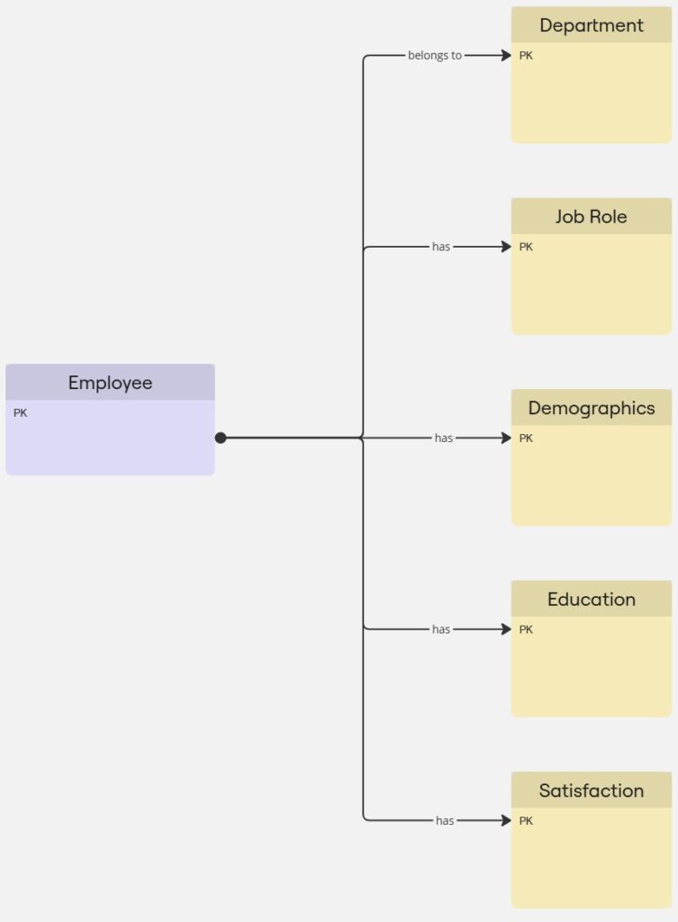
After creating the dimension tables, I structured the data model into a star schema, which is ideal for analytics.
Fact Table
The fact table contains:
- Key metrics like Income (Monthly), DistanceFromHome, and Attrition.
- Foreign keys linking to dimension tables (JobID, DepartmentID, and EmployeeNumber).
Relationships in the Model
- One-to-Many Relationships:
- The Job Role and Department tables are linked to the fact table via JobID and DepartmentID.
- These relationships allow us to analyze employees by role or department without duplicating data.
- One-to-One Relationships:
- The Demographics, Education, and Satisfaction tables connect to the fact table via EmployeeNumber.
- These relationships ensure that each employee’s personal details, education, and satisfaction metrics are tied to a single record.

Why Use a Star Schema?
A star schema is the best choice for Power BI data modeling because:
- Optimized Queries: Queries are faster and easier to understand due to fewer joins.
- Simplified Structure: Clearly separates facts (measurable metrics) from dimensions (descriptive attributes).
- Scalability: New attributes or tables can be added with minimal disruption to the existing model.
Final Thoughts and Next Steps
This concludes the first step of our project: cleaning and preparing the data, normalizing it into logical groups, and designing a star schema in Power BI. This structure is optimized for performance, scalability, and ease of analysis. If you want to have more information about data modeling in general, visit my Data Modeling Guide.
In the next step of the project, we’ll explore DAX (Data Analysis Expressions) to calculate key metrics like attrition rates and satisfaction averages. These insights will form the basis of dynamic visualizations, which we’ll build in the final article.