
In this project with healthcare data, I will explore deeply into the health of Pima Indian women.
Using Python, I first cleaned and explored the data. After, I used statistical methods and data visualization techniques to reveal hidden patterns, correlations, and insights within the data. This analysis cleared the path for predictive modeling. So, with machine learning, I took on the role of a predictor, trying to forecast possible diabetes diagnoses.
This notebook dives into The Pima Indian Diabetes Dataset.
Originally from the National Institute of Diabetes and Digestive and Kidney Diseases, contains information of 768 women from a population near Phoenix, Arizona, USA.
The database is available here: Link to Kaggle.
My objective is to organize the dataset through an exploratory data analysis (EDA), visualize the cleaned data and understand the statistical distribution, and creating a model to predict the diabetes for a new person, outside original data.
Contents
Exploratory Data Analysis and Machine Learning (Python)
We will use the following Python libraries:
1. Importing and Overview of the Dataset
We start by importing the necessary Python libraries and loading the dataset. The data is read into a pandas DataFrame, a two-dimensional tabular data structure with labeled axes, which is a common structure for statistical data.
import pandas as pd
import numpy as np
import matplotlib.pyplot as plt
import seaborn as sns

# Load the data
diabetes_data = pd.read_csv(r'C:\Users\Francesco\Desktop\Data Project\DIABETE\diabetes.csv')
diabetes_data.shape
diabetes_data.head()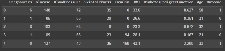
The dataset comprises 768 rows and 9 columns.
The available columns are: Pregnancies, Glucose, BloodPressure, SkinThickness, Insulin, BMI, DiabetesPedigreeFunction, Age, and Outcome.
2. Preliminary Data Exploration
# Check for missing values in the dataset
missing_values = diabetes_data.isnull().sum()
print("\nMissing values for each column:")
print(missing_values)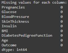
# Generate summary statistics for the dataset
summary_stats = diabetes_data.describe()
print("\nSummary statistics for the dataset:")
print(summary_stats)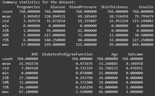
We don’t have columns missing values.
But we have identified unrealistic zero values in Glucose, BloodPressure, SkinThickness, Insulin, and BMI.
# Plot histograms for each column in the dataset BEFORE data cleaning
plt.figure(figsize=(20, 12))
for i, column in enumerate(diabetes_data.columns, 1):
    plt.subplot(3, 3, i)
    sns.histplot(diabetes_data[column], kde=True, bins=30)
plt.tight_layout()
plt.title("Data distributions BEFORE cleaning")
plt.show()

# Identify columns with unrealistic zero values
columns_with_zeros = ['Glucose', 'BloodPressure', 'SkinThickness', 'Insulin', 'BMI']

for column in columns_with_zeros:
    count_zeros = (diabetes_data[column] == 0).sum()
    print(f"Number of zero entries in {column}: {count_zeros}")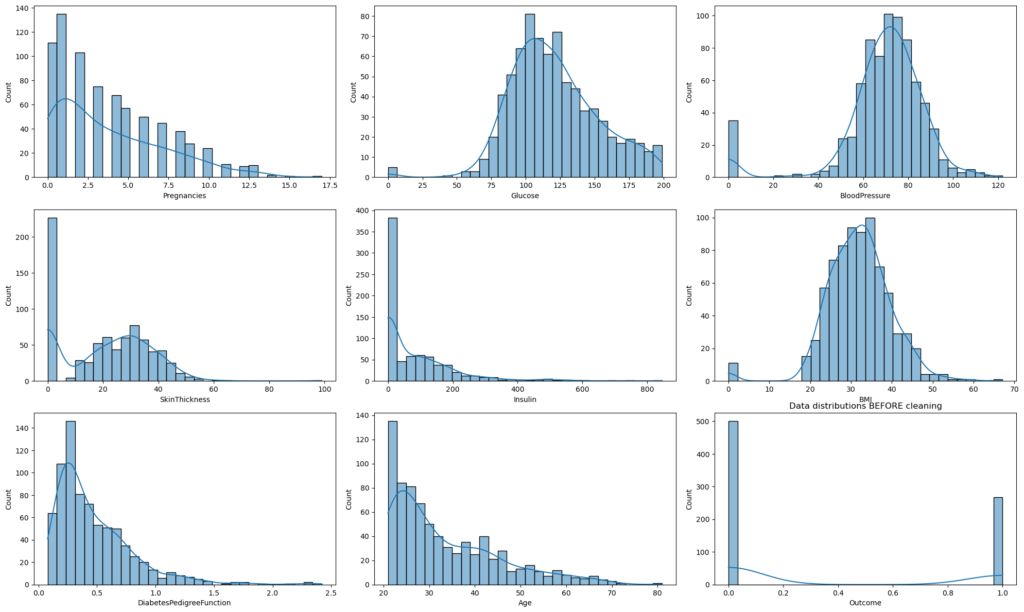
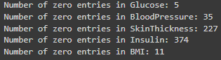
Identified unrealistic zero values in certain columns that should naturally not have a zero. (biologically implausible (e.g., blood pressure of zero)).
3. Data Cleaning & Preprocessing
# Replace zero values with NaN for the identified columns
for column in columns_with_zeros:
    diabetes_data[column].replace(0, np.nan, inplace=True)

# Impute NaN values with the median of the respective columns
for column in columns_with_zeros:
    diabetes_data[column].fillna(diabetes_data[column].median(), inplace=True)

print("\nData after cleaning and preprocessing:")
print(diabetes_data.head())
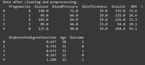
I decided to replace the zero values with the median of the respective columns.
Using the median for imputation is less sensitive to outliers than the mean.
4. Exploratory Data Analysis (EDA)
# Plot histograms for each column in the dataset AFTER Data Cleaning
plt.figure(figsize=(20, 12))
for i, column in enumerate(diabetes_data.columns, 1):
    plt.subplot(3, 3, i)
    sns.histplot(diabetes_data[column], kde=True, bins=30)
plt.tight_layout()
plt.show()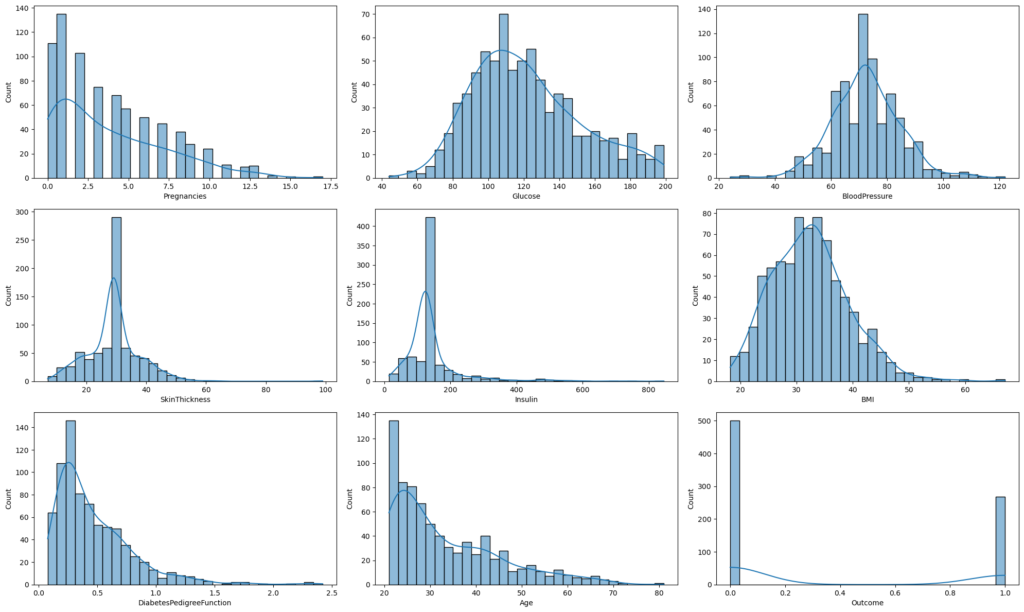
Histograms displayed for each feature to understand data distributions after replacing 0 values.
5. Statistics and Data Visualization
# Boxplots for Each Feature (Excluding 'Outcome')
# ------------------------------------
plt.figure(figsize=(20, 15))

# Exclude 'Outcome' from the columns list
features_for_boxplot = diabetes_data.columns[:-1]

# Plotting boxplots for the selected features
for i, column in enumerate(features_for_boxplot, 1):
    plt.subplot(3, 3, i)
    sns.boxplot(y=diabetes_data[column])
    plt.title(f"Boxplot of {column}")

plt.tight_layout()
plt.show()
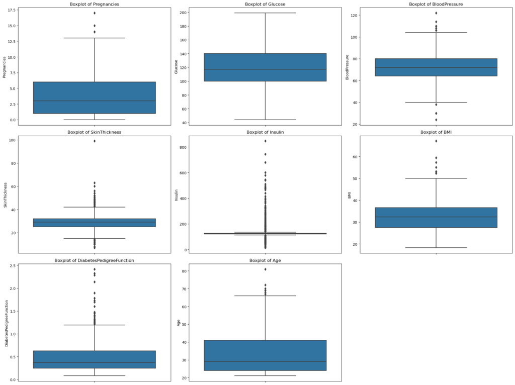
Pregnancies: Most of the data is clustered around the lower values, suggesting that a majority of the women in the dataset have fewer pregnancies. The outliers on the upper end indicate some women with a higher number of pregnancies than typical.
Glucose: The data distribution is fairly symmetric, centered around the median. There aren’t any noticeable outliers, indicating that glucose levels in the dataset are mostly within a typical range.
BloodPressure: The distribution is again reasonably symmetric. There are a few outliers on both the lower and upper ends, suggesting some instances of unusually low or high blood pressure.
SkinThickness: The majority of the data is concentrated in a particular range, but there are some noticeable outliers on the upper end. This suggests that while most women have skin thickness measurements within a typical range, some instances are unusually high.
Insulin: Most of the data is clustered towards the lower end, with several outliers on the higher side. This indicates that while many women in the dataset have lower insulin levels, there are also some with significantly elevated levels.
BMI: The data distribution appears fairly symmetric around the median. However, there are outliers on the upper end, suggesting some instances of very high BMI.
DiabetesPedigreeFunction: Most of the data is towards the lower range, but there are several outliers on the upper end. This indicates that while most women have a lower diabetes pedigree function score, some have a significantly higher score, possibly suggesting a stronger genetic disposition.
Age: The majority of the women in the dataset appear to be on the younger side, as indicated by the data clustering towards the lower range. There are outliers on the higher end, indicating the presence of older individuals in the dataset.
# Correlation Heatmap

correlation_matrix = diabetes_data.corr()

plt.figure(figsize=(12, 9))
sns.heatmap(correlation_matrix, annot=True, cmap='coolwarm', linewidths=0.5, fmt=".2f")
plt.title("Correlation Heatmap")
plt.show()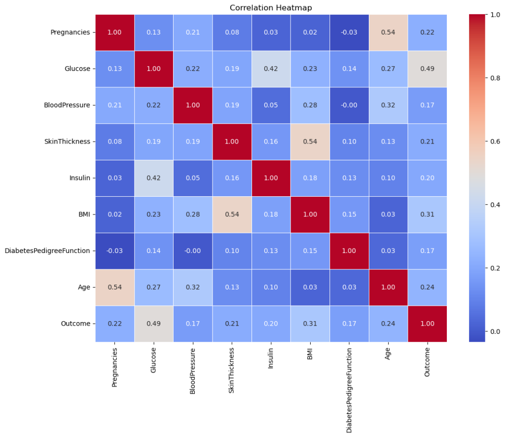
Glucose & Outcome: There’s a moderate correlation of 0.47, suggesting that glucose levels have a noticeable relationship with the diabetes outcome.
Age & Pregnancies: There’s a moderate correlation of 0.54, indicating that as age increases, the number of pregnancies tends to increase as well.
BMI & SkinThickness: There’s a moderate correlation of 0.39, suggesting a relationship between body mass index and skin fold thickness.
Most other correlations are relatively low, suggesting limited linear relationships between them. However, remember that correlation doesn’t imply causation, and non-linear relationships won’t be captured well by this metric.
I will now focus on the relation between Glucose & Outcome, discovered in our correlation analysis.
# Distribution of Glucose Levels based on Diabetes Outcome
plt.figure(figsize=(10, 6))
sns.kdeplot(data=diabetes_data, x='Glucose', hue='Outcome', fill=True, common_norm=False, palette="coolwarm")
plt.title('Distribution of Glucose Levels by Diabetes Outcome')
plt.xlabel('Glucose Levels')
plt.ylabel('Density')
plt.legend(title='Diabetes Outcome', labels=['Diabetes', 'No Diabetes'])
plt.show()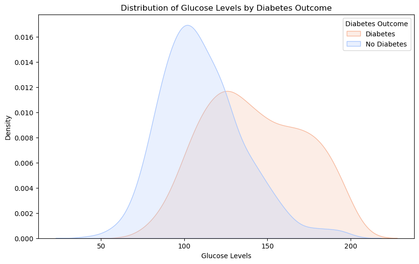
With Diabetes (Red): Individuals with diabetes often have glucose levels centered around 140-150.
Without Diabetes (Blue): Those without diabetes typically have glucose levels around 100-110.
Overlap: There’s an overlapping region, showing that while glucose is indicative, it’s not the sole marker for diabetes. Some with elevated glucose might be prediabetic or have other conditions.
6. Model selection and split
# Import necessary libraries for model building
from sklearn.model_selection import train_test_split
from sklearn.ensemble import RandomForestClassifier

# Separate features and target variable from the dataset
X = diabetes_data.drop('Outcome', axis=1)
y = diabetes_data['Outcome']

# Split the data into training and testing sets
X_train, X_test, y_train, y_test = train_test_split(X, y, test_size=0.2, random_state=42)

# Initialize the Random Forest classifier
rf_model = RandomForestClassifier(n_estimators=100, random_state=42)

# Train the classifier using the training data
rf_model.fit(X_train, y_train)
I Chose the Random Forest classifier, a robust learning method known for its high accuracy and ability to handle large datasets.
Split the data into training and test sets (80-20), and trained the model.
7. Prediction
# Define sample data for a young woman and an older man
young_woman = [[1, 90, 70, 25, 80, 22, 0.3, 25]]
older_man = [[0, 140, 85, 30, 130, 30, 0.5, 60]]

# Use the trained model to make predictions for the samples
young_woman_prediction = rf_model.predict(young_woman)
older_man_prediction = rf_model.predict(older_man)

# Display the predictions
print("\nSample Predictions:")
print("Prediction for young woman:", "Diabetic" if young_woman_prediction[0] == 1 else "Non-diabetic")
print("Prediction for older woman:", "Diabetic" if older_man_prediction[0] == 1 else "Non-diabetic")
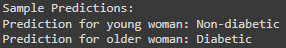
Made predictions for two hypothetical individuals: a young woman who eats well and goes to the gym, and an older overweight woman.
As we can see the Young Woman is Predicted as non-diabetic, the Older Woman is Predicted as diabetic.
8. Model Evaluation
# Import necessary libraries for model evaluation
from sklearn.metrics import accuracy_score, precision_score, recall_score, roc_auc_score

# Make predictions on the test set using the trained classifier
rf_predictions = rf_model.predict(X_test)

# Display performance metrics for the predictions
print("\nRandom Forest Model Performance Metrics:")
print("Accuracy:", accuracy_score(y_test, rf_predictions))
print("Precision:", precision_score(y_test, rf_predictions))
print("Recall:", recall_score(y_test, rf_predictions))
print("AUC-ROC:", roc_auc_score(y_test, rf_predictions))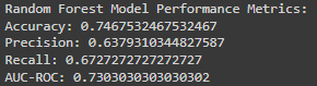
The model’s accuracy is 74.7%, meaning it makes correct predictions about three-quarters of the time.
While this is a decent rate, aiming for higher accuracy is always beneficial, especially in medical applications.
# ------------------------------------
# Visualize Confusion Matrix for Random Forest Model
# ------------------------------------
from sklearn.metrics import confusion_matrix

# Generate the confusion matrix
conf_matrix = confusion_matrix(y_test, rf_predictions)

# Visualize the confusion matrix using a heatmap
plt.figure(figsize=(8, 6))
sns.heatmap(conf_matrix, annot=True, cmap='Blues', fmt='g')
plt.xlabel('Predicted')
plt.ylabel('Actual')
plt.title('Confusion Matrix for Random Forest Model')
plt.show()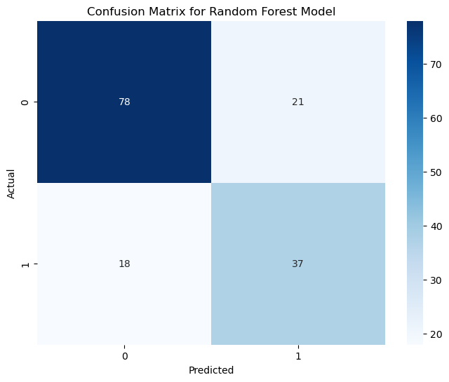
The Random Forest model’s performance on the test data is summarized as follows:
True Negatives (78): The model correctly confirmed that 78 individuals did not have diabetes. This means it’s doing a great job in many cases.
True Positives (37): It rightly identified 37 individuals with diabetes, showcasing its potential in catching actual cases.
False Positives (21): In 21 cases, the model was overly cautious and predicted diabetes when there wasn’t any. It’s always better to be safe, but we can fine-tune this further.
False Negatives (18): It missed 18 cases where diabetes was present. It’s a reminder that there’s room to make the model even better.