
This project presents an exploratory data analysis (EDA) and an interactive dashboard idea centered around a unique dataset from five different vending machines scattered between four various strategic locations in Central New Jersey, USA. The dataset originates from vending machines owned and operated by the publisher of the public available dataset, available here.
These machines are strategically located in places with varying foot traffic and consumer demographics:
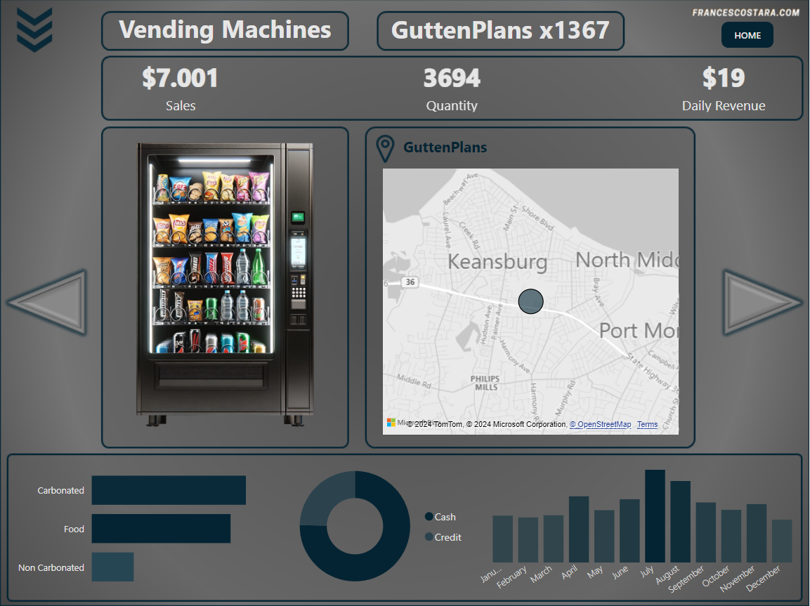
– GuttenPlans, a frozen dough specialist company.
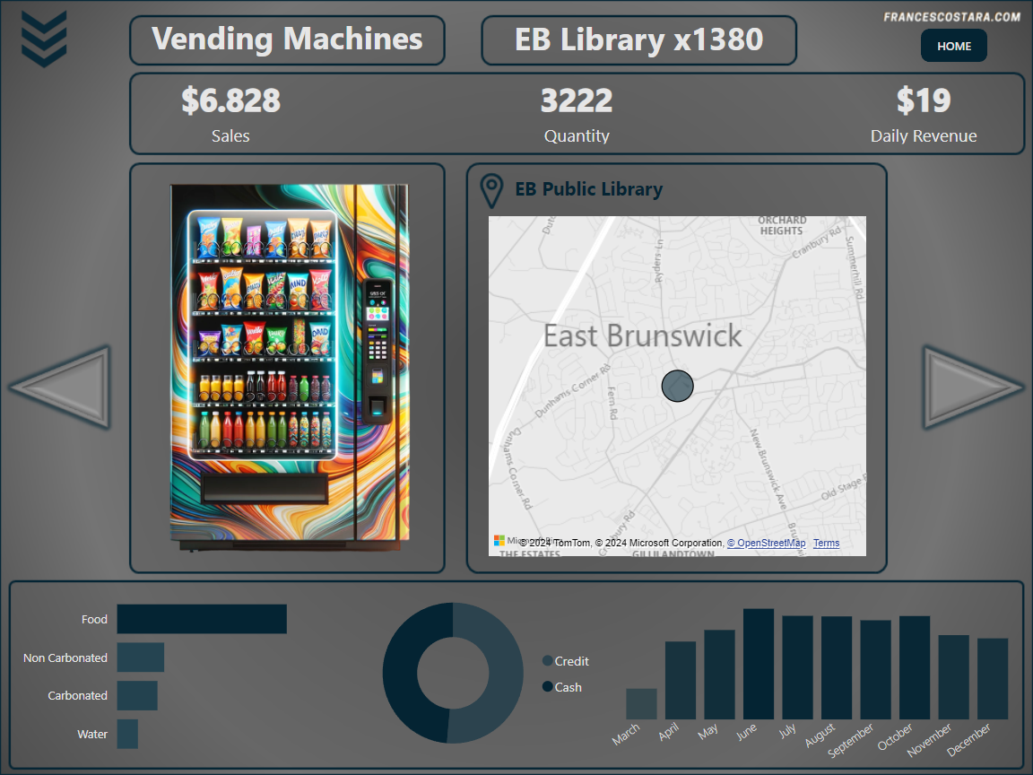
– EB Public Library, a public library with high visitor counts.
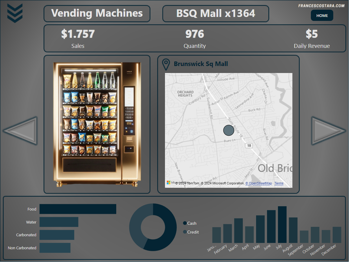
– Brunswick Sq Mall, a shopping center.
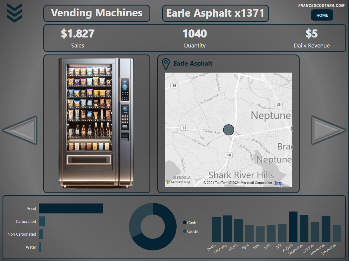
– Earle Asphalt, a construction engineering firm.
Each location has one or two designated vending machine, equipped with an e-port device that stores every transaction’s details. The data, collected from 01/01/2022 to 31/12/2022, is then transferred during the night to an electronic data aggregator.
Through a series of steps starting from data cleaning, preprocessing, and exploratory analysis, this project will uncover the consumption patterns that define each location, guiding strategies for product optimization and enhancing customer satisfaction.
After preparing the data, the focus will be on creating a dashboard that could be used in similar real life situations and can help business owner to make informed decisions.
The code and the dashboard are available for download at the end of the page.
Contents
Exploratory Data Analysis (Python)
We will use the following Python libraries:
Importing and Overview of the Dataset
I will start by importing pandas library and loading the dataset.
The data is read into a pandas DataFrame, a two-dimensional tabular data structure with labeled axes, which is a common structure for statistical data.
From the “About this file” section in kaggle, is possible to have a preliminary understanding of the attributes:
- Status : Represents if the machine data is successfully processed
- Device ID : Unique electronic identifier ( also called as ePort) for the vending machine. A machine is allocated a unique ePrt * device
- Location : Indicates location of the vending machine
- Machine : User-friendly machine name
- Product : Product vended from the machine
- Category : Carbonated / Food / Non-carbonated / Water
- Transaction : Unique identifier for every transaction
- TransDate : The Date & time of transaction
- Type : Type of transaction ( Cash / Credit )
- RCoil : Coil # used to vend the product
- RPrice : Price of the Product
- RQty : Quantity sold. This is usually one but machines can be configured to sell more items in a single transaction
- MCoil : Mapped coil # used to vend the product ( from toucan )
- MPrice : Mapped price of the Product
- MQty : Mapped quantity sold. This is usually one but machines can be configured to sell more items in a single transaction
- LineTotal : Total sale per transaction
- TransTotal : Represents total of all transactions that will show up on the Credit Card. A user could vend a drink for $3 and a snack for $1.5 making a total of $4.50
- Prcd Date : Date when the transaction was processed by SeedLive ( an entity that is used to aggregate all transactions electronically )
import pandas as pd

# Load the dataset
file_path = r'C:\Users\Francesco\Desktop\PROJECTS\Data Project\Vending Machines\vending_machine_sales.csv'
data = pd.read_csv(file_path)

# Display the first rows
data.head()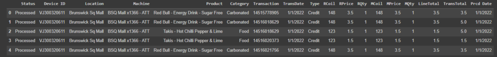
Preliminary Data Exploration
# Step 1: Check for missing values
missing_values = data.isnull().sum()
# Step 2: Check for duplicate entries
duplicates = data.duplicated().sum()
# Step 3 & 4: Checking data types
data_types = data.dtypes
# Checking for consistency in 'Category' and 'Type' columns (Step 3)
category_uniques = data['Category'].unique()
type_uniques = data['Type'].unique()
# Initial exploration for outliers in numeric columns (Step 5)
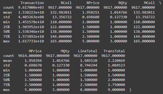
describe = data.describe()
missing_values, duplicates, data_types, category_uniques, type_uniques, describe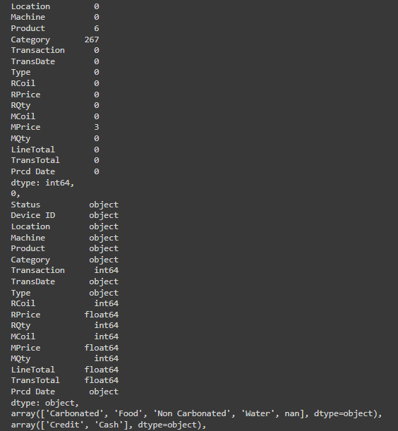
Missing Values: There are some missing values in the ‘Product’ and ‘Category’ columns, and a few in ‘MPrice’. Specifically, ‘Product’ has 6 missing entries, ‘Category’ has 267 missing entries, and ‘MPrice’ has 3 missing entries.
Duplicate Entries: There are no duplicate entries in the dataset.
Consistency in Categorization: The ‘Category’ column contains four unique values: ‘Carbonated’, ‘Food’, ‘Non Carbonated’, ‘Water’, and some missing values. The ‘Type’ column contain two payment types: ‘Credit’ and ‘Cash’.
Data Types: Most columns have the appropriate data type, but ‘TransDate’ and ‘Prcd Date’ should be converted to datetime format for better analysis.
Outliers: There doesn’t seem to be any noticeable outliers in the numeric data that suggest data entry errors. The data describes transaction amounts and product prices within reasonable ranges.
Data Cleaning & Preprocessing
I decided to delete “Product” and “MPrice” missing rows.
For “Category” missing values I will list all the unique products with an empty category and manually assign them a category.
# Deleting rows where 'Product' and 'MPrice' have missing values
cleaned_data = data.dropna(subset=['Product', 'MPrice'])
# Filtering products with missing 'Category' values and listing unique ones
missing_category_products = cleaned_data[cleaned_data['Category'].isnull()]['Product'].unique()
missing_category_products.sort()
missing_category_products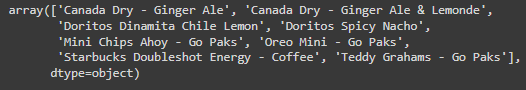
After the result seems acceptable to manually map the categories for the products.
# Assigning categories manually
category_mapping = {
    'Canada Dry - Ginger Ale': 'Carbonated',
    'Canada Dry - Ginger Ale & Lemonde': 'Carbonated',
    'Doritos Dinamita Chile Lemon': 'Food',
    'Doritos Spicy Nacho': 'Food',
    'Mini Chips Ahoy - Go Paks': 'Food',
    'Oreo Mini - Go Paks': 'Food',
    'Starbucks Doubleshot Energy - Coffee': 'Non Carbonated',
    'Teddy Grahams - Go Paks': 'Food'
}

# Applying category
for product, category in category_mapping.items():
    cleaned_data.loc[cleaned_data['Product'] == product, 'Category'] = category

# Checking if there are still missing categories
remaining_missing_categories = cleaned_data['Category'].isnull().sum()

remaining_missing_categories
Exploratory Data Analysis (EDA)
Now I will perform an Exploratory Data Analysis (EDA) to better understand the dataset using different visualizations. For this analysis, I will look at:
1. Sales Distribution by Category: Understanding what types of products are most popular.
2. Transaction Count by Location: Seeing which locations have the most activity.
3. Average Transaction Total by Location: To get a sense of spending patterns across different locations.
4. Sales Over Time: To identify any trends or patterns in sales activity over time. Top Selling Products: Identifying the most popular products across all locations.
import matplotlib.pyplot as plt
import seaborn as sns
# Setting up visualization styles
sns.set(style="whitegrid")
# 1. Sales Distribution by Category
sales_by_category = cleaned_data.groupby('Category')['LineTotal'].sum().sort_values(ascending=False)
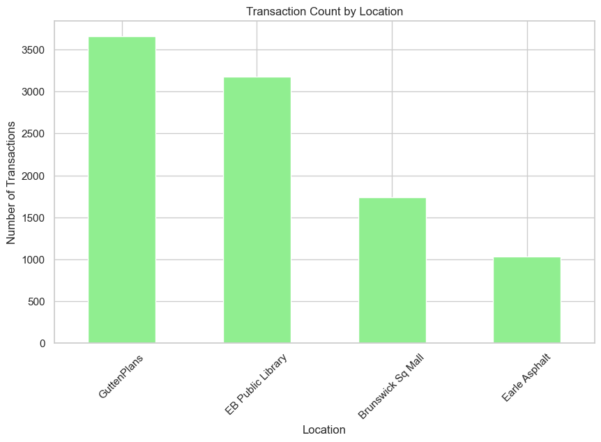
# 2. Transaction Count by Location
transaction_count_by_location = cleaned_data['Location'].value_counts()
# Plotting Sales Distribution by Category
plt.figure(figsize=(10, 6))
sales_by_category.plot(kind='bar', color='skyblue')
plt.title('Sales Distribution by Category')
plt.xlabel('Category')
plt.ylabel('Total Sales ($)')
plt.xticks(rotation=45)
plt.show()
# Plotting Transaction Count by Location
plt.figure(figsize=(10, 6))
transaction_count_by_location.plot(kind='bar', color='lightgreen')
plt.title('Transaction Count by Location')
plt.xlabel('Location')
plt.ylabel('Number of Transactions')
plt.xticks(rotation=45)
plt.show()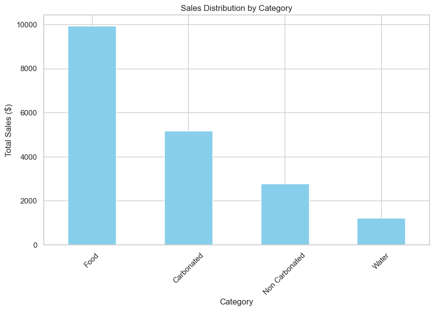
The first analysis gives insight into the Sales Distribution by Category. It’s clear that the Food category generate the most sales, that can indicate higher prices for this type of category, customer preferences and product popularity.
The second analysis shows the Transaction Count by Location. This shows which locations are busiest in terms of the number of transactions, giving an idea of foot traffic and vending machine usage across different places. It is important to note that, despite having two different vending machines, the Brunswick Sq. Mall has a little number of transactions in comparison to GuttenPlans and EB Public Library with only one vending machine for location.
After observing again the categories, I decided to create a new category split, between Food and Drinks, that I think will be helpful for a better understanding of the products sold by the vending machines, and for more possibilities later on when I will work on the dashboard.
# Adding a new column for the food-drinks category split
cleaned_data['Big Category'] = cleaned_data['Category'].apply(lambda x: 'Food' if x == 'Food' else 'Drinks')

# Calculating sales distribution for the new broad categories
sales_distribution_broad = cleaned_data.groupby('Big Category')['LineTotal'].sum()

# Plotting the sales distribution for Food vs Drinks
plt.figure(figsize=(8, 6))
sales_distribution_broad.plot(kind='pie', autopct='%1.1f%%', startangle=140, colors=['tomato', 'royalblue'])
plt.title('Sales Distribution: Food vs Drinks')
plt.ylabel('')  # Removing the y-label as it's not needed for pie chart
plt.show()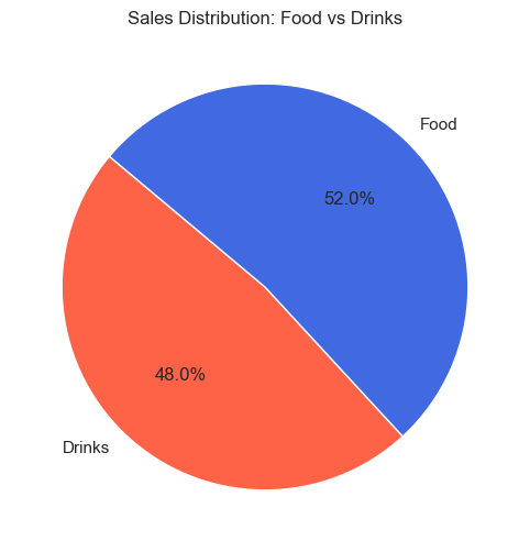
Also after the split between categories, food is still first in the sales ranking.
I will now proceed with the rest of the analysis.
# Average Transaction Total by Location
average_transaction_by_location = cleaned_data.groupby('Location')['TransTotal'].mean().sort_values(ascending=False)
# Plotting Average Transaction Total by Location
plt.figure(figsize=(10, 6))
average_transaction_by_location.plot(kind='bar', color='blue')
plt.title('Average Transaction Total by Location')
plt.xlabel('Location')
plt.ylabel('Average Transaction Total ($)')
plt.xticks(rotation=45)
plt.show()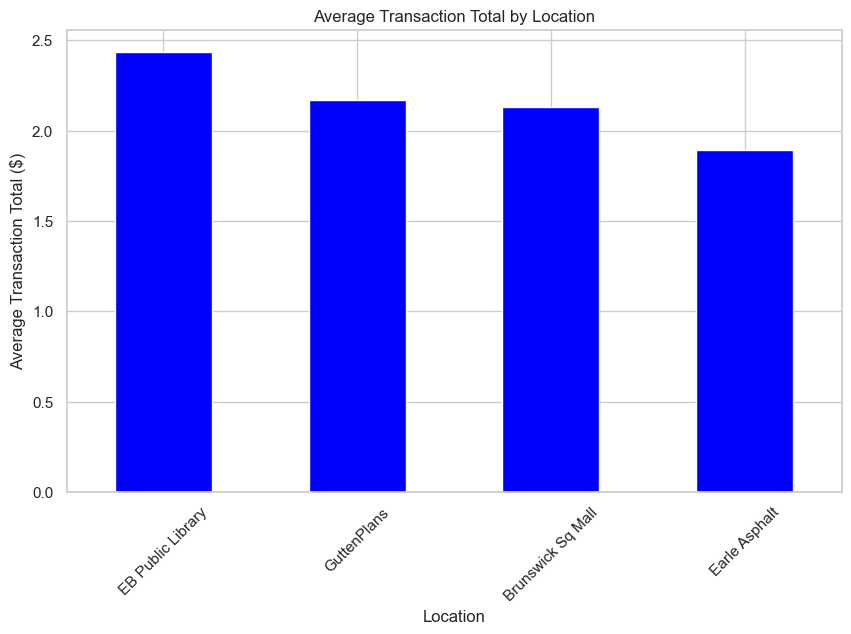
As is clear from the statistical data generated before, the average transaction of the data is around $2. This line graph shows the distribution, that is expected, considering the mean.
# Converting 'TransDate' to datetime format for time series analysis
cleaned_data['TransDate'] = pd.to_datetime(cleaned_data['TransDate'])

# 4. Sales Over Time (Monthly Sales)
monthly_sales = cleaned_data.set_index('TransDate').resample('M')['LineTotal'].sum()

# Plotting Sales Over Time (Monthly Sales)
plt.figure(figsize=(12, 6))
monthly_sales.plot(marker='o', linestyle='-', color='orange')
plt.title('Sales Over Time (Monthly)')
plt.xlabel('Month')
plt.ylabel('Total Sales ($)')
plt.xticks(rotation=45)
plt.show()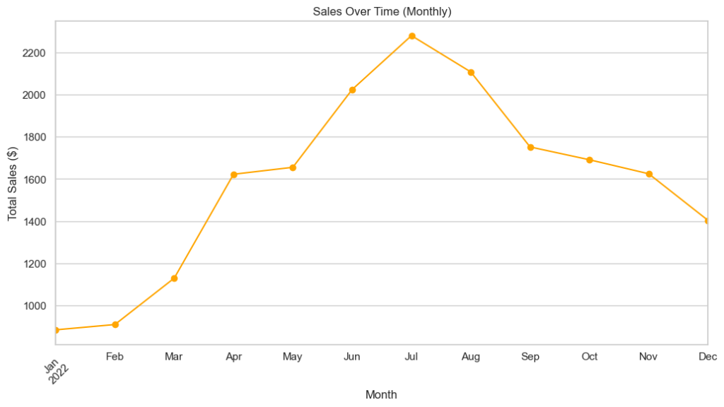
The sales over time showed how sales fluctuated across different months. During summer months (June, July, August) there is a peak of sales, more than $2000/monthly, the rest of the year is always less than $1800/monthly. Is important to notice that the vending machines in the EB Public Library started being functional from March/April, and not in the first months of the year.
# 5. Top Selling Products
top_selling_products = cleaned_data.groupby('Product')['LineTotal'].sum().sort_values(ascending=False).head(10)

# Plotting Top Selling Products
plt.figure(figsize=(10, 6))
top_selling_products.plot(kind='barh', color='green')
plt.title('Top Selling Products')
plt.xlabel('Total Sales ($)')
plt.ylabel('Product')
plt.show()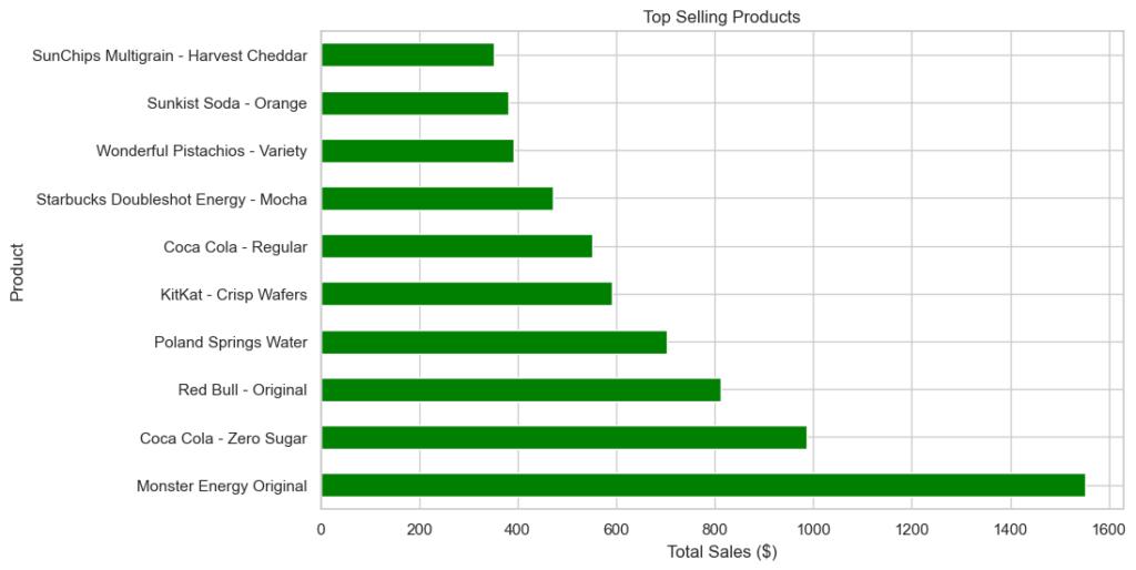
This graph shows that the most sold product is Monster Energy Original, followed by Coca Cola – Zero Sugar (also present in the 6th place in the ranking with the version Regular), third place is for Red Bull – Original. The carbonated category, despite having half the sales quantity of the food category, lead the rankings.
cleaned_data.to_csv("vending_machine_clean2.csv", index=False)Dashboard Creation (PowerBI)
Now that the dataset is cleaned and that I have a better understanding of the distribution of the values inside it, I will proceed to create a dashboard to showcase a general overview of the business and details for every vending machines.
Changes to the model
First of all I removed the categories not needed for this part of the project (Status, Device ID, MCoil, MPrice, MQty, TransTotal, Prcd Date)
After, using Power Query, I changed the type of some attributes (numbers and date).
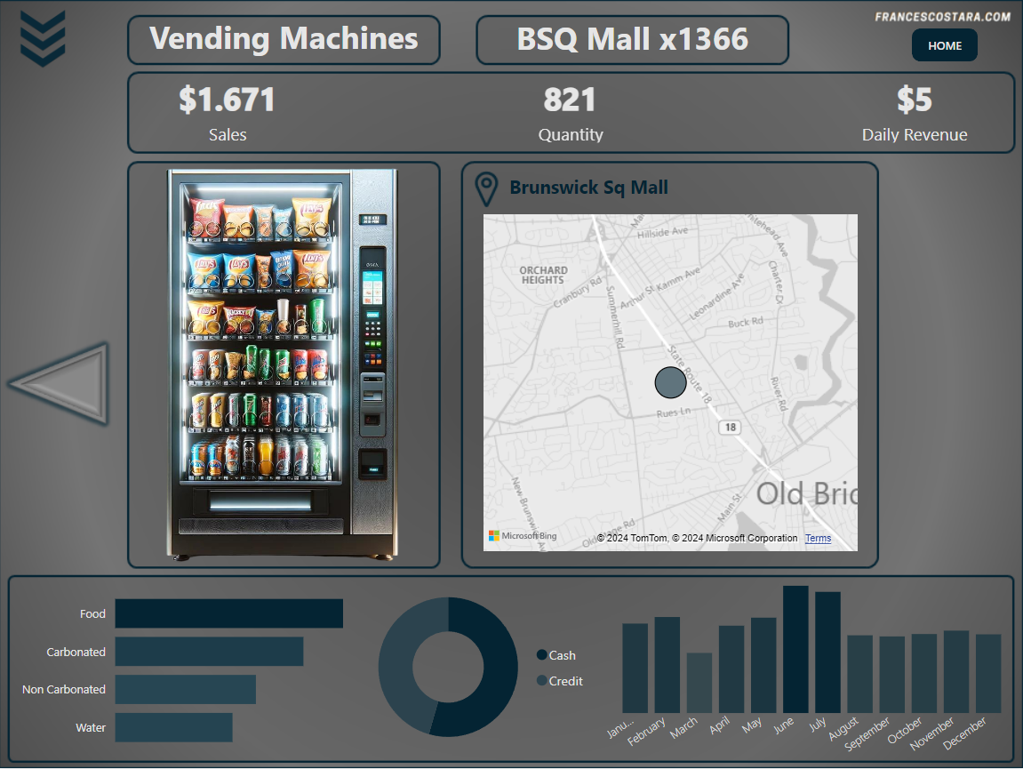
I also created a measure for having an attribute that can shows the revenue by day:
LineTotal divided by Count of Day =
DIVIDE(
SUM('vending_machine_clean2'[LineTotal]),
COUNTA('vending_machine_clean2'[TransDate].[Day])
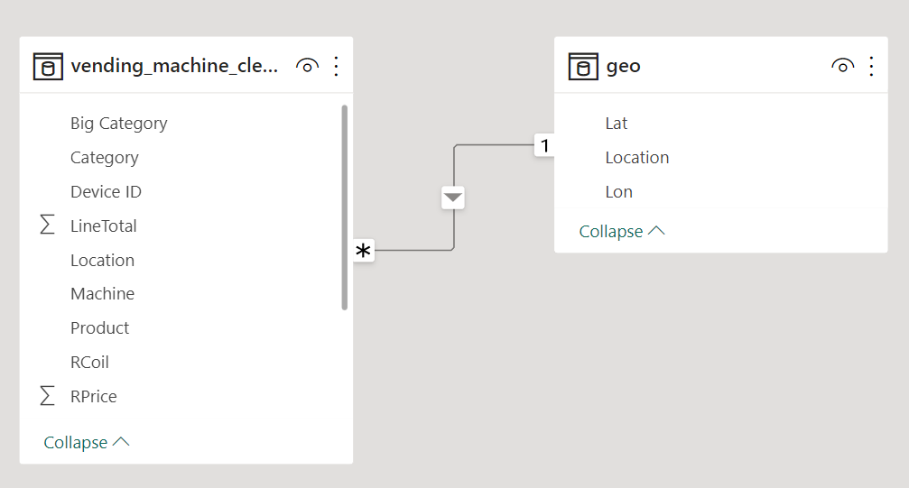
)The idea for this dashboard is also to provide a map for every location, to make the dashboard more visually appealing. Using a dataset based on a real-life business for this project I could easily find the locations and the coordinates, to use them for creating the maps.
I decided so to add a table called “geo” that includes the coordinates of the various locations.
This is how the final model looks like:
UI/UX Design
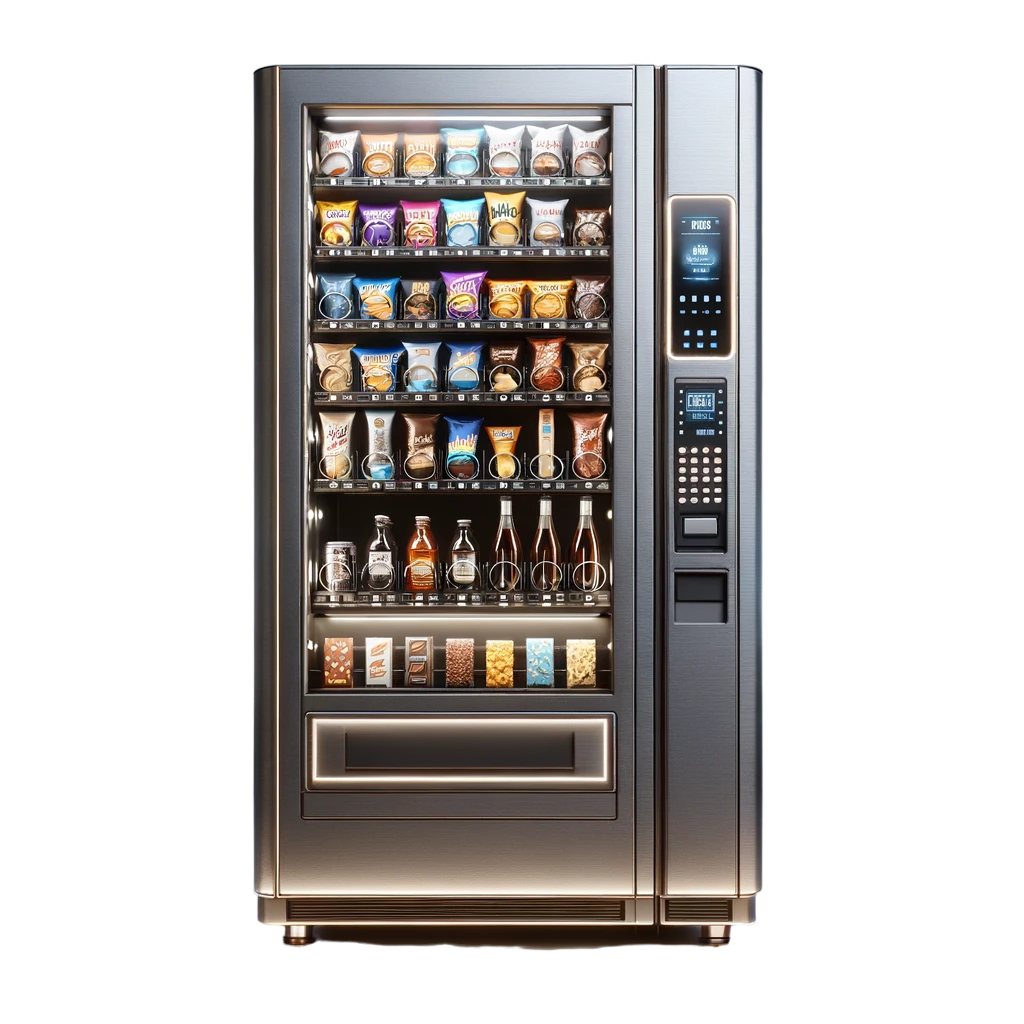
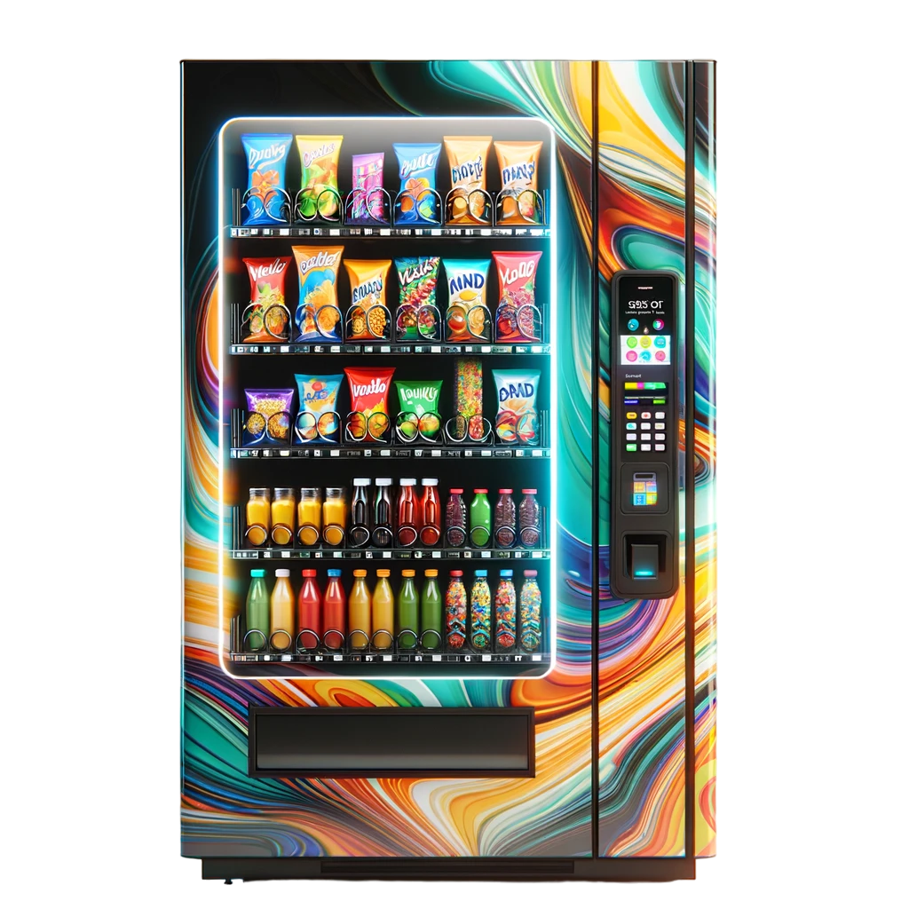
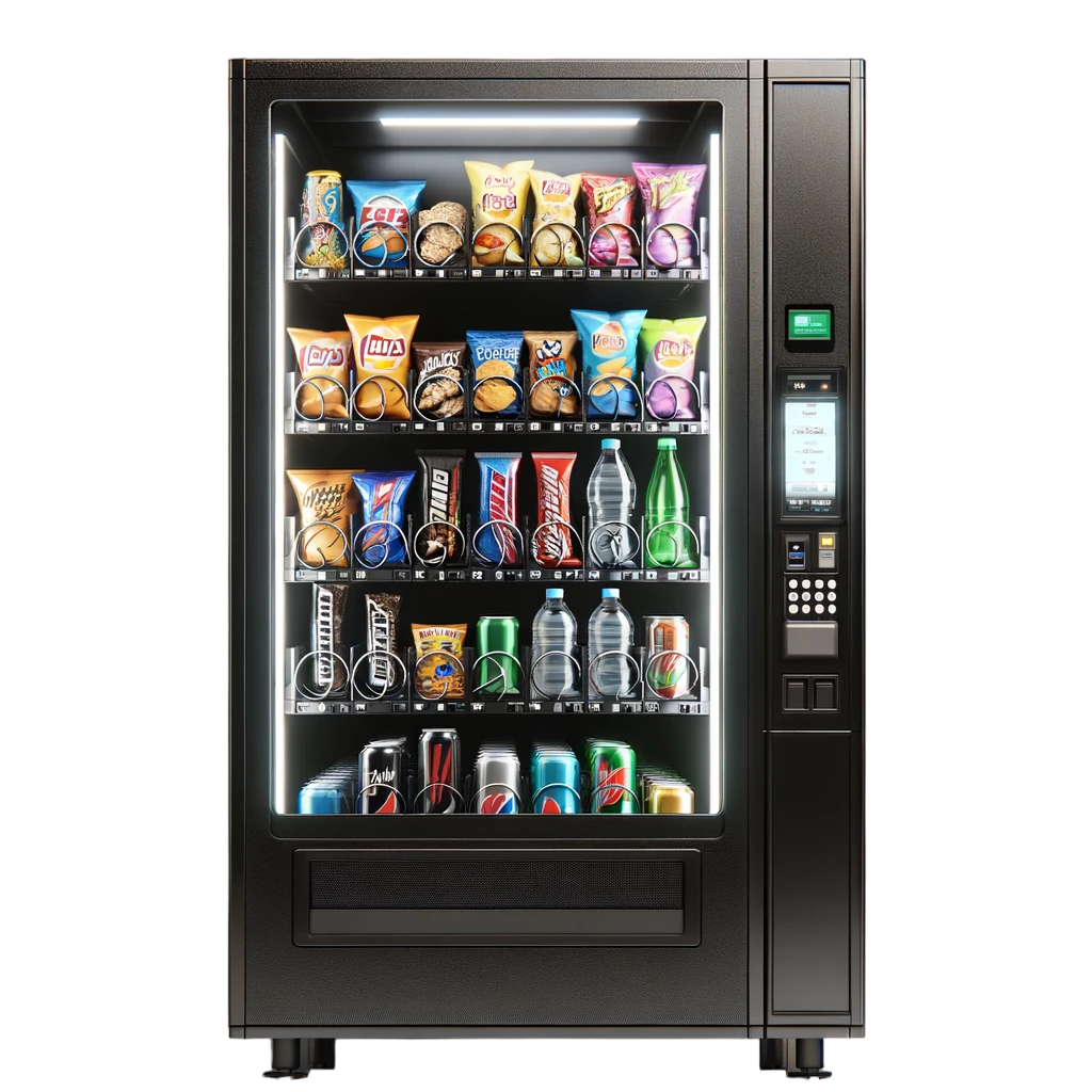
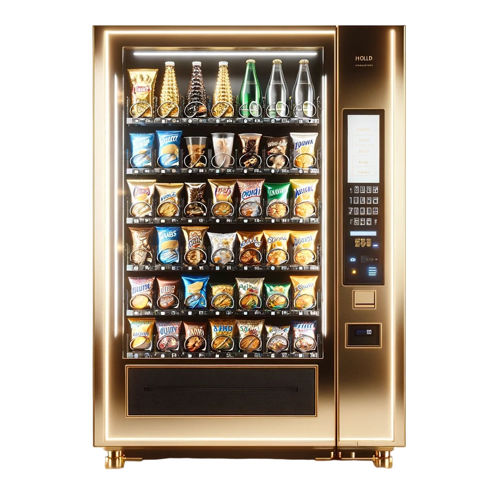
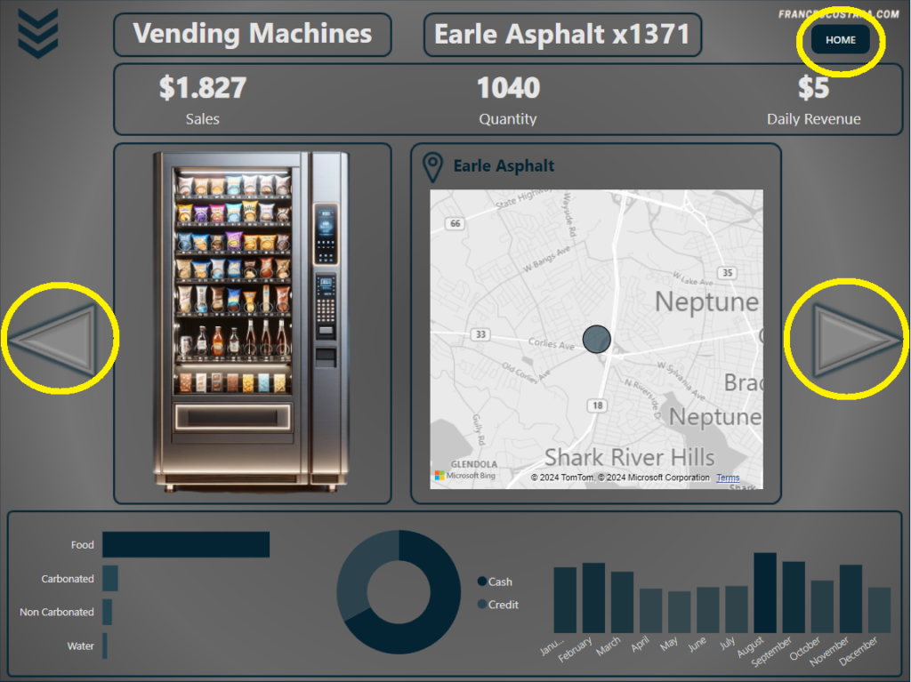
I decided to have an Homepage and a single page for every vending machine, and I wanted to include in every page a picture of the vending machine.
Having no access to the real pictures of them I decided to use generative Artificial Intelligence to create the images, that is possible to see here:

I created the background and the icons using Microsoft PowerPoint:


Final Result
That’s the final result:
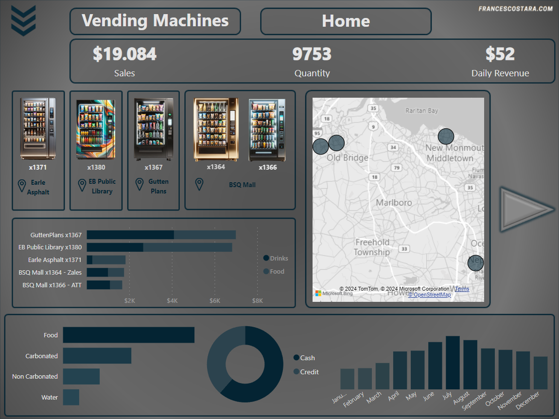
In every page is present a Category and Product filter, activable by clicking the icon at the top left of the page. This is the appearance after clicking on it:
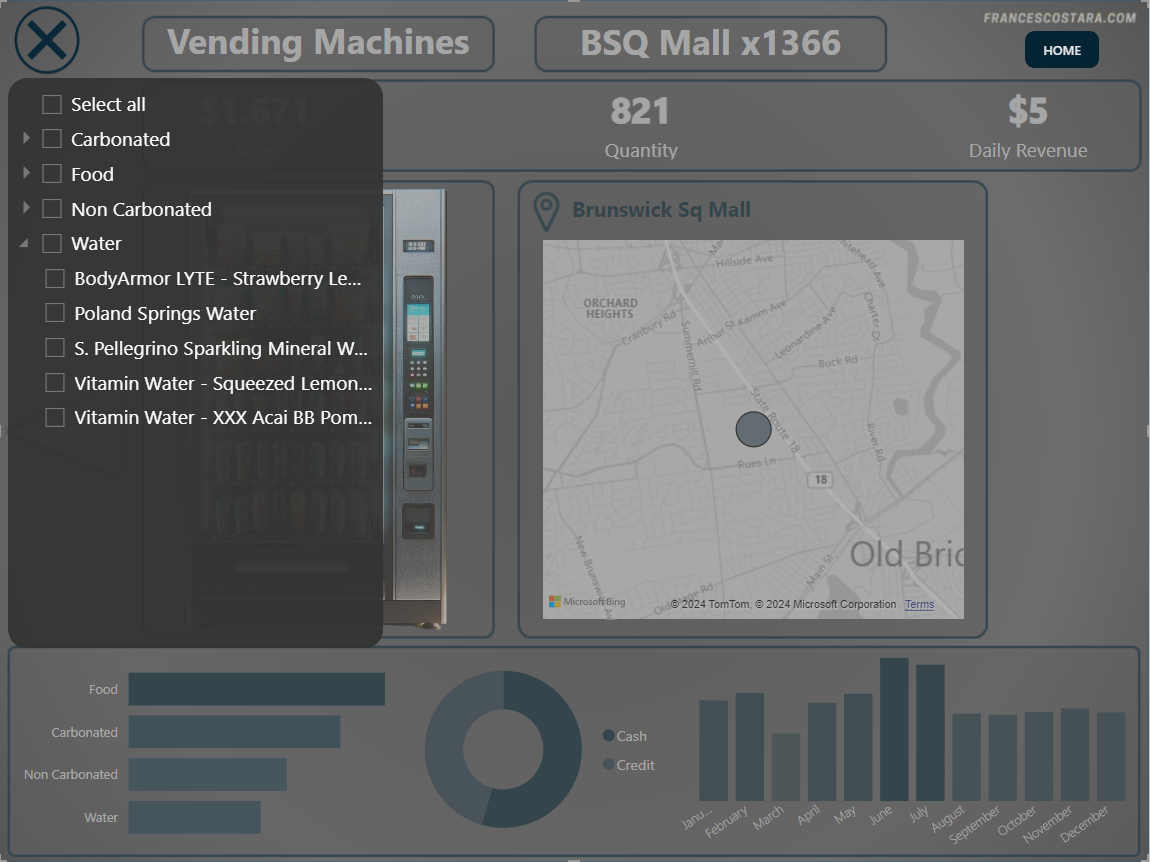
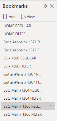
I created it using bookmarks, for every page there are two different bookmarks:
One with the regular design.
Another one with the filter design, and the rest of the page clearer, plus a change in the icon in the top left.
Every time that the user clicks on the icon, will switch the visual (bookmark)
The other interactive tools present in the dashboard (obviously for the funcitionality of PowerBI every visualization is interactive and the user can filter clicking on a line or a slice of the pie chart) are:
– Page Navigators: I inserted arrows for navigating between the pages.
– Home Navigator: I inserted an “Home” button at the top right of the page to rapidly come back to the first page, the homepage.
The raw files, the code and the PBI file are available here: Google Drive folder.
Special thanks to the owner of the dataset, Aniruddh Singh.
If you want to discover dataset like this take a look at my article: Finding The Best Dataset For Data Analytics Practice And Portfolio.