In this weather data analysis project, I analysed daily meteorological data from Warsaw, Poland from 1993 to 2022.
I used Python for initial data preprocessing, Exploratory Data Analysis (EDA), statistical analysis and I created a Machine Learning model to see if there is a relationship between the years and the temperature increase.
After, I decided to use Microsoft Excel for creating a dynamic and interactive dashboard visualization, to showcase that also with the common spreadsheet software is possible to obtain very good results in terms of data visualization and User Interface.
This project stands blends data science techniques and visualization tools applied to a topic of personal relevance, Warsaw is the city where I actually live.
The objective of this project is to analyze daily weather data from Warsaw, Poland, to identify trends and patterns. The dataset includes daily weather readings from 1993 to 2022, including the average, maximum, and minimum temperatures (TAVG, TMAX, TMIN), precipitation (PRCP), and snow depth (SNWD).
The data is publicly available on Kaggle (Here).
Contents
Exploratory Data Analysis, Machine Learning and Visualization (Python)
I will use the following Python libraries:
1. Importing Libraries and Loading Data
Let’s start by importing the necessary Python libraries and loading the dataset. The data is read into a pandas DataFrame, a two-dimensional tabular data structure with labeled axes, which is a common structure for statistical data.
import pandas as pd
import numpy as np
from sklearn.model_selection import train_test_split
from sklearn.linear_model import LinearRegression
from sklearn.metrics import mean_squared_error, r2_score
import matplotlib.pyplot as plt
import seaborn as sns
# Load the data
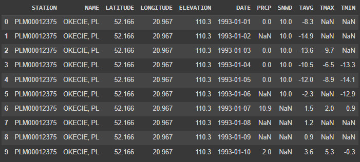
data = pd.read_csv(r'C:\Users\Francesco\Desktop\Progetti Portfolio/warsaw.csv')
data.head(10)
2. Data Cleaning and Preprocessing
In this step, I preprocessed the data to prepare it for the subsequent analysis.
I converted the ‘DATE’ column to a datetime format and extract the year, month, and day into separate columns.
# Convert the 'DATE' column to datetime format
data['DATE'] = pd.to_datetime(data['DATE'])

# Extract year, month, and day from the 'DATE' column
data['YEAR'] = data['DATE'].dt.year
data['MONTH'] = data['DATE'].dt.month
data['DAY'] = data['DATE'].dt.day

data.head(30)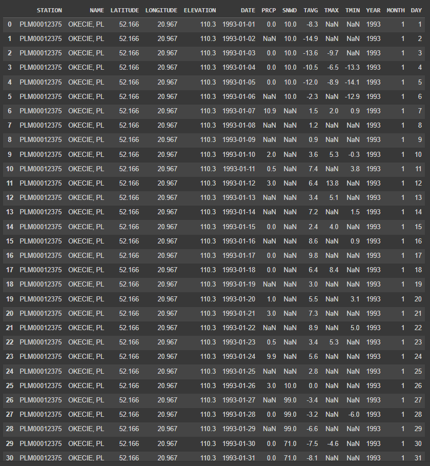
I now handled missing data by imputing the missing values with the median of the same month in the given year.
# Impute missing values using the median of the same month in the given year
for column in ['PRCP', 'SNWD', 'TAVG', 'TMAX', 'TMIN']:
    data[column] = data.groupby(['YEAR', 'MONTH'])[column].transform(lambda x: x.fillna(x.median()))

# Check if there are still missing values
missing_values = data.isnull().sum()
print(missing_values)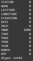
Is possible to notice that there are still some missing values, only for the ‘SNWD’ column (snow depth).
# Filter rows for months from May to September
summer_data = data[(data['MONTH'] >= 6) & (data['MONTH'] <= 9)]

# Display the data
print(summer_data)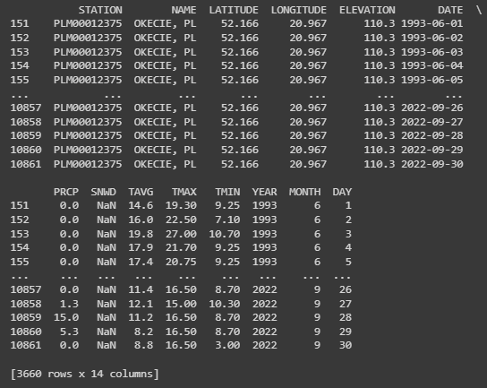
The data of snow is missing during summer. I specifically addressed the missing values in the ‘SNWD’ column (snow depth) for the summer months by filling them with 0, since it’s reasonable to assume that there is no snow in summer.
# Impute remaining missing values in 'SNWD' with 0
data['SNWD'] = data['SNWD'].fillna(0)

# Check if there are still missing values
missing_values = data.isnull().sum()
print(missing_values)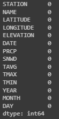
# Filter rows for months from May to September
summer_data = data[(data['MONTH'] >= 6) & (data['MONTH'] <= 9)]

# Display the data
print(summer_data)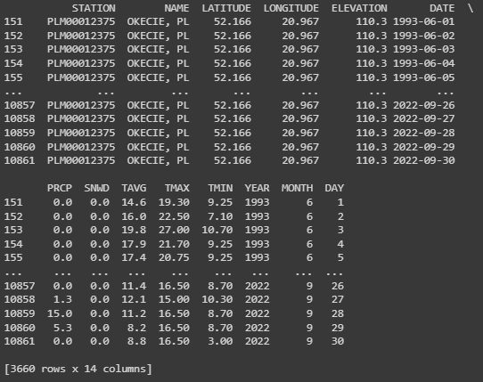
3. Exploratory Data Analysis (EDA)
Next, I will perform an exploratory data analysis to understand the data’s main characteristics.
I will generate descriptive statistics, such as count, mean, standard deviation, minimum, maximum, and quartiles for each variable.
# Descriptive statistics for each relevant variable
desc_stats = data[['PRCP', 'SNWD', 'TAVG', 'TMAX', 'TMIN']].describe()

print(desc_stats)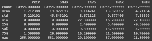
In the next step, I detected and counted the number of outliers using the Z-score method, where an outlier is defined as a data point that is more than three standard deviations away from the mean.
# Outlier Detection: Z-score method
from scipy import stats
# Calculate the number of outliers for each variable
num_outliers = {}
for column in ['PRCP', 'SNWD', 'TAVG', 'TMAX', 'TMIN']:
    z_scores = stats.zscore(data[column])
    abs_z_scores = np.abs(z_scores)
    outliers = abs_z_scores > 3  # a common threshold for outliers is a z-score greater than 3
    num_outliers[column] = outliers.sum()

# Print the number of outliers for each variable
for variable, num in num_outliers.items():
    print(f'{variable}: {num} outliers')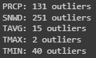
Now let’s visualize the distribution of temperatures using box-plots.
# Boxplots for temperature variables
f, axes = plt.subplots(1, 3, figsize=(15, 5))
sns.boxplot(data=data['TAVG'], color="skyblue", ax=axes[0])
sns.boxplot(data=data['TMAX'], color="teal", ax=axes[1])
sns.boxplot(data=data['TMIN'], color="pink", ax=axes[2])
axes[0].set_title('Average Temperature')
axes[1].set_title('Max Temperature')
axes[2].set_title('Min Temperature')
plt.tight_layout()
plt.show()
From the EDA, is possible to observe that the variables have different ranges, with temperature variables having a wider range compared to precipitation and snow depth.
Also, several outliers in each variable are identified, which may be due to extreme weather events.
4. Machine Learning: Linear Regression Model
I will now use a linear regression model to predict the average temperature based on the year.
First, I grouped the data by year and calculate the mean temperature for each year.
I split the data into a training set and a test set, where the model learns from the training data and its performance is evaluated on the test data.
I then trained the model, make predictions using the test set, and evaluated the model’s performance by calculating the Root Mean Squared Error (RMSE) and the R-squared (R2) score.
After, I visualized the actual versus predicted average temperatures using a scatter plot.
# Group the data by year and calculate the mean temperature for each year
data_yearly = data.groupby('YEAR').mean().reset_index()

# Define the predictors (features) and the target
features_yearly = ['YEAR']
target_yearly = ['TAVG']

# Split the data into training and testing sets
X_train_yearly, X_test_yearly, y_train_yearly, y_test_yearly = train_test_split(
    data_yearly[features_yearly], data_yearly[target_yearly], test_size=0.2, random_state=42)

# Train the model
model_yearly = LinearRegression()
model_yearly.fit(X_train_yearly, y_train_yearly)

# Make predictions using the testing set
y_pred_yearly = model_yearly.predict(X_test_yearly)

# Evaluate the model
rmse_yearly = np.sqrt(mean_squared_error(y_test_yearly, y_pred_yearly))
r2_yearly = r2_score(y_test_yearly, y_pred_yearly)

# Print the RMSE and R2 score
print(f'Root Mean Squared Error (RMSE): {rmse_yearly}')
print(f'R-squared (R2) Score: {r2_yearly}')

# Plot the actual vs predicted average temperatures
plt.figure(figsize=(10, 6))
plt.scatter(X_test_yearly, y_test_yearly, color='blue', label='Actual')
plt.plot(X_test_yearly, y_pred_yearly, color='red', linewidth=2, label='Predicted')
plt.title('Actual vs Predicted Average Temperatures')
plt.xlabel('Year')
plt.ylabel('Average Temperature (°C)')
plt.legend()
plt.grid(True)
plt.show()
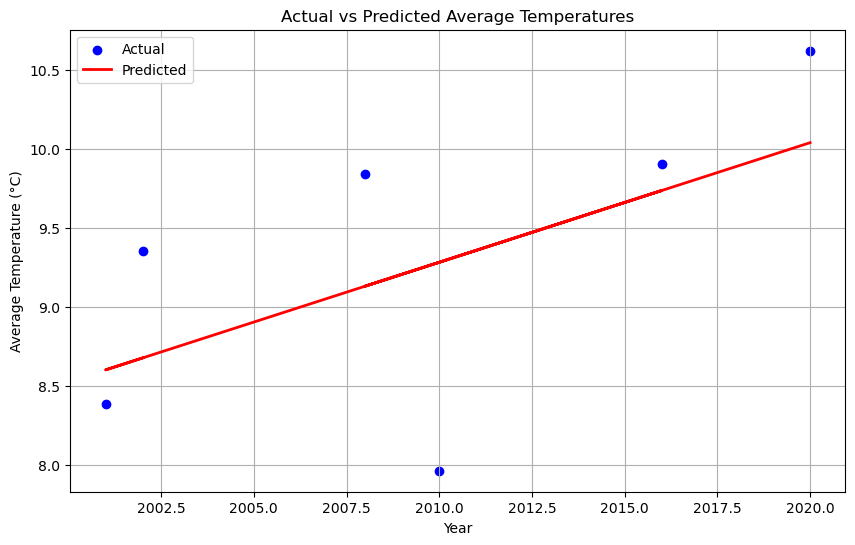
The linear regression model shows that there is a positive correlation between the year and the average temperature, indicating a trend of increasing temperatures over time.
The model’s performance is reasonable, with an R2 score of about 0.38, suggesting that approximately 38% of the variation in average temperature can be explained by the year.
5. Seasonality Analysis
I will now conduct a seasonality analysis to understand how temperature patterns change throughout the year.
I grouped the data by month and calculate the mean temperature for each month.
After I visualized the average temperature over the months using a line plot.
# Group the data by month and calculate the mean temperature for each month
data_monthly = data.groupby('MONTH').mean().reset_index()

# Create a line plot to visualize the average temperature over the months
plt.figure(figsize=(10, 6))
sns.lineplot(x='MONTH', y='TAVG', data=data_monthly)
plt.title('Average Temperature by Month')
plt.xlabel('Month')
plt.ylabel('Average Temperature (°C)')
plt.xticks(ticks=range(1, 13), labels=['Jan', 'Feb', 'Mar', 'Apr', 'May', 'Jun', 'Jul', 'Aug', 'Sep', 'Oct', 'Nov', 'Dec'])
plt.grid(True)
plt.show()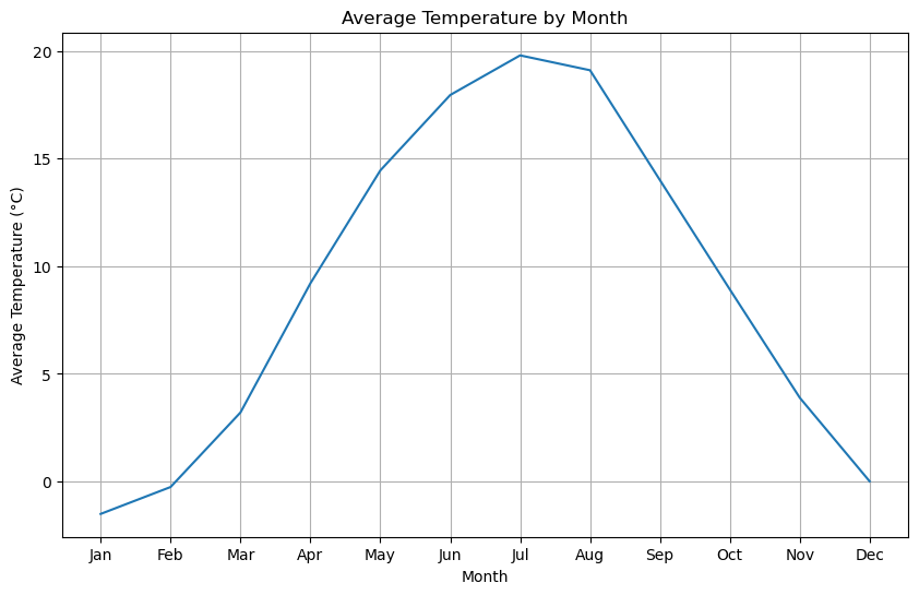
I also created an heatmap to visualize the average temperature for each month across the years.
# Heatmap of monthly average temperatures
avg_temp_monthly = data.pivot_table(values='TAVG', index='MONTH', columns='YEAR').round(0)
plt.figure(figsize=(15, 10))
sns.heatmap(avg_temp_monthly, cmap='coolwarm', annot=True, fmt=".0f", annot_kws={'size': 10})
plt.title('Monthly Average Temperature Across Years')
plt.xlabel('Year')
plt.ylabel('Month')
plt.show()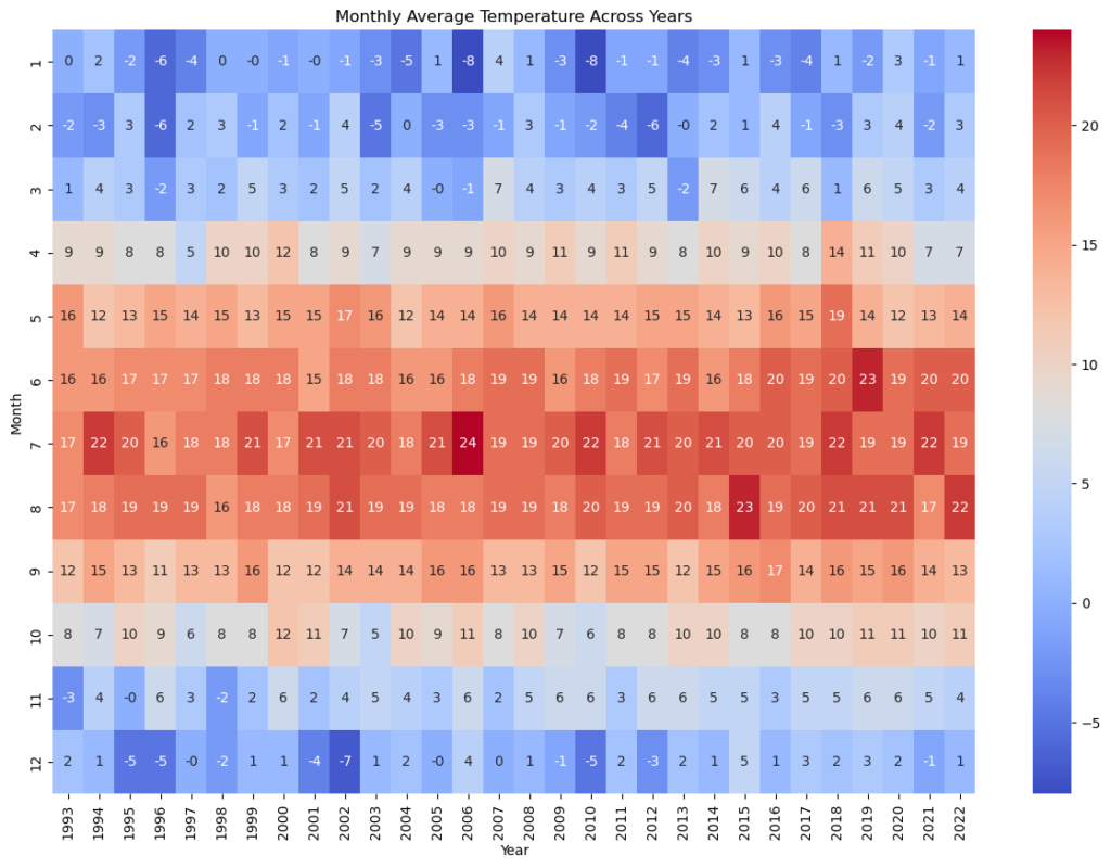
The seasonality analysis reveals a clear pattern of temperatures varying with the seasons, with higher temperatures in the summer months (June to September) and lower temperatures in the winter months (December to February).
The heatmap shows how the average temperature for each month has changed over the years, with some indication of rising temperatures over time.
6. Extreme Weather Events Analysis
Now I will analyze extreme weather events, such as extremely hot days, cold days and heavy rainfall days.
I decided to define a “hot day” a day when the temperature is above the 90th percentile.
I created a bar plot with a trend line for showing that the quantity of hot days has changed over the years, with some indication of rising temperatures over time.
# Calculate the 90th percentile temperature
temp_90th_percentile = data['TAVG'].quantile(0.9)

# Calculate the number of extremely hot days each year
hot_days = data[data['TAVG'] > temp_90th_percentile]
hot_days_yearly = hot_days.groupby('YEAR').size()

# Bar plot of the number of extremely hot days each year with trendline
plt.figure(figsize=(15, 5))
plt.bar(hot_days_yearly.index, hot_days_yearly.values, color='red')
sns.regplot(x=hot_days_yearly.index, y=hot_days_yearly.values, scatter=False, color='black')
plt.title('Number of Extremely Hot Days Each Year')
plt.ylabel('Number of Days')
plt.xlabel('Year')
plt.show()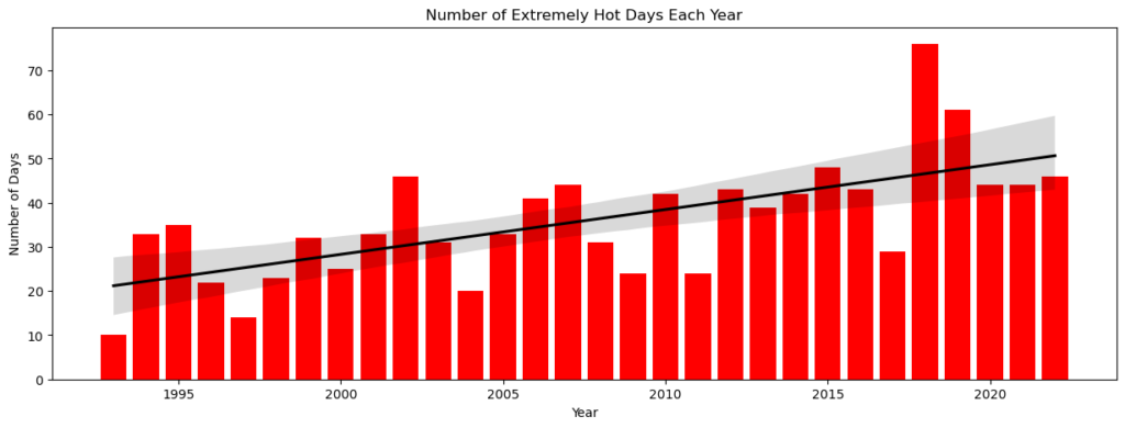
The definition of “extreme” events in this analysis are events that fall in the top 1% of temperatures and precipitation. I calculated the number of these extreme events for each year and visualized the number of extreme events over time using line plots.
# Define "extreme" events as those that fall in the top 1% of temperatures and precipitation
extreme_low_temp = data['TAVG'].quantile(0.01)
extreme_precip = data['PRCP'].quantile(0.99)

# Create a new dataframe to store the number of extreme events for each year
extreme_events = data.groupby('YEAR').apply(lambda x: pd.Series({
    'LowTemps': (x['TAVG'] < extreme_low_temp).sum(),
    'HighPrecip': (x['PRCP'] > extreme_precip).sum()})).reset_index()

# Visualize the number of extreme events over time
plt.subplot(312)
sns.lineplot(x='YEAR', y='LowTemps', data=extreme_events, color='blue')
plt.title('Number of Extremely Cold Days Over Time')
plt.ylabel('Number of Days')
plt.grid(True)
plt.subplot(313)
sns.lineplot(x='YEAR', y='HighPrecip', data=extreme_events, color='green')
plt.title('Number of Heavy Rainfall Days Over Time')
plt.ylabel('Number of Days')
plt.grid(True)
plt.tight_layout()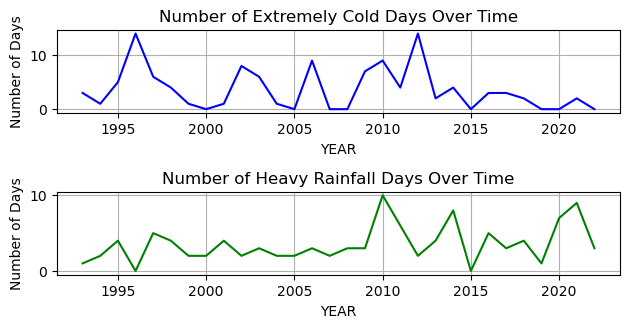
The analysis of extreme weather events shows that the number of extremely hot and cold days and heavy rainfall days varies from year to year.
It’s important to note that these extreme events could be related to climate change, but further analysis would be needed to confirm this.
By the end of this project, we have gained a deeper understanding of the weather trends and patterns in Warsaw, Poland, over nearly 30 years. This analysis can serve as a basis for further studies, such as climate change research, or can be used in applications like weather forecasting.
data.to_excel(r'C:\Users\Francesco\Desktop\Progetti Portfolio\Python_WarsawWeather/warsaw_filled.xlsx', index=False)Dashboard Creation (Microsoft Excel)
(Google Drive link down below)
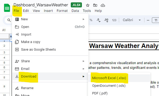
I decided to use Microsoft Excel to create a dashboard to showcase all the potential in the tool, not only for calculation, but also for data visualization.
I focused on creating an interactive dashboard (is possible to select every day or period from 1993 to 2022) visually appealing.
This dashboard was prepared to offer users a clear understanding of Warsaw’s weather patterns over the years.

Disclaimer:
Is necessary to download and open the workbook with Microsoft Excel.
- Overview:
The “Dashboard_WarsawWeather.xlsx” Excel workbook delivers a comprehensive visualization and analysis of Warsaw’s daily weather data, spanning from 1993 to 2022.
This file is an essential tool for understanding weather patterns, trends, and significant events in Warsaw over the years. - Data Source:
The weather data integrated into this dashboard originates from a dataset publicly accessible on Kaggle (Link). The dataset encompasses daily metrics such as average, maximum, and minimum temperatures, precipitation levels, and snow depths. - Workbook Sheet Structure:
For user convenience and easy navigation, the workbook is organized as follows:
Data: Contains the raw data and the columns created for the project.
Cards: Dedicated to generating the cards and the Timeline Slicer for the Detailed Time Analysis.
Seasonality: Crafts the monthly temperature graph to illustrate seasonality.
Probability: Analyzes precipitation and snow trends in the Seasonality Analysis.
Timeline: Dedicated to the yearly trend analysis graphs.
Colours: Displays the color palette employed in the dashboard. - How to Use:
Dashboard Viewing: Navigate to the “Dashboard” sheet to access the curated visual insights.
Seasonality Analysis: Data here is categorized by month. The “Probability of Day with Snow per Month” graph represents the likelihood of encountering snow in Warsaw, not necessarily the probability of snowfall on any given day.
Detailed Time Analysis: Use the Timeline Slicer to pinpoint specific daily/monthly/quarterly/yearly values from 01/01/1993 to 31/12/2022.
Yearly Trend Analysis: This section groups data by year for a lucid understanding of evolving trends.
If you wish to inspect or modify the raw data, head to the “Data” sheet. Please be cautious when altering data to maintain dashboard accuracy. - Data Cleaning and Preprocessing:
The data was explored and manipulate with Python. - Notes & Considerations:
The “warsaw_filled.xlsx” dashboard aims to provide a comprehensive view of Warsaw’s weather patterns, but it’s essential to approach the data with an analytical mindset and consider potential external factors that might affect the readings.
The workbook is optimized for use in the latest versions of Microsoft Excel. Display or functionality might vary slightly in older versions or different spreadsheet software. - Feedback & Suggestions:
Your feedback is invaluable. If you have insights, corrections, or any queries regarding the data and its presentation, please refer back to this README or contact the creator. - Credits & Acknowledgments:
A big thank you to the original data providers on Kaggle for making this dataset available to the public.