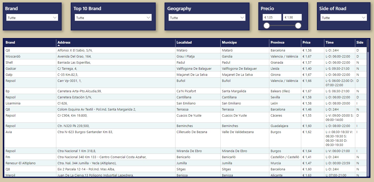
This project focuses on the analysis of gas stations across all provinces in Spain, using a dataset extracted from the official Spanish government portal dedicated to energy infrastructures. The data was obtained in September 2024 from the Gas Stations Geoportal, and includes details such as the location, prices, and brands of gas stations throughout the country. Additionally, population data from 2021 (Instituto Nacional de Estadìstica) has been integrated into the dataset to allow for more in-depth comparative analysis.
You can find the link with the code, the raw data and the Power Bi file at the end of this page.
Key Aspects of the Dataset:
- Data Source: Spanish government’s Gas Stations Geoportal.
- Date of Extraction: September 2024.
- Population Data: From the year 2021, integrated to provide more context in terms of population distribution and its potential impact on gas station availability and fuel prices.
Columns of Interest:
- Province (Provincia): The Spanish province where the gas station is located.
- Municipality (Municipio): The municipality within the province.
- Location (Localidad): The locality or town of the gas station.
- Postal Code (Código postal): Zip code of the gas station.
- Address (Dirección): The specific address of the gas station.
- Side of Road (Margen): Whether the station is located on the left (I) or right (D) side of the road.
- Data Collection Date (Toma de datos): The date when the gas station data was collected.
- Price (Precio): The price of fuel at the time of data collection.
- Brand (Rótulo): The gas station brand.
- Type of Sale (Tipo venta): Specifies if the sale is in-person (P).
This project aims to provide a comprehensive understanding of fuel availability and pricing across Spain, while considering population density as a potential factor. This analysis can be useful for companies in the energy sector to understand market distribution, regional price variations, and fuel accessibility in relation to population size.
In the final stage of this project, the data will be visualized using Power BI to create interactive dashboards that showcase key insights and patterns.
If you need help to find the best dataset for your BI Portfolio, check this article on my blog: Finding The Best Dataset For Data Analytics Practice And Portfolio
Contents
Exploratory Data Analysis and Visualization (Python)
For this project I will use the following Python libraries:
1. Importing Libraries and Loading Data
Firstly, I will load the dataset of gas stations and the population data for further analysis.
# Importing necessary libraries
import pandas as pd
import matplotlib.pyplot as plt

# Load the gas station and population datasets
gasolineras_file_path = '/mnt/data/Gasolineras1.xlsx'
population_file_path = '/mnt/data/Population.xlsx'

# Load the data
gasolineras_df = pd.read_excel(gasolineras_file_path, sheet_name='Foglio1')
population_df = pd.read_excel(population_file_path, sheet_name='Population')
I am loading two datasets: one that contains gas station information from Spain and another with population data. These datasets will allow me to analyze how fuel prices and gas station distribution relate to population density across Spanish provinces
2. Data Cleaning
In this step, I will address missing values and duplicates. Missing data can distort the analysis, while duplicate rows could indicate multiple entries for the same station.
# Check for missing values
# Check how many missing values are present in each column.

missing_values = gasolineras_df.isnull().sum()
print("Missing values before cleaning:", missing_values)

# Step 2.2: Check for duplicates
# Count how many duplicate rows are present.

duplicate_rows = gasolineras_df.duplicated().sum()
print("Duplicate rows before cleaning:", duplicate_rows)
Checking for missing values is essential to ensure that the key variables analyzed, like fuel prices, are complete. Duplicates are also removed to prevent the same station from being counted multiple times, which could bias the results.
I will handle missing values in critical columns like fuel prices and brand by removing the rows with missing data. For less critical columns, is possible to choose to either impute values or remove them. I will also handle duplicate entries by removing them.
# Handle missing values and duplicates
# Remove rows with missing data in critical columns (Price, Brand), and drop duplicate rows.

# Remove duplicates
gasolineras_df_cleaned = gasolineras_df.drop_duplicates()

# Remove rows with missing values in 'Precio' or 'Rótulo' (fuel price or brand)
gasolineras_df_cleaned = gasolineras_df_cleaned.dropna(subset=['Precio', 'Rótulo'])

# Check missing values and duplicates after cleaning
missing_values_after_cleaning = gasolineras_df_cleaned.isnull().sum()
duplicate_rows_after_cleaning = gasolineras_df_cleaned.duplicated().sum()

print("Missing values after cleaning:", missing_values_after_cleaning)
print("Duplicate rows after cleaning:", duplicate_rows_after_cleaning)
Rows with missing values in key columns like Price and Brand were removed because these are essential for the analysis of fuel market trends. Duplicates were removed to avoid skewing the results, ensuring that each gas station is counted only once.
Consideration: Fuel prices are critical because they directly impact consumer behavior and economic activity. Missing price data means that a key information for analysis is missing. Similarly, brands (e.g., Repsol, Cepsa) are important to understand market dominance and brand distribution.
3. Exploratory Data Analysis (EDA) and Insights
First, let’s display the descriptive statistics for fuel prices and analyze the result.
# Descriptive statistics for fuel prices
price_descriptive_stats = gasolineras_df_cleaned['Precio'].describe()
print("Descriptive statistics for fuel prices:", price_descriptive_stats)
The average fuel price across Spain is €1.55 per liter, with prices ranging from €1.05 to €1.98. This distribution reflects regional differences in fuel costs, which can be attributed to factors like transportation, logistics, competition, and demand.
Real-World Insights:
- Global Market Context: According to global fuel market reports, Spain is relatively cheaper compared to other European countries due to lower fuel taxes (Source: European Commission Fuel Prices).
- Regional Differences: In rural areas or tourist-heavy locations, fuel prices tend to be higher due to logistical challenges and higher demand during certain seasons (especially in the Balearic Islands or Canary Islands).
- Spanish Market: Spain’s reliance on imported oil makes it vulnerable to fluctuations in the global oil market, with recent geopolitical factors like the Russia-Ukraine conflict causing global price increases (Source: El País).
Now, let’s display the most common brands in the spanish market and analyze the result.
# Step 3.2: Top 10 most common gas station brands
top_brands = gasolineras_df_cleaned['Rótulo'].value_counts().head(10)
print("Top 10 brands by number of stations:", top_brands)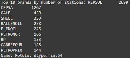
The Repsol and Cepsa brands dominate the market, controlling a large share of the gas stations across Spain. Repsol, in particular, has a strong presence due to its vertically integrated operations, allowing it to control the entire fuel supply chain from extraction to sales.
Real-World Insights:
- Repsol: As one of Spain’s largest companies, Repsol has the advantage of scale, which allows it to maintain a vast distribution network. Repsol also invests heavily in renewables, which may contribute to its long-term competitiveness (Source: Repsol Investor Relations).
- Cepsa: With a major foothold in southern Spain and close ties to the petrochemical industry, Cepsa has a large presence in Andalusia and regions along major highways (Source: Cepsa Corporate).
- Emerging Brands: Companies like Ballenoil and Plenoil focus on low-cost, automated service models, which are growing in popularity, especially in suburban areas where consumers prioritize price over premium services (Source: Economía Digital).
4. Data Visualization
I will now conduct some analysis to understand more the spanish gas market before moving to Power BI for dashboard creation.
– Fuel Price Distribution
# Step 4.1: Fuel price distribution plot
plt.figure(figsize=(10, 6))
plt.hist(gasolineras_df_cleaned['Precio'], bins=30, color='skyblue', edgecolor='black', alpha=0.7)
plt.title('Distribución de los Precios de Combustible')
plt.xlabel('Precio (€)')
plt.ylabel('Frecuencia')
plt.grid(True)
plt.show()
The distribution shows that most prices cluster around €1.50-€1.60. This reflects a relatively stable market, with fewer stations offering extremely high or low prices.
– Top 10 Brands by Number of Stations
# Step 4.2: Top 10 brands plot
plt.figure(figsize=(10, 6))
top_brands.plot(kind='bar', color='orange', edgecolor='black', alpha=0.7)
plt.title('Las 10 Principales Marcas de Estaciones de Servicio')
plt.xlabel('Marca')
plt.ylabel('Número de Estaciones')
plt.grid(axis='y')
plt.xticks(rotation=45)
plt.show()
The chart illustrates that Repsol and Cepsa dominate the market, with a much larger number of stations than the other brands.
The descriptive statistics and visualizations provide key insights into the Spanish fuel market:
- Fuel Price Distribution: Spain maintains a relatively stable pricing structure, with most prices falling between €1.50 and €1.60. However, isolated areas and high-demand regions, such as tourist destinations, may experience higher prices due to logistical constraints.
- Brand Dominance: Repsol and Cepsa dominate the market, leveraging their integrated supply chains and extensive networks. However, smaller brands like Ballenoil and Plenoil are emerging as low-cost competitors, especially in suburban and semi-rural areas.
5. Merging the datasets: Handle mismatches
Now I will proceed with the merging of the two datasets loaded at the start: gas stations and population data.
Step 1: Cleaning and Standardizing Province Names
This step ensures consistent naming conventions across datasets for provinces in Spain, a necessary prerequisite for accurate data merging. Since data from different sources often vary in naming conventions (e.g., uppercase vs. lowercase, extra spaces, or alternate province names), this cleaning process aims to harmonize the data.
Standardizing province names prevents mismatches during data merging and ensures that analyses and visualizations accurately represent combined datasets. Without this step, discrepancies like “alicante” vs. “Alicante/Alacant” or trailing spaces could cause data to be excluded, leading to incomplete insights.
This preprocessing step is critical when integrating multiple datasets, especially in large-scale data projects involving regional or geographic information.
Both datasets (gasolineras_df and population_df) have province columns (Provincia and Province respectively). The code removes leading and trailing spaces and converts all text to lowercase. This ensures uniformity in case and whitespace handling:
# Clean and standardize province names
# Remove leading/trailing spaces and convert to lowercase to standardize both datasets
gasolineras_df_cleaned['Provincia'] = gasolineras_df_cleaned['Provincia'].str.strip().str.lower()
population_df['Province'] = population_df['Province'].str.strip().str.lower()

# Check the unique province names in both datasets for comparison
unique_gasolineras_provinces = gasolineras_df_cleaned['Provincia'].unique()
unique_population_provinces = population_df['Province'].unique()

print("Unique province names in gas station dataset:", unique_gasolineras_provinces)
print("Unique province names in population dataset:", unique_population_provinces)
It’s clear that there are some differences between the naming convention of the two datasets, for example “alicante” and “alicante/alacant” or “coruña (a)” and “coruña, a”.
Step 2: Mapping Province Names:
After seeing the results is necessary to manually map the provinces to correctly merge the two datasets.
# Clean the province names by stripping spaces and converting to lowercase
gasolineras_df_cleaned['Provincia'] = gasolineras_df_cleaned['Provincia'].str.strip().str.lower()
population_df['Province'] = population_df['Province'].str.strip().str.lower()

# Adjust the mapping dictionary to lowercase keys and values
province_mapping = {
    'albacete': 'albacete',
    'alicante': 'alicante/alacant',
    'almería': 'almería',
    'araba/álava': 'araba/álava',
    'asturias': 'asturias',
    'ávila': 'ávila',
    'badajoz': 'badajoz',
    'balears (illes)': 'balears, illes',
    'barcelona': 'barcelona',
    'bizkaia': 'bizkaia',
    'burgos': 'burgos',
    'cáceres': 'cáceres',
    'cádiz': 'cádiz',
    'cantabria': 'cantabria',
    'castellón / castelló': 'castellón/castelló',
    'ciudad real': 'ciudad real',
    'córdoba': 'córdoba',
    'coruña (a)': 'coruña, a',
    'cuenca': 'cuenca',
    'gipuzkoa': 'gipuzkoa',
    'girona': 'girona',
    'granada': 'granada',
    'guadalajara': 'guadalajara',
    'huelva': 'huelva',
    'huesca': 'huesca',
    'jaén': 'jaén',
    'león': 'león',
    'lleida': 'lleida',
    'lugo': 'lugo',
    'madrid': 'madrid',
    'málaga': 'málaga',
    'murcia': 'murcia',
    'navarra': 'navarra',
    'ourense': 'ourense',
    'palencia': 'palencia',
    'palmas (las)': 'palmas, las',
    'pontevedra': 'pontevedra',
    'rioja (la)': 'rioja, la',
    'salamanca': 'salamanca',
    'santa cruz de tenerife': 'santa cruz de tenerife',
    'segovia': 'segovia',
    'sevilla': 'sevilla',
    'soria': 'soria',
    'tarragona': 'tarragona',
    'teruel': 'teruel',
    'toledo': 'toledo',
    'valencia / valència': 'valencia/valència',
    'valladolid': 'valladolid',
    'zamora': 'zamora',
    'zaragoza': 'zaragoza',
    'ceuta': 'ceuta',
    'melilla': 'melilla'
}

# Apply the mapping to the gasolineras dataset
gasolineras_df_cleaned['Mapped_Province'] = gasolineras_df_cleaned['Provincia'].map(province_mapping)

# Calculate how many rows will be deleted due to no matching province
rows_before = len(gasolineras_df_cleaned)
unmatched_rows = gasolineras_df_cleaned['Mapped_Province'].isna().sum()

# Remove rows where no match was found (i.e., NaN values in 'Mapped_Province')
gasolineras_df_cleaned2 = gasolineras_df_cleaned.dropna(subset=['Mapped_Province'])

# Display how many rows were deleted
rows_after = len(gasolineras_df_cleaned2)
deleted_rows = rows_before - rows_after
print(f"Rows before cleaning: {rows_before}")
print(f"Rows with unmatched provinces: {unmatched_rows}")
print(f"Rows after cleaning: {rows_after}")
print(f"Total rows deleted: {deleted_rows}")

# Merge the gasolineras and population data
merged_df = pd.merge(gasolineras_df_cleaned2, population_df, left_on='Mapped_Province', right_on='Province')

# Display the first few rows of the final merged dataframe using pandas
merged_df.head()
The process of merging went smoothly and no rows were deleted.
Now I will drop unnecessary columns that are duplicated after the merging.
# Drop unnecessary columns
# Drop 'Provincia' from gasolineras_df_cleaned2 because 'Mapped_Province' is the cleaned version, and 'Province' after merging
columns_to_drop = ['Mapped_Province', 'Province']
merged_df_cleaned = merged_df.drop(columns=columns_to_drop)

# Rename columns to Spanish
merged_df_cleaned = merged_df_cleaned.rename(columns={'Total': 'Población'})

# Display the first few rows of the cleaned and merged dataframe using pandas
merged_df_cleaned.head()
Now that data is ready and the two datasets are merged I will proceed with the download and move to PowerBI for further analysis and data visualization.
If you want to have more information and more insights on how to perform a correct and extensive Exploratory Data Analysis, check this article from my blog: EDA With Python
Optimizing Data for Visualization (DAX)
I decided to use Power BI for this dashboard, especially for the functionalities of Power Query, that will help me to standardize the values in the dataset.
My goal here is to create an interactive report that can help the user to better comprehend the data about gas prices, brand distribution and geographical differences between locations in Spain.
Before starting to create the visualizations, I explored the data and understood that some changes are needed, especially for brands naming and geocoding configuration.
1. Brand name standardization
The column named “Rotulo” in the final merged dataset comprehends the Brand for a specific station.
Some stations have local brands that can be associated to a bigger brand naming, for example “BP INNUBEL – NOVELDA” is clearly related to BP, a bigger brand present in the Spanish market.
To handle this problem let’s create a new column using DAX language and manually map all the brands that are redundant.
The goal of Brand Consolidation is to group different variations of the same brand or related brands under a single name. This will also prevent variations in formatting (such as capitalization, spaces, or abbreviations).
First Step: Text Normalization
Text.Lower() Function
First, I converted the content of the Brand column to lowercase using Text.Lower([Brand]). This ensures that comparisons are case-insensitive, so “REPSOL,” “repsol,” or “RePsOl” are all interpreted in the same way.
Second Step: Conditional Statements for Brand Grouping
I used a series of conditional expressions with Text.Contains() to search for specific terms in the brands and group them under main brand names.
The basic structure in Power Query is:
if Text.Contains(Text.Lower([Brand]), “repsol”) then Text.Upper(“Repsol”) In this case, Text.Contains() checks if the word “repsol” is present in each row’s brands. If so, the brand “REPSOL” (converted to uppercase with Text.Upper()) is assigned. This same pattern is repeated for each brand that I want to consolidate.
2. Creating Maps with perfect geocoding
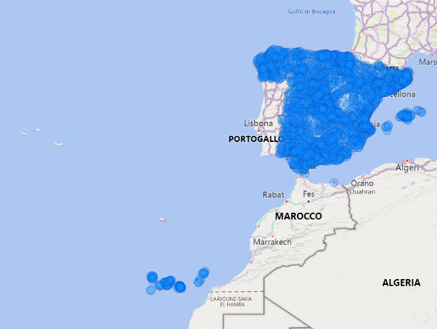
The other problem noticed is that some locations in Spain are mapped wrongly, in other countries (for example “Cuenca” province was mapped in Ecuador). For an accurate analysis all the locations must be mapped in the correct way.
So I created a new column with the country (each “Spain”), for being able to create a full and precise geographic hierarchy for every location.
For the maps used in the report I used this hierarchy:

This makes every mapping correct, and with the use of the “drill down” functionality is now possible to show every geographic level as needed.
Dashboard Creation (PowerBI)
Page 1: Province
This page is designed for Province-based analysis.
Is possible to change the province by clicking in the Filters button at the top left of the page, that will open a new bookmark page with three different filters: one for choose the province and two for the brands (top 10 brands are the brands with the most stations in the country).
The default province is Madrid.
I included five different cards to show important metrics:
- Number of Stations (in the province selected)
- Average Price (in the province selected)
- Variance of Price (in the province selected)
- Population (of the selected province)
- Stations / Population (ratio between stations and population of the selected province, it shows how many stations for habitant are available)
Another visualization included is a map that shows the number of stations for every town/district.
Is also possible to drill down to “Address” level, to see the exact location of every station accordingly to Bing maps.
The last visualization present is a table that shows the full data for every station present in the selected province, with Brand, full Location, Price and Side of the Road.


Page 2: Map
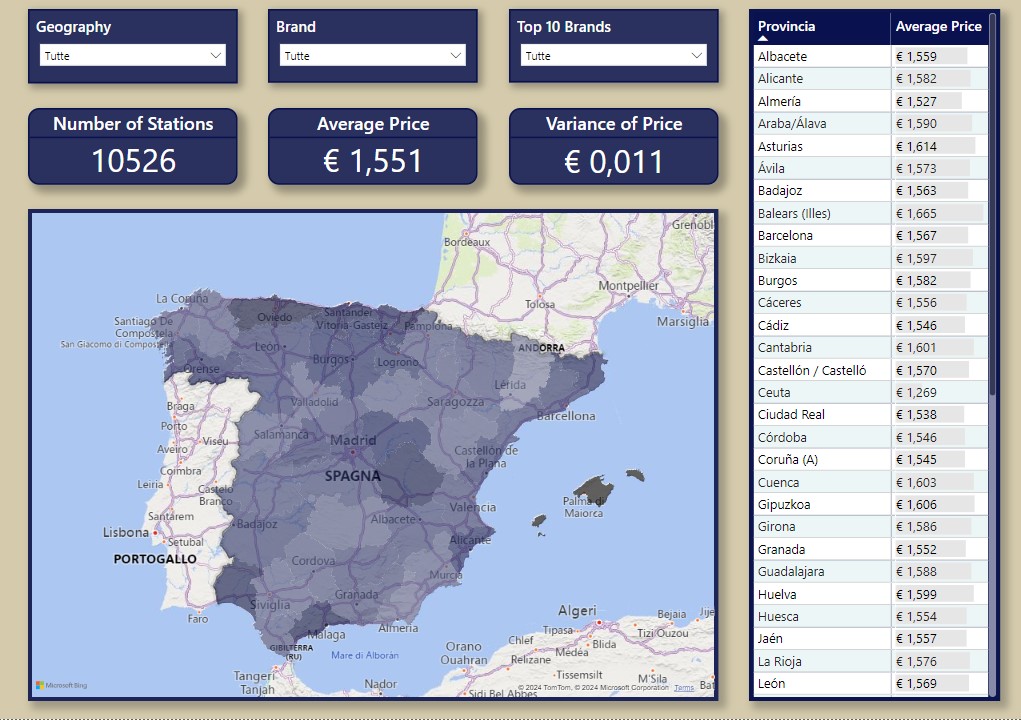
The scope of this page is to have a general understanding and overview of the data, focused on average price.
The map shows the average price for province, the darker the color the higher the average price.
With the filters is possible to select every geographic location and/or one or more specific brands.
The cards show the number of stations, the average price and the variance of price for the selected filters.
The table on the right shows the same data as the map, but in a tabular way and it does not interact with the other filters, so it will always shows an overview of all provinces for comparison. It is possible to sort out by price.
Page 3: Brands
The focus on this page is about Brands, and is thought to perform complete analysis of the brands, also at a location level.
With the filter is possible to select every level of geographical ierarchy.
The cards show the number of station, the average price and the variance of price.
The first table shows the number of stations and the the average price for every brand.
The bar chart “Number of Stations per Brans” showcases how many stations every brand has for a specific location or at a national level.
The bar chart “Average Price and Variance per Brands” showcases the average price and the variance (smaller in grey) for every brand for a specific location or at a national level.
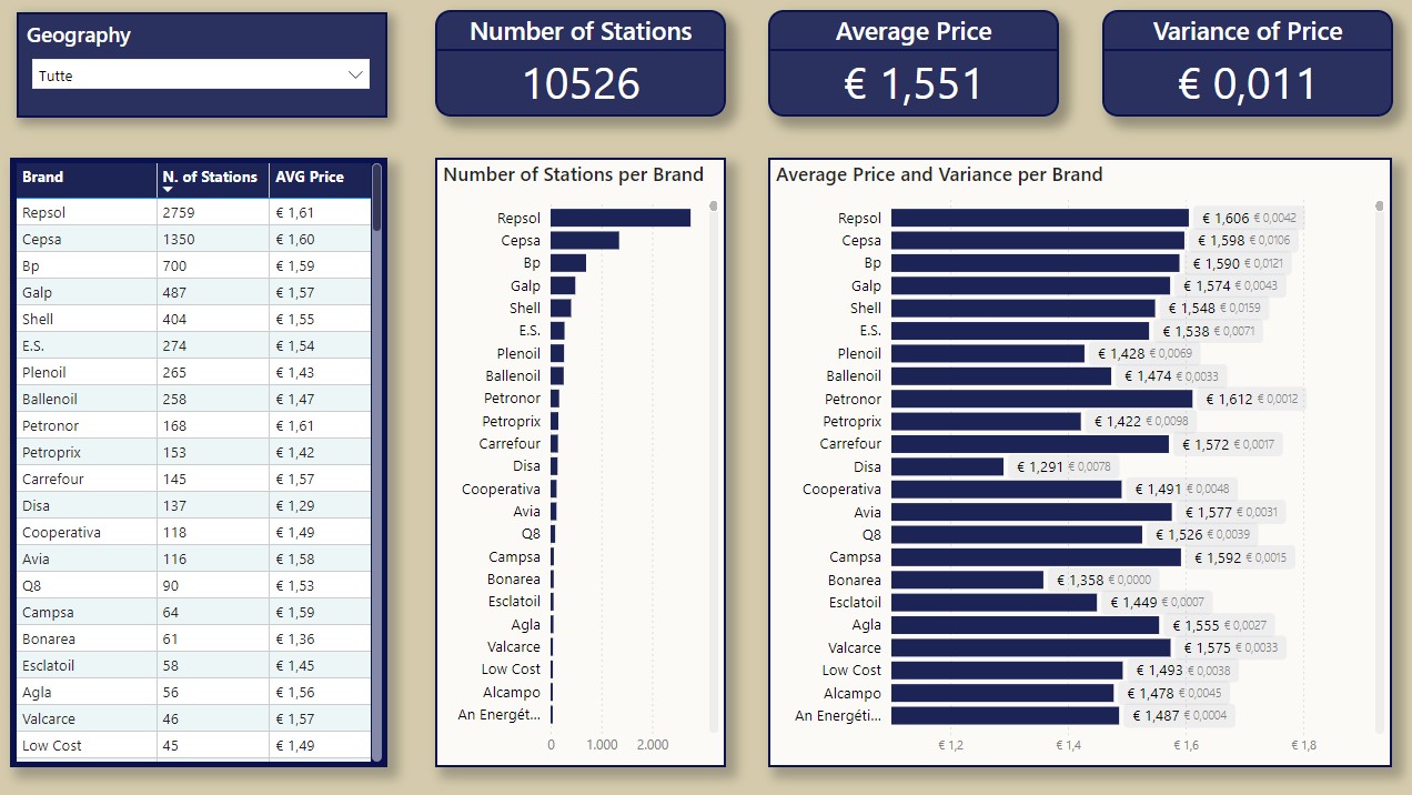
If needed is possible to filter out just the top brands or specific brands, via the basic filtering at the right of the page:

Page 4: Table / Download
This page contains a full table with the data and some filters to see the data in his completness and download the table for further analysis.
