
Exploratory Data Analysis (EDA) is the first and most important step in the data analysis workflow.
It allows analysts and scientists to understand the patterns, relationships, and anomalies within the data, making it ready for a deeper analysis or the development of predictive models. This process involves a series of procedures designed to systematically understand the characteristics of the dataset, regardless of its size or complexity.
Choosing the Right Tools for EDA
An EDA can be performed using a variety of different tools, ranging from basic spreadsheet software to advanced data analysis platforms. Each tool has its strengths for EDA:
• Spreadsheet Software (e.g., Excel, Google Sheets): Accessible and straightforward, suitable for quick and small exploratory tasks.
• Statistical Software (e.g., R, SPSS, SAS): Offers powerful statistical analysis capabilities and is highly valued in certain industries, like academy.
• Business Intelligence Tools (e.g., Tableau, Power BI): The best tools for data visualization and also commonly used for business analytics.
• Programming Languages (e.g., Python, Julia): Provide flexibility and depth, enabling data manipulation, analysis, and modeling in one tool.
Personally, I always use Python for EDA. It is a favorite for many because it’s free, easy to learn, and has libraries like Pandas for data manipulation, Matplotlib, and Seaborn for visualization. It’s widely used by companies, with more of 57% (and increasing) of data scientist positions requiring proficiency in Python (source). Python, famous for its simplicity, versatility, and a vast library ecosystem, is the dominant tool in data analysis. Its growth is expected to jump by another 50% in 2024, indicating a big trend toward its adoption in various technological domains, including data science and artificial intelligence (source).
Python has a lot of influence in data analysis, its capabilities, joined with the extensive support and resources available to developers, make it an indispensable tool in data science and analytics.
Steps of EDA
For this post I will utilize a dataset called “Billionaires Statistics Dataset”, presents on Keggle. The dataset contains data about billionaires around the world and it’s compiled from various sources, including official reports, government databases, financial institutions, and reputable publications such as Forbes, Bloomberg, and World Bank.
My goal is to show how to perform a basic EDA with Python and how to write comments to explain the results obtained, because is important to not only write the proper code and showcase the results of the analysis, but also to explain the findings to the public.
I will describe every line of code with an explanation before and a sample comment after.
Contents
Load the Data and Initial Review
The goal of this first section in Exploratory Data Analysis (EDA) is to load the dataset into a Python environment and get an initial sense of its content. This involves understanding the basic structure of the data, including the number of entries (rows), features (columns), and the type of data each feature contains (numeric, categorical, dates, etc.). This step is crucial as it lays the foundation for the entire EDA process, enabling you to plan subsequent steps effectively.
I will now load the dataset into the Python environment using a library called pandas, known for its efficiency and ease of use in handling structured data.
The read_csv function from pandas is typically used for this purpose, given that many datasets are in CSV (Comma Separated Values) format.
# Load dataset
billionaires_data_path = r'C:\Users\Francesco\Desktop\PROJECTS\Data Project\Billionaire\data.csv'
billionaires_data = pd.read_csv(billionaires_data_path)
After loading, it’s important to visualize the first few entries of the dataset using the head() method. This provides a quick snapshot of the data, including sample values for each column.
This step helps in getting a preliminary idea of the data’s nature and the type of information each column holds.
To understand the data structure, the info() method is used to obtain a summary of the dataset, including the total number of entries, the number of non-null entries per column, and the data type of each column (e.g., integer, float, object for text, or boolean). This method helps in identifying if there are missing values in the dataset and understanding the kind of data manipulation or cleaning that might be needed in the future steps.
# Display the first 5 rows of the dataframe
billionaires_data_head = billionaires_data.head()
billionaires_data_head

# General information about the dataset
billionaires_data_info = billionaires_data.info()
billionaires_data_info
Comment:
The “Billionaires Statistics Dataset” contains 2,640 entries and 35 columns.
It offers a wide range of data about billionaires, including their rank, net worth, personal details, and various statistics related to their country of residence.
Here are some key columns included in the dataset (you can always find information about the features from the source that provided the dataset):
– rank: The billionaire’s rank based on their net worth.
– finalWorth: The final worth of the billionaire in USD billion.
– personName: Name of the billionaire.
– age: Age of the billionaire.
– country: The billionaire’s country.
– city: The city where the billionaire resides.
– source: Source of wealth.
– industries: Industries the billionaire is involved in.
– selfMade: Indicates whether the billionaire is self-made.
– gender: Gender of the billionaire.
– birthDate: Birthdate of the billionaire.
– organization, title, state, residenceStateRegion: Various details about the billionaire’s business and residence.
– birthYear, birthMonth, birthDay: Components of the billionaire’s birthdate.
– education, networth: Additional details about the billionaire’s education and net worth.
Data Cleaning
Remove Unnecessary Columns
A preliminary (but not mandatory) step is to remove columns that are not necessary for the analysis, with drop().
# List of columns to be dropped
columns_to_drop = ['title', 'date', 'state', 'residenceStateRegion', 'birthYear', 'birthDay', 'birthMonth', 'cpi_change_country', 'latitude_country', 'longitude_country']

# Drop these columns from the dataset
billionaires_data = billionaires_data.drop(columns=columns_to_drop)
Comment:
I decided to remove some columns (10 of 35) that are not fundamental at the moment for the EDA.
This will simplify the process of data cleaning.
Remove Duplicates
The first step of Data Cleaning is always to check and remove duplicate rows that can skew the analysis, leading to misleading results. Use duplicated().sum() to identify and drop_duplicates() to remove duplicate entries.
# Calculate the number of duplicated rows
billionaires_data.duplicated().sum()
Comment:
There are no duplicated entries in the dataset and we can continue with data cleaning.
Handling Missing Values
Another mandatory step in this initial part of the EDA is to handle missing values, that can compromise the integrity of the analysis. We can check them using the function isnull().sum().
Is possible to drop them with dropna(), or input them with fillna(), using mean/median/mode or forward/backward fill, a placeholder or a prediction.
# Calculate the number of missing values in each column
billionaires_data.isnull().sum()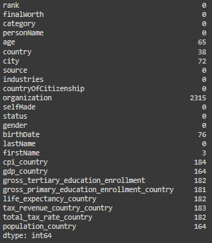
# Dropping the 'organization' column due to a high percentage of missing values
billionaires_data = billionaires_data.drop(columns=['organization'])

# Filling missing textual values with "Unknown"
textual_columns = ['country', 'city', 'firstName']
for column in textual_columns:
    billionaires_data[column] = billionaires_data[column].fillna("Unknown")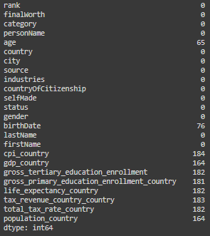
Comment:
For organization: I decided to drop the column, there are too many missing values.
For country, city and first name I decided to maintain the columns and to replace missing values with “Unknown” to indicate that the data is not available.
Age and birthdate: these columns have some missing values, but for not interfering with next analysis I will leave them with NaN and NaT (missing indicators respectively for numbers and time).
For the rest of the columns: the rest of the columns with missing values are columns related to the country (ex. gdp_country or population_country), for the countries that are not unknown is possible to manually input the relative data, if is possible to find it on a trustable source. For the moment I will leave them with missing values.
Ensure Data Type Consistency
Ensuring data type consistency involves verifying and, if necessary, converting the data types of columns in your dataset to match their content and the needs of your analysis. Is possible to convert a column to its appropriate data type using the astype() method in pandas for basic type changes (e.g., converting to int, float, str, bool), or specific functions like pd.to_datetime for handling dates.
We already saw before the info of the dataset (step 1), so let’s jump into the code:
# Control data types
billionaires_data.dtypes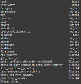
# Convert a date column to datetime type
billionaires_data['birthDate'] = pd.to_datetime(billionaires_data['birthDate'])

# Converting categorical data
categorical_columns = ['category', 'country', 'city', 'source', 'industries',
'countryOfCitizenship', 'status', 'gender', 'lastName', 'firstName']
for col in categorical_columns:
    billionaires_data[col] = billionaires_data[col].astype('category')

billionaires_data['gdp_country'] = (
    billionaires_data['gdp_country']
    .replace('[\$,]', '', regex=True)  # Remove $ signs and commas
    .astype(float)  # Convert the result to float)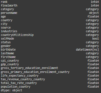
Comment:
For optimizing our analysis I converted date column in a datetime format, and the categorical columns to a category format.
The column “gdp_country” was in a “object” format, incorrectly, I converted it into a float, after removing the dollar sign that was interfering with the transformation.
Summary Statistics
Generating descriptive statistics that summarize the central tendency, dispersion, and shape of a dataset’s distribution. Use describe() for an overview of the central tendencies, dispersion, and shape of the dataset’s distributions.
# This will show only numerical data
billionaires_data.describe()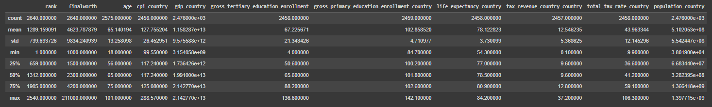
# Now will show only the other type of data
billionaires_data.describe(include=['category', 'object', 'bool'])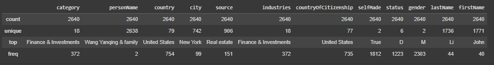
Comment (about the most important columns or the ones with weird values):
rank: Indicates the billionaire’s rank based on final worth. The ranking varies from 1 to 2540, which shows the dataset covers a broad range of billionaires from the richest to those at the lower end of the billionaire spectrum.
finalWorth: Reflects the net worth of each billionaire in millions of dollars. The mean net worth is approximately $4.6 billion, but the standard deviation is high, about $9.8 billion, indicating a significant disparity in the wealth of individuals within the list. The maximum net worth is an extraordinary $211 billion, highlighting the vast difference between the top and the average billionaires.
age: The ages range from 18 to 101 years, showcasing a wide diversity in the ages of billionaires. The median age is 65 years, which implies that half of the billionaires are younger than 65 and half are older, providing insights into the distribution of ages in the financial elite.
Data Visualization
Using visual methods to understand relationships, patterns, and trends within the data. Employ Matplotlib and Seaborn for visual exploration. Use histograms (hist()), boxplots (boxplot()), and scatter plots (scatterplot()) to examine distributions and relationships between variables.
# Histogram of the 'age' column
plt.figure(figsize=(10, 6))
sns.histplot(billionaires_data['age'].dropna(), bins=30, kde=True)
plt.title('Distribution of Age')
plt.xlabel('Age')
plt.ylabel('Frequency')
plt.show()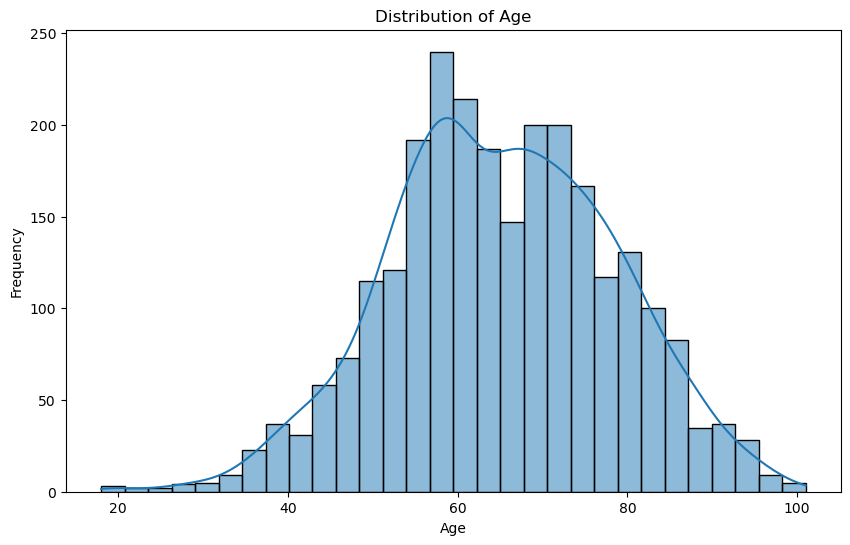
Comment:
The histogram shows the age distribution of billionaires. It appears slightly right-skewed, meaning there are more younger billionaires than older ones, but the majority are in their 60s and 70s.
# Get the count of billionaires by country and select the top 20
country_count = billionaires_data['country'].value_counts().head(20)
# Create the bar plot using Seaborn, which will automatically order the bars
plt.figure(figsize=(12, 8))
sns.barplot(x=country_count.index, y=country_count.values, order=country_count.index)
plt.title('Top 20 Countries by Number of Billionaires')
plt.xlabel('Country')
plt.ylabel('Number of Billionaires')
plt.xticks(rotation=45)
plt.show()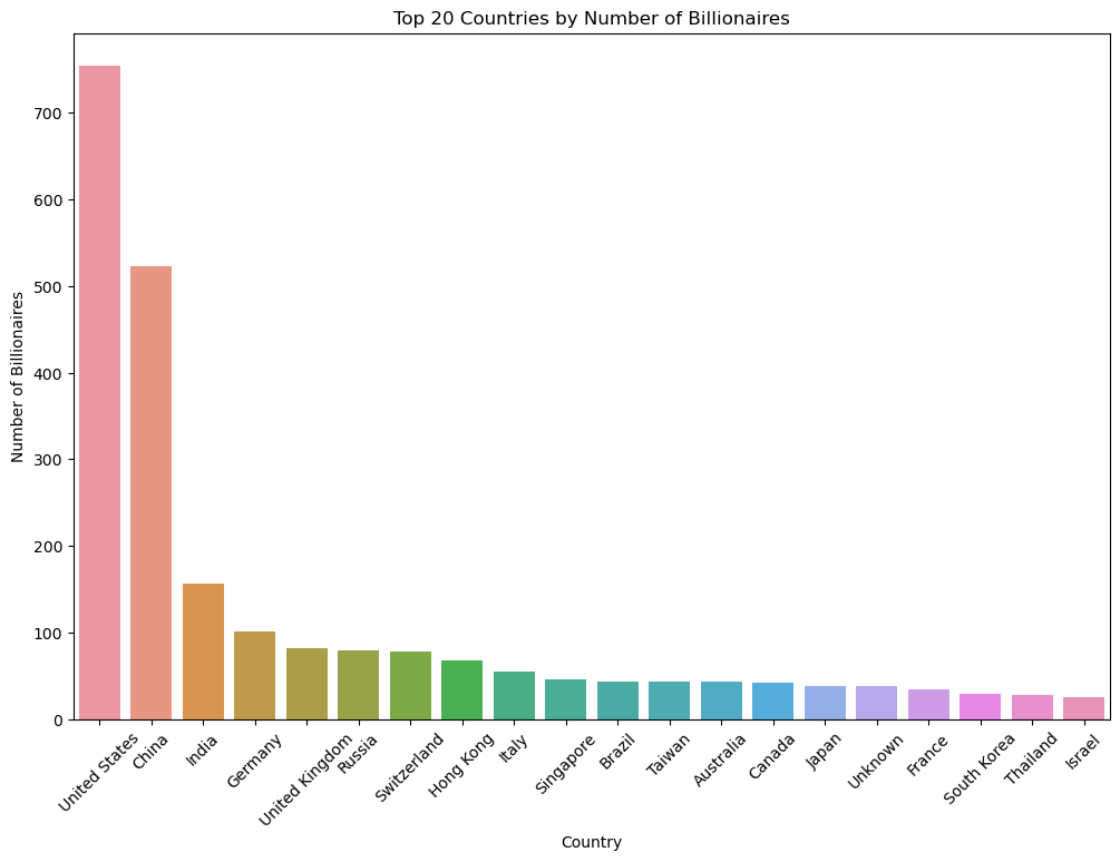
Comment:
This bar chart shows the countries with the highest number of billionaires. It provides a clear view of which countries dominate the billionaire list, is clear that GDP and population can influence this measure, as we will see later.
# Pie chart for the distribution of billionaires by gender
gender_distribution = billionaires_data['gender'].value_counts()
plt.figure(figsize=(8, 8))
plt.pie(gender_distribution, labels=gender_distribution.index, autopct='%1.1f%%')
plt.title('Pie Chart of Billionaires by Gender')
plt.show()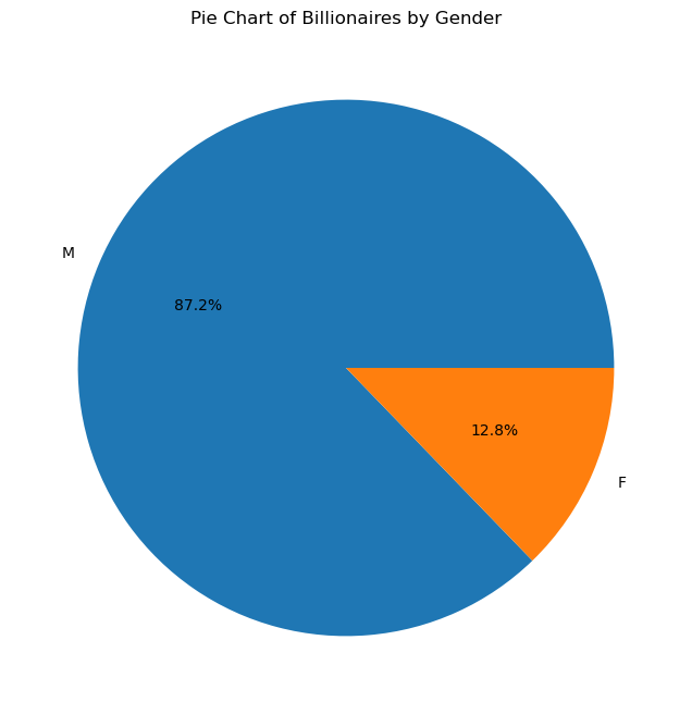
Comment:
The pie chart indicates a significant disparity in the number of male and female billionaires, with males dominating the dataset. This discrepancy highlights gender representation in the context of global wealth distribution, suggesting that males are much more prevalent in the billionaire category than females.
# Extracting the top 20 industries by billionaire count
top_industries_by_billionaires = billionaires_data['industries'].value_counts().head(20)
# Creating the bar chart with the correct order
plt.figure(figsize=(12, 8))
# The 'barh' plot will allow us to place the industry with the most billionaires at the top naturally due to horizontal layout.
top_industries_by_billionaires.sort_values().plot(kind='barh')
plt.title('Top 20 Industries with the Most Billionaires')
plt.xlabel('Number of Billionaires')
plt.ylabel('Industries')
plt.show()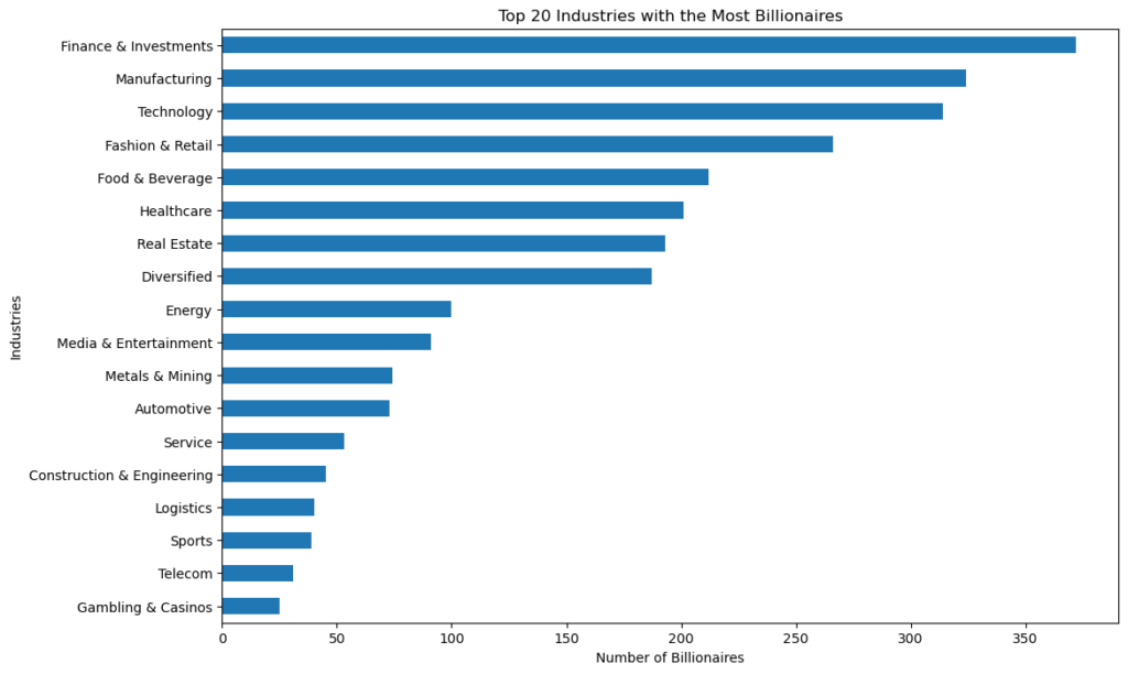
Comment:
The bar chart shows that “Finance & Investments” category is the one that produces the most billionaires, given its direct connection to wealth management and capital growth.
At the second place the “Manufacturing” category, traditionally a strong source of wealth, especially in economies transitioning from developing to industrialized status.
After, “Technology”, reflecting the massive wealth generated in this sector due to high-impact global companies and startups.
Outlier Identification
Detecting data points that deviate significantly from the norm, which can be crucial for certain analyses. Outliers can significantly affect your analysis. Visual tools (like boxplots), along with IQR (Interquartile Range) calculations, help identify and decide how to handle these data points.
# Boxplot of the 'finalWorth' column
plt.figure(figsize=(10, 6))
sns.boxplot(x=billionaires_data['finalWorth'])
plt.title('Boxplot of Final Worth')
plt.xlabel('Final Worth (in million USD)')
plt.show()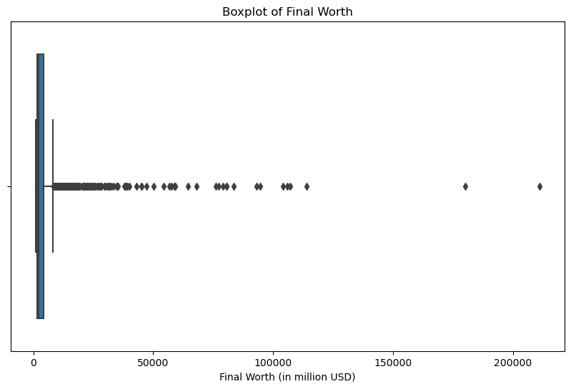
Comment:
The boxplot displays the distribution of the final worth of billionaires in millions of USD. It shows a significant number of outliers on the right, indicating that there are billionaires whose net worth is considerably higher than the majority.
# Function to calculate IQR and identify outliers
def identify_outliers(column_name):
    # Calculate Q1, Q3, and IQR
    Q1 = billionaires_data[column_name].quantile(0.25)
    Q3 = billionaires_data[column_name].quantile(0.75)
    IQR = Q3 - Q1

    # Define the thresholds for outliers
    lower_bound = Q1 - 1.5 * IQR
    upper_bound = Q3 + 1.5 * IQR

    # Identify the outliers in the data
    outliers = billionaires_data[(billionaires_data[column_name] < lower_bound) | (billionaires_data[column_name] > upper_bound)]

    # Summary of outlier detection
    outlier_summary = {
        'Q1': Q1,
        'Q3': Q3,
        'IQR': IQR,
        'Lower Bound': lower_bound,
        'Upper Bound': upper_bound,
        'Number of Outliers': outliers.shape[0]
    }

    return outlier_summary

# Analyzing 'age' column for outliers
age_outlier_summary = identify_outliers('age')

# Plotting boxplot for 'age' column
plt.figure(figsize=(12, 6))
sns.boxplot(x=billionaires_data['age'])
plt.title('Boxplot of Billionaires Age')
plt.xlabel('Age')
plt.show()

age_outlier_summary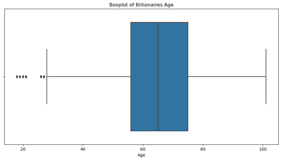

Here, I created a function that permits to detect outliers with the interquartile range for every column.
Comment:
– The first quartile (Q1) is 56 years.
– The third quartile (Q3) is 75 years.
– The Interquartile Range (IQR) is 19 years.
-The lower bound for outliers is 27.5 years, and the upper bound is 103.5 years.
– There are 9 outliers, indicating that there are 9 billionaires who are either significantly younger than the majority. The boxplot visually confirms the presence of outliers.
Correlation Analysis
Exploring the relationships between variables to understand how they interact with each other.
Correlation Matrix: Use DataFrame.corr() to calculate correlation coefficients between variables, identifying potential relationships.
Heatmaps: Visualize the correlation matrix with Seaborn’s heatmap() function to easily identify highly correlated variables or patterns.
# Select numerical columns for correlation analysis
numerical_data = billionaires_data.select_dtypes(include=['int64', 'float64'])

# Calculate the correlation matrix
correlation_matrix = numerical_data.corr()

# Plotting the heatmap for the correlation matrix
plt.figure(figsize=(12, 10))
sns.heatmap(correlation_matrix, annot=True, cmap='coolwarm', fmt=".2f")
plt.title('Correlation Matrix Heatmap')
plt.show()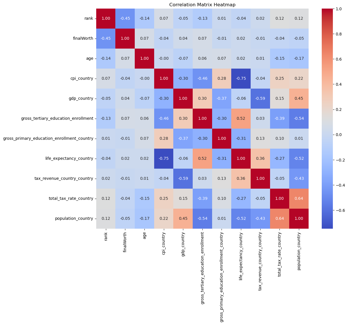
Comment:
The heatmap visualizes the correlation matrix of the numerical variables in the dataset. Each cell in the heatmap shows the correlation coefficient between the variables, ranging from -1 to 1:
A coefficient close to 1 indicates a strong positive correlation (as one variable increases, the other tends to increase as well).
A coefficient close to -1 indicates a strong negative correlation (as one variable increases, the other tends to decrease).
A coefficient around 0 indicates no linear relationship between the variables.
In this case we don’t have any strong positive or negatice correlation to the main variable “finalworth”.
But some correlations are noticeable like a strong negative one between “cpi_country” and “life_expectancy_country”